


MAPPING TUTORIAL - MEADOW
A visual simple step-by-step example of fundamental map design.
 Blind
Blind- 01/17/2012 06:01 AM
- 28585 views

This tutorial is very much for beginners. The intention here is not necessarily to present any real innovation (in terms of visual trickery or techniques) but just to provide a straightforward "mapping 101" for newcomers.
(Aka, anyone familiar with basic workings of RM may want to just overlook this article entirely)
That being said, I have always believed the potential the map-design (and general aesthetics) in RPGMaker far exceeds what many developers aspire for.
Most of my experience comes from Rm2k3, but what is presented here can certainly apply to any comparable engine. These tutorials will ultimately build toward an approach to map-design that considers factors such as:
Ambiance ( the "Identity" and sense of place in a map)
Layout-functionality/Puzzles
Working with elevation, etc.
1.) Choosing Terrain & Setting
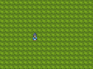
As you can see, the "first step" is pretty intuitive. ;D Deciding on an overall "theme" or location for your map will allow you to more easily select the dominant tiles. In this example, it's a meadow/woodsy outdoor setting.
In the above image, the grass tile will serve as the 'negative space' in the map. (the bucket-tool is an easy way to quickly apply your selection to the map.)
For graphic resources that allow it, multiple-tile patterns or textured terrains are a good device to break up the monotony of the 16x16 grid. However, for this example I felt Rudra's basic grass tile would suffice.
2.)The Map's Layout
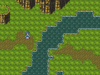
With the pencil tool (or circle applicator), conceive a rough outline corresponding to the direction of your map, determining where the basic ingredients will go.
Keep in mind the direction in which the player will move the Hero to progress through the game.
For outdoor areas, elevation is often a key ingredient in both the map's visual appeal and the dynamism of exploration. It is also a good determinant of the map's space confines. Wall/Cliff Tiles (as in, the ones shown at the topmost space in the above example) are often the means of dividing a space based upon the perceived depth in a particular game location. Here, very basic cliff tiles are utilized. Notice that they are organized correctly based on curves and shape rather than randomly accumulated.
- Reference to wall/cliff tiles applies largely to projects displayed in a top-down, 3/4 or isometric visual style.
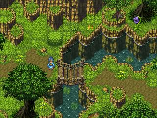
3.) Playing with Elevation
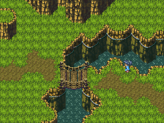
As stated, the depth and dynamism of a map is crucial to overall immersion. Without adequate attention to such details many environments simply become flat, featureless locales. With our example, although I had already implemented the basic cliff tiles, I went a step further in adding similar detailing in the space surrounding the specified 'river' area of the map. This can be done via the Map's Chipset or with separately-placed Event tiles (many of which may animate to create the illusion of movement and fluidity!)
4.) Placing Large Objects, Adding Detail
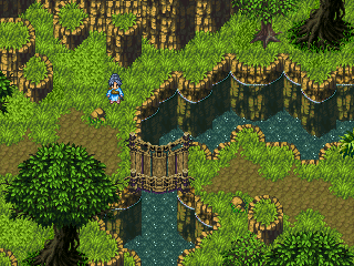
Although to a certain extent the construction of a map is intuitive, it is endlessly helpful to organize and plan where the visually 'large' objects will appear in design.
With this in mind, one element is key in placement: symmetry. With outdoor or nature-influenced locations, symmetry is primarily a concept to be avoided! The organization of objects such as trees, cliffs, large stones, etc., should be arranged as randomly as possible while decidedly not becoming totally intrusive. For our example, a Meadow-esque pathway, trees and foliage are often seen as necessary inclusions. Finding an adequate balance between empty space and visually-occupied areas can be tricky.
Oddly enough, there is no steadfast rule. Subjectivity nearly always comes into the equation: what one player may see as overwhelmingly 'busy' another may thoroughly enjoy. Therefore, practice and personal judgement are the best criteria.
5.) Embellishing the Space
Now that all of the cornerstones are adequately in place, the (equally important!) process of adding details takes center stage.
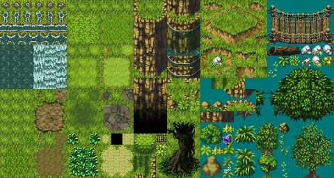
RPGMaker as a platform divides map-engine tiles among multiple 'layers' that act precisely as one would expect. 2K and 2K3 include three distinct layers (terrain-based, objects, and events), wheras XP and VX add an additional 'object' layer for various options that include parallax backgrounds and additional room for objects.
- Although this tutorial was written with RM in mind, I am sure that similiar tile-based and multi-layer engines could work comparably in principle.
Without going too far into technicalities, RPGMaker chipset templates are arranged in such a way that allows most terrain objects to be assigned into the primary (or bottom) layer. The bottom-layer spaces usually coincide with either walkable, visually-flat areas that Hero can traverse, such as grass and dirt, or impassable spots such as cliff and water tiles. Again, all chipsets are arranged differently so this is hardly a steadfast rule.
Take the time to use both the Bottom and Middle layers to implement varied terrain and visual texture. In simple language, busy it up! Flowers, high grasses, shrubs and plants, stones, pots, boxes & barrels all make for time-tested options. Spontaneity and disarray are key for our example here! Cliff edges, crags, and large bushes are frequented throughout our example.
6.) The Finishing Touches
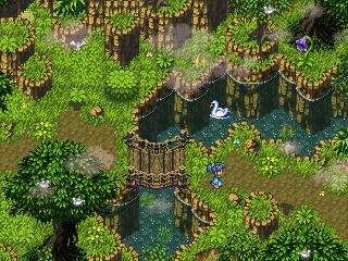
With this step I added quite a few elements at once. Events can (and should) be used to add busyness and beautify a map just as easily as with the two base layers. In the above, I added sporadically circulating butterflies, birds nested among the treetops, a swan swimming peacefully in the stream, and two birds that circulate the map via a manually-assigned pattern.
For their shadows, as I am often asked, it's as simple as creating a gray or black shaded-in silhouette of the bird. An event with the same speed of animation and movement pattern is given to this 'shadow' and placed several tiles below, giving a further illusion of depth.
Lastly, clouds are added into the location via the RM Picture Command. At this low transparency setting, they are not overtly intrusive to the map, but rather create a sense of atmosphere that disrupts staleness. (For those savvy enough to master the effective movement of pictures (check some other RMN tutorials!), the clouds are likewise animated.) Altogether, this makes for a pleasing scene, if mildly unoriginal.
Follow-up with a simple screen-tint (another under-used asset of RM!), and a wholly enticing ambiance arrives into the area!
Not entirely my greatest work of all time, but it feels thoroughly finished-with. If anyone wondered, I used a chipset at random that I found floating around. For anyone who takes a look at this, feel free to post what you come up with. :]
Posts 

Pages:
1


Map looks great, but I suppose should be commenting on the text, not the pictures. :P Great article for a beginner from an iconic mapper.
It's a nicely illustrated tutorial, and those are some great instructions.
The only thing I would add is that people who are not familiar with their chips may want to include large objects earlier in the steps. I don't know how many times when first using a chip I over or underestimate the room my objects need and I have to go back and redo the basic skeleton of the map because things didn't fit quite right. This is especially true with chips like the one you're using that have huge trees with odd shapes. Sometimes, it can be best to plan around the big trees than to try to fit them into an already existing map.
All in all, very useful and well done!


The 6th and 7th maps, scrolling down : the plants seem to rest on this dark green matter, that, I would have thought would be the surface of the water but that remains on the bottom of the river. May be I'm not seeing right, in any case, this, I insist, is an exceptionally beautiful map.
I really don't understand what's obscure about my post, but anyways, I'll try again : the plants on the water seem to be in the water :6.) The Finishing Touches:


They are 'underneath' the surface of the water, Chana. Or at least that was the intention. I could have done more with the transparency but I was hoping to keep things pretty simple with this one and stay away from events.

Pages:
1

