


SCREENSHOT SURVIVAL 20XX
Posts

author=Kaempfer
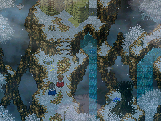
Having seen literally any of Blindmind's maps in the past I think the one thing you don't have to worry about is tiles repeating too much. It looks like the upper layer just exploded most of the time. I think this was a colour/style test, mostly.
Lol yeah, it was just a color/palette test for the trees. The map isn't even really completed... xD I guess I should have mentioned that.
I've been giving some thought to replacing a good deal of the Rudra objects with custom-made tiles, kind of like what Luchino did for Tristan. But so far it's been tricky to get the visual style to stay consistent with what's already been established. Do you think the shading for those trees seems off from the other BR screens?
Example


If your username was Rapture I would say ''Your game looks beloved, Rapture!''

See those maps are fine I just wasn't aware it was a demo/test.
Only the one on top-right gives me a red flag, mostly because all of the foliage is bright green except a couple which are more desaturated and teal in color.
It doesn't really fit, that aside, the bottom right has a chest and brazier... thing that don't blend well with the rest of the map, other than that, you uh... you've got this!
Also! New page, and I'm torn on which video to show you fellas, but since you've already seen Yogg'Fuzzmittens, we'll take a look at the big Warth'og boss instead... there was also a cutscene I just finished but I am being strictly one video per page.
Gonna fix up the pre-battle text being hard to read and inconsistent with later text, also going to fix that thing where the cleave animation is playing 3 times instead of one.
Oh! Here's a small album of screenshots if you're interested.
http://imgur.com/a/Po5pn#0

Those screenshots look amazing Blindmind
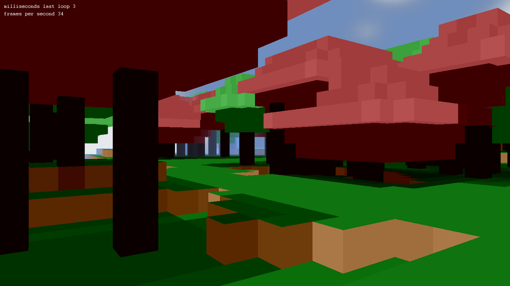
Ive changed to a flatshaded look. Its means I have less surfaces as Im only using vertex colors and not using any textures at all.
Ive changed to a flatshaded look. Its means I have less surfaces as Im only using vertex colors and not using any textures at all.


Then you may want to remove those particles is it's getting in the way :P
Is there a full map of this forest I can take inspiration from?
I've been trying to choose a tint for my game and I posted some different versions on twitter and many people said I should go for number 1

But I actually kinda like 3rd and 4th better. What do you guys think?
And here's my inspiration:

Is there a full map of this forest I can take inspiration from?
I've been trying to choose a tint for my game and I posted some different versions on twitter and many people said I should go for number 1
But I actually kinda like 3rd and 4th better. What do you guys think?
And here's my inspiration:
@ED: Definitely tint #1. I literally squinted at the others because either they're too harsh or have too much contrast/saturation. #4 would probably work better for a sunset.
As for that map, I've just started on the area now =)
As for that map, I've just started on the area now =)

Yeah definitely #1 looks the best for a sunny day, but perhaps #4 would work good for dawn time. I would still somehow make it less saturated, though.
Yeah when I said it's supposed to be dawn everyone suddenly changed to 4 :P
2 is my least favorite to be honest and 1 looks too plain to me but people seem to like it
2 is my least favorite to be honest and 1 looks too plain to me but people seem to like it
Extreme I agree with Cash on this one.
I think that your large tree has a very flat side to it on the right side and stands out, also the top corners of the cliff's down the bottom left and right don't seem to match correctly.
author=Luchino
I think that your large tree has a very flat side to it on the right side and stands out, also the top corners of the cliff's down the bottom left and right don't seem to match correctly.
author=ExtremeDevelopment
I hope I'm not being too harsh, but all 4 of those look kinda gross tbh. Maybe they look better in-game, but the tint just comes off looking artificial and tacky. (If I had to choose one, I'd agree the first is the least extreme...)
With the example you're aspiring for, the green and blue tones still retain some of their saturation, so it looks more natural. You're better off messing around with the vibrancy/saturation setting for your chip-set, or color-grading the tiles with a filter.
@Blindmind-I'm not gonna go for anything fancy I just wanted to use a simple tint :P
I'm trying to focus more on gameplay than the overlays. Also it's supposed to be a horror game to give you a better idea.
I'm trying to focus more on gameplay than the overlays. Also it's supposed to be a horror game to give you a better idea.

Excuse the shit map (it's a test map for something else) but as you can see, just nudges can produce decent effects. Two of those have saturation set at 68 and the other two, at 85. The colours are set just above/below the 0 mark with the highest being around 50 and the lowest about the same. Honestly, little nudges work well, it's just a matter of finding the right combination.

author=ExtremeDevelopment
Oh yes I love that <3
I kinda cheated because it was made with After Effects, but i will only need to export it to a .swf and use it with RMFlash so heh, cheating ftw

Whoa that's pretty gorgeous <3
I wonder if it'll lag / work fine with fullscreen though... If it does anyway I suppose you could use pictures? lol
I wonder if it'll lag / work fine with fullscreen though... If it does anyway I suppose you could use pictures? lol


