


SCREENSHOT SURVIVAL 20XX
Posts

Healy
Huh, those houses look a lot like the ones in Link's Awakening. Is there anything you could do to make them look more different?
something like this?

Ramshackin
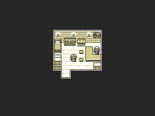
The palette used in the second set of screens is a lot more interesting + has that perfect retro look.
CashmereCat
I agree with Ramshackin, I <33 the green palette.
baww, i'm glad other people like it!
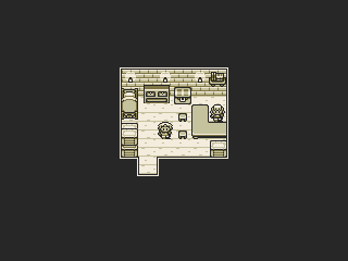
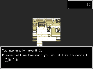
i did some more interior stuff.


Here's a text-based RPG I'm working on with some other folks.
You create a character and depending on the choices you make the game plays out differently (i.e you'll have different relationships with different characters). There are a number of alternate pathways that the story can take. There's also a sanity meter and you will be haunted by demons if things get bad enough for you. It's inspired by Harry Potter and HP Lovecraft and was also heavily influenced by the game Sunless Sea.
You create a character and depending on the choices you make the game plays out differently (i.e you'll have different relationships with different characters). There are a number of alternate pathways that the story can take. There's also a sanity meter and you will be haunted by demons if things get bad enough for you. It's inspired by Harry Potter and HP Lovecraft and was also heavily influenced by the game Sunless Sea.
author=Milennin
If inspired by Pokémon, why not have different palette colours for different places?

facesets/system/charsets would have to be changed each time a differently-coloured area comes up, but that shouldn't be a problem.

Tau gurl I love what you are doing with the palette play there. It's very fresh and funky but be careful not to overuse saturation. Some colors need to be less saturated to let the accent colors pop out

@PCTRASH: You could have a set colour combo for the menu system/sprites/faces (maybe greyscale for those only).

Making some rough story boards for a skippable cutscene during the splash intro for the game.
http://i.imgur.com/iyv8V1G.png
http://i.imgur.com/Z3rvK9K.png
It's that or screenshots from Excel... :[
http://i.imgur.com/iyv8V1G.png
http://i.imgur.com/Z3rvK9K.png
It's that or screenshots from Excel... :[
Liberty
@PCTRASH: You could have a set colour combo for the menu system/sprites/faces (maybe greyscale for those only).
i know the black is supposed to standout compared to the map's tileset but it feels odd to me.
It does a bit... how about making it more dark grey instead of straight black? That might help a little, maybe. I do like that title screen though. Very simple but sleek.
I made priority of my most egregious screenshot first. Old one is in the spoiler box if you want to compare. I'd like to add more ground cover, but it also has to not look distracting if i do. I wouldn't mind finding a nicer fence, but i suppose the one i have works...? I can already see a couple tree leaves i need to trim. This is without NPCs or animal sprites too of course.
Thoughts? Ideas? Many thanks.
(Old screen)

Thoughts? Ideas? Many thanks.
(Old screen)


That sprite needs to go.
One it clashes with the style you're presenting with the tiles.
Two, its just an ugly sprite, even for an rtp edit.
Three, look at the scaling of objects in relationship to hero. He looks like a five year old in comparison to the benches. Either make him taller or make he objects smaller.
Also I think that orange ground is too vibrant, too neon, too saturated. Dial that shit down some, gray it out a bit.
author=Dookie
That sprite needs to go.
One it clashes with the style you're presenting with the tiles.
Two, its just an ugly sprite, even for an rtp edit.
Three, look at the scaling of objects in relationship to hero. He looks like a five year old in comparison to the benches. Either make him taller or make he objects smaller.
Also I think that orange ground is too vibrant, too neon, too saturated. Dial that shit down some, gray it out a bit.
The sprites are an issue i want to fix... i'm just not sure how to replace them? I'd like to go with a larger size, but i haven't a clue how to work around the system limits (24 x 32).

Yeah, the "rendered" objects are marginally better than what you had before, but ultimately still stick out quite a lot.
Also, why the removal of the shadows? The whole scene seems a bit flat, you know? Very pasted-together. If you're going for more of a CG texturized look, a la The Way, lighting and shadow placement certainly would help.
Also, why the removal of the shadows? The whole scene seems a bit flat, you know? Very pasted-together. If you're going for more of a CG texturized look, a la The Way, lighting and shadow placement certainly would help.
I removed the shadows because i felt the issue where other objects, like the hay bale and the swing bench don't have shadows would be a conflict.
In all though, i'm thinking about how much time i have to spend cleaning up low definition renders of all my HD materials, and that i wouldn't have to spend all that effort at a higher resolution. It took me several hours to get that swing looking even that good just yesterday alone...
The truth is, i will probably complete this project in a far shorter amount of time in the long run by simply switching to a newer maker. Plus, it feels like the effort is being wasted on all these graphics that are a mere shadow of their original format.
Trouble is, even switching feels like a bit of a barrier right now with MV coming out in the near future. The work i put into porting over to ACE right now would be lost when that comes out... So i don't know, but i am certain that i will actually save time in the long run by switching to a newer program.


I thought I'd already commented on this one but apparently I hadn't. It looks great. The only things I question is the shading at the top of the pillars as they kind of look like the proper top of the pillars instead of continuing to reach up and support the ceiling... just a bit. And the moon is very flat - even just a few light dots or something to give it a liiiittle bit of depth might help. I mean, the ground is pretty flat-looking but it has grass clumps and the pat to make it look a little more lively. The sky could use a few clouds or stars or something but the moon is currently just a circle in the sky.
Otherwise it looks great! <3
Otherwise it looks great! <3

