


LET'S TALK ABOUT MAP DESIGN
Posts

Maps are an integral part of most games and they are very important. A lot of the time we make maps look a certain way without really thinking about the design and sense of such things.
The recent discussion in the Screenshot thread over restaurant (and shop) mapping has shown that it might be a good idea to discuss map design and talk about general and/or particular kinds of maps and how to go about designing them.
Let's start with something simple - the humble store.
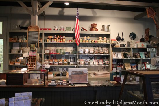
Here's what I posted in the Screenshot thread and my general take on designing a realistic store.
One thing I would like to point out is that if you're going for a certain style, it is okay to ignore realistic stylings. If your shop is set in a cave, it's bound to be more cramped than if it were set in an emporium, for example. Think of the discussion in this thread as guidelines instead of hard and fast rules. And while you're at it, check out the second half of this month's Podcast as the Game Dev Corner this time around focussed on maps and mapping.
Feel free to bring up other ideas and 'themes', too. The thread is half to help with understanding layout and design, and half to discuss it.
The recent discussion in the Screenshot thread over restaurant (and shop) mapping has shown that it might be a good idea to discuss map design and talk about general and/or particular kinds of maps and how to go about designing them.
Let's start with something simple - the humble store.
Here's what I posted in the Screenshot thread and my general take on designing a realistic store.
Item shops are all about selling items and directing customer flow while also keeping an eye on the customers. It depends on the kind of store as well as the amount of traffic you usually get. Often your sales want to be front and centre so that customers can see them and be persuaded. Sale items are usually those you want to get rid of (yeah, guess who's also worked retail quite a bit - including setting up sales floors) so you want them to be very visible for the customer.
More specialised items you want in their own sections and areas. Regulars know where things are kept without signage since shops rarely change the area allotment of certain item types. And no, this isn't just supermarkets - small shops do this because it helps the customer find what they want. On the way to what they want, though, will be more specials or items that you want to sell off.
More costly items will be kept close to the counter so that they can't be stolen, or kept in an area the customer can see but not enter (depends on the items in question. If you've a weapon store, putting the swords out where potential robbers can pick them up and kill you with 'em ain't a great idea. ;p )
Ideally you want a walkway lined with specials from the door to the counter, and then some lines of specials leading to the 'rows' of specialist items/areas. This increases the chances of people picking up on-sale items and helps guide the buyer along the 'path' so they unconsciously feel they need to follow the line and browse. Tricksy~
Some examples:
One thing I would like to point out is that if you're going for a certain style, it is okay to ignore realistic stylings. If your shop is set in a cave, it's bound to be more cramped than if it were set in an emporium, for example. Think of the discussion in this thread as guidelines instead of hard and fast rules. And while you're at it, check out the second half of this month's Podcast as the Game Dev Corner this time around focussed on maps and mapping.
Feel free to bring up other ideas and 'themes', too. The thread is half to help with understanding layout and design, and half to discuss it.

Supermarkets actually want to keep the customer confused, so he is buying stuff he doesn't want, just cuz it's on the place, where thing he needs used to be.
But stores in games don't work as supermarket.
What you need is this very basic layout. It shows exactly player's expectations. The player wants to have his path as short as possible.
Realism is the other thing. You can do better than the classic 8-bit store (There exist all behind cash desk stores, but they are never too visually appealing). You can include shelves, tables, crates. However they are not essential. I haven't seen a game, which does make you walk for your picks. So,liberty's layout is pretty much right.
Can I make a post on my own theme too?
author=Cap_H
But stores in games don't work as supermarket.
What you need is this very basic layout. It shows exactly player's expectations. The player wants to have his path as short as possible.
This actually raises a good point. Considering that we are making games, we should better mind how the design of the map affects the player's decisions, as oppose to simply representing real life... Or doing both wouldn't hurt.
I personally like the simple, straightforward design of that NES map posted because if the player is constantly backtracking to town after fighting a slew of mooks in the overworld, it makes the process of getting into shops and getting out a lot quicker.
The type of design Liberty has can still work, however, provided that you give the player a reason to explore those extra tiles to begin with.
I think that having the counter just directly across from the entrance so they don't have to dodge around things in order to get to the shopkeeper is an important thing for players to not get annoyed every time they have to go into the store. A store is about convenience and ease of access, so if its difficult to get to the shopkeep, then itll just be another annoyance the player needs to slog through.
edit: ratty beat me to the post and says the same thing better than i did
edit: ratty beat me to the post and says the same thing better than i did

author=Ratty524author=Cap_HThis actually raises a good point. Considering that we are making games, we should better mind how the design of the map affects the player's decisions, as oppose to simply representing real life... Or doing both wouldn't hurt.
But stores in games don't work as supermarket.
What you need is this very basic layout. It shows exactly player's expectations. The player wants to have his path as short as possible.
I personally like the simple, straightforward design of that NES map posted because if the player is constantly backtracking to town after fighting a slew of mooks in the overworld, it makes the process of getting into shops and getting out a lot quicker.
The type of design Liberty has can still work, however, provided that you give the player a reason to explore those extra tiles to begin with.
Exactly. It all depends on how it's being used. I find there's a sweet-spot between player utility and beauty/realism when it comes to mapping.

This is an awesome idea. For one who has done next to no employed work his whole life information like this usually completely evades me.
Basic concepts can enter my brain but it's a whole other matter of implementing the tricksy ways of shopkeepers.
I often feel my maps are incredibly lacking in my games, especially considering one of the creative wellsprings that lead me towards game design was architecture and fantastical model making. When I was young I'd constantly make worlds out of cardboard and stuff.
I have next to no experience in half of the places I designate mapping, I have no idea how a Nuclear silo is structured, or how police headquarters are layed out... and it never seems to be a thing I even contemplate researching, my instinct is to go at it blindly.
This stated, I did enjoy mapping a lot more when I was drawing it myself. What I like is when I make a map that has atmosphere. Which is why this is probably one of the favorites of mine.
There are certainly bugs with it, such as the bridge leading into the stairs unconditionally.
Also Apoc's simplistic 'Biz-catered' tiles don't melt steel beams I mean don't exactly go with Celianna, Lunarea or Ayene's hyper defined foresty tiles.
Basic concepts can enter my brain but it's a whole other matter of implementing the tricksy ways of shopkeepers.
I often feel my maps are incredibly lacking in my games, especially considering one of the creative wellsprings that lead me towards game design was architecture and fantastical model making. When I was young I'd constantly make worlds out of cardboard and stuff.
I have next to no experience in half of the places I designate mapping, I have no idea how a Nuclear silo is structured, or how police headquarters are layed out... and it never seems to be a thing I even contemplate researching, my instinct is to go at it blindly.

This stated, I did enjoy mapping a lot more when I was drawing it myself. What I like is when I make a map that has atmosphere. Which is why this is probably one of the favorites of mine.
There are certainly bugs with it, such as the bridge leading into the stairs unconditionally.
Also Apoc's simplistic 'Biz-catered' tiles don't melt steel beams I mean don't exactly go with Celianna, Lunarea or Ayene's hyper defined foresty tiles.
LockeZ

I'd really like to get rid of LockeZ. His play style is way too unpredictable. He's always like this too. If he ran a country, he'd just kill and imprison people at random until crime stopped.
5958
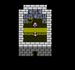
The screenshot of FF3 that Cap_H posted is the horrible, worthless kind of shop map that I originally brought this topic up to try to get people to stop doing. It's ugly as sin, it doesn't look anything like a shop, and it says to the player "I'm not trying to get you immersed at all, no matter how little effort it would take on my part. So if you were starting to care about the story or the setting, or trying get immersed in the fantasy, you might as well just quit right now, it's not going to happen."
Even just having a purchase menu pop up when you enter the door on the street, with no shop interior at all, would be better. At least then it's left to the player's imagination.
It's possible to make things look visually appealing without making them time-consuming, so I don't understand your idiotic argument about walking back to town. Liberty's map has all of three tiles further to walk than the FF3 screenshot, and if that really honestly bothers you, you can move the door to the east wall next to the counter, or make up for it by moving the building three tiles closer to the edge of town.
@LockeZ: I stated the FF3 map design as a personal preference, not something that I want to see with every single game. I think it works because it works with how the game handles shops. If you are not doing anything else with shops other than giving the player a pit-stop to collect more items, then that design works. If not, then something like Liberty proposed would work better, as it allows you more room to add stuff for the player to interact with.
If that's not your goal with your particular game, then why bother adding extra crap when the player isn't going to do anything with it? That being said:
This is a good idea for something like this.
If that's not your goal with your particular game, then why bother adding extra crap when the player isn't going to do anything with it? That being said:
author=LockeZ
Even just having a purchase menu pop up when you enter the door on the street, with no shop interior at all, would be better. At least then it's left to the player's imagination.
This is a good idea for something like this.
Yup, It looks terrible. The point was to show how the most basic shop can look like and to demonstrate the main function of it. It could had been written in liberty's post, but it wasn't clear enough.
And Liberty's map works really well, accomplishing the same and adding something extra.
And Liberty's map works really well, accomplishing the same and adding something extra.

author=LockeZ
The screenshot of FF3 that Cap_H posted is the horrible, worthless kind of shop map that I originally brought this topic up to try to get people to stop doing. It's ugly as sin, it doesn't look anything like a shop, and it says to the player "I'm not trying to get you immersed at all, no matter how little effort it would take on my part. So if you were starting to care about the story or the setting, or trying get immersed in the fantasy, you might as well just quit right now, it's not going to happen."
Even just having a purchase menu pop up when you enter the door on the street, with no shop interior at all, would be better. At least then it's left to the player's imagination.
It's possible to make things look visually appealing without making them time-consuming, so I don't understand your idiotic argument about walking back to town. Liberty's map has all of three tiles further to walk than the FF3 screenshot, and if that really honestly bothers you, you can move the door to the east wall next to the counter, or make up for it by moving the building three tiles closer to the edge of town.
There's something you should know. Prior to the supermarket, most stores were not self-serve. It took people like Selfridge and Clarence Saunders to make the idea of self-serve stores. Before that, a store like this would actually be the reality. "You want a potion? Wait here, I'll get it from the back."
Having loads of shelves is not realistic. Having a backroom area is.
Anyway, if you have a shelf system, it should be interactable, such as asking if you want to pick up the item, and then going to cashier to buy.
author=bulmabriefs144Anyone played Dungeons of Dredmor?
Anyway, if you have a shelf system, it should be interactable, such as asking if you want to pick up the item, and then going to cashier to buy.
So much yes for that system!
Also you could steal, (via certain teleport spells and other stuff) at the expense of angering Brax, which unless you were overpowering a floor was a good deterrent.

@BizarreMonkey I haven't played Dungeons of Dredmor, but when I googled it, I realized I've encountered such a shop before.
I think these types of shops are pretty awesome. I'm pretty sure they stem from the likes of roguelikes:
Where there's a bunch of items just strewn all about the ground and you have to pick them up to buy them. But then you have to take them to the counter and pay for them, otherwise the shopkeeper will either call the police on you, or shoot you himself with his own gun ;)
The pros and cons of using this method in RPG Maker games, as far as I can tell:
Pros
Cons
So I think everything has pros and cons. For instance, the traditional style that Cap used to illustrate for a simple shop. LockeZ was stating that the shop is worthless, and you might as well have an event where you walk into the door and it activates a shop event for you. Me personally, I like the FF3 looking version, and I don't think it's worthless, because at least it's at least a little more immersive than walking into a doorway and activating an event. In my opinion, maps can benefit from being extremely minimalist and yet functionally usable. For example, in the type of shop that we just discussed, it's just items on a floor. Often this shop is in a cave, where it seems nobody passes by, there are no doors or stairs to indicate that the person has a living space, they merely just sit there all day, every day. Even though that is extremely unrealistic, I find it really cute. It's like the game is saying, "I know this is unrealistic, that's why I'm lampshading it by making it extremely unrealistic and that way you know I know I'm not trying to accommodate for you."
It's a stylistic choice. Some maps would never exist in real life, and yet they represent real life better than realism can. It's like the difference between abstract paintings and realism paintings. They're both 2 different kettles of fish, and it doesn't always need to be one or the other, because it's a stylistic choice and both are valid ways of expressing art.
I think these types of shops are pretty awesome. I'm pretty sure they stem from the likes of roguelikes:
Where there's a bunch of items just strewn all about the ground and you have to pick them up to buy them. But then you have to take them to the counter and pay for them, otherwise the shopkeeper will either call the police on you, or shoot you himself with his own gun ;)
The pros and cons of using this method in RPG Maker games, as far as I can tell:
Pros
- Hardly anyone does this style in a normal RPG Maker game because it's kind of hard to event, but it can make your game stand out
- It just seems like a fun idea
- It could create fun emergent gameplay
Cons
- It seems quite hard to event (though this shouldn't be the sole deterrent)
- It might not fit the style of the traditional JRPG
- It might be a useless addition or unnecessary complication. (if you want to make sure that the things you add to your game are beneficial)
So I think everything has pros and cons. For instance, the traditional style that Cap used to illustrate for a simple shop. LockeZ was stating that the shop is worthless, and you might as well have an event where you walk into the door and it activates a shop event for you. Me personally, I like the FF3 looking version, and I don't think it's worthless, because at least it's at least a little more immersive than walking into a doorway and activating an event. In my opinion, maps can benefit from being extremely minimalist and yet functionally usable. For example, in the type of shop that we just discussed, it's just items on a floor. Often this shop is in a cave, where it seems nobody passes by, there are no doors or stairs to indicate that the person has a living space, they merely just sit there all day, every day. Even though that is extremely unrealistic, I find it really cute. It's like the game is saying, "I know this is unrealistic, that's why I'm lampshading it by making it extremely unrealistic and that way you know I know I'm not trying to accommodate for you."
It's a stylistic choice. Some maps would never exist in real life, and yet they represent real life better than realism can. It's like the difference between abstract paintings and realism paintings. They're both 2 different kettles of fish, and it doesn't always need to be one or the other, because it's a stylistic choice and both are valid ways of expressing art.
author=bulmabriefs144
There's something you should know. Prior to the supermarket, most stores were not self-serve. It took people like Selfridge and Clarence Saunders to make the idea of self-serve stores. Before that, a store like this would actually be the reality. "You want a potion? Wait here, I'll get it from the back."
Having loads of shelves is not realistic. Having a backroom area is.
Not necessarily true. I grew up in a podunk hole in the wall 'town' of 2 block radius. We had a small shop that was set up like the one I showed (a little different since the counter was next to the door) - you went and got what you needed then brought it to the counter and paid. Every small store I have ever been in has been set up in that kind of way - and we're talking late 80s, early 90s here - well before the advent of huge-ass supermarkets. (This store also doubled as the petrol station AND post office). Granted, there were some items that couldn't be grabbed by customers - bullets, smokes, alcohol - and frankly, they'd be the equivalent of potions and the like if you think about it. So...
Anyway, if you have a shelf system, it should be interactable, such as asking if you want to pick up the item, and then going to cashier to buy.
Look, there's realism and non-realism. The idea of game creation is to find a good balance between the two to cut down on awkwardness for the player. Forcing them to search shelves is bullshit unless your game is like Zelda where you have items to pick up and purchase on the spot.
Besides, if a chest has multiple items in it, do you force the player to look through it each time for that item or just give them all? Do you force the player to check the bodies of the slain or give the items at the end of the battle in a handy little bundle? Do you force your player to physically walk themselves to their bed and get in when sleeping at the inn or do you jump-cut to a new day? Do you make the player wait all 8 hours while sleeping? NO, of course not. Because small shortcuts in gameplay are fine when they help out the player and make things streamlined, but that doesn't mean you make a dungeon map that is a square with two chests or that your inn doesn't have beds - because you want the player to feel like the world is real in some way.
You can have a good looking, realistic-seeming store without the annoyance of searching high and low for your items. It's a thing that is recommended. But just because you have a salesman behind a counter doesn't mean your store needs to look like shit.
You don't have to get utility out of the map for it to work but, you know, you can also add NPCs browsing the shelves to actually sell the idea that *GASP* your town is inhabited by more than shop clerks. It adds depth and realism and helps the player buy the illusion that your world is a real place as opposed to just being bland and empty, and making every shop looking like every other fucking shop in the world.
Don't make your shops like that unless you're doing a NES clone/fangame. It's extremely lazy.
Besides, like LockeZ said, it's a whole three steps more than in that other store and adds a hell of a lot more to the illusion of your town being a real place instead of some empty buildings and two NPCs.
As for the roguelike stores, they're a neat idea. A lot of games have used them before and they work well, especially since treasure is placed on the map when opening a chest. It adds cohesion. It'd due to that cohesion that they work well, though. If you picked up treasure automatically and enemies handed their drops right into your hands then it would be strange to have a shop scatter items around to pick up and use, but because enemy drops actually drop on the map and treasure drops do the same, it makes sense that shop drops be on the map too.
LockeZ
I'd really like to get rid of LockeZ. His play style is way too unpredictable. He's always like this too. If he ran a country, he'd just kill and imprison people at random until crime stopped.
5958
Um... supermarkets were invented before 1920, I don't think you were around back then.
Bulmabriefs is right. In 1917, the US Patent Office awarded Clarence Saunders a patent for a "self-serving store," a concept he incorporated into his Piggly Wiggly chain of supermarkets. Saunders invited his customers to collect the goods they wanted to buy from the store and present them to a cashier, rather than having the store employee consult a list presented by the customer, and collect the goods.[1]
This is really interesting stuff, I didn't know this. It's actually a fairly modern invention. Old-timey shops really did work more like video game shops.
Anyway yeah unless you're making Recettear you probably shouldn't make your shop system too involved. It's fine if the interface is just an abstraction. I think it's more important for the map to look good to help immerse the player in the world, and it's fine if the background details are noninteractive.
I can imagine games though where there's a good reason for making it more complex. An Elder Scrolls game, for example, where the player has a wide variety of abilities to interact with every object in the world in a lot of ways, and being able to do all that little tiny minor stuff is the main appeal of the game. If you can pick up an object in a store and sneak out without being seen or plant it on another customer and get them arrested, that's cool, as long as your game is about doing that kind of stuff. If you added something that involved to a Final Fantasy game it would feel like a tacked-on distraction.
XD
My time inflection is skewed weirdly. "The other day" tends to be a few months back while "Back in the old days" becomes the 80/90s. Unless actual dates are said, in which case, okay.
That said, old time shops actually had the shelves visible behind the counter so that customers knew what was for sale and could physically see the items to choose from. There were also small tables/shelves along the sides of the room where certain foods could be checked by the purchasers - fruit, vegetables, oats, etc.
Keep in mind that shops started out as market stalls that gained permanence over time, so the layout was 'show goods in front of the buyer' around the counter. When a shop actually became a store the same ideas were in play. There was always a display of the items for sale, whether the salesman had to go into a room holding the actual sale items or not. Displays always played a part in store life not matter how far back you go. All that changed was the service itself.
LockeZ
I'd really like to get rid of LockeZ. His play style is way too unpredictable. He's always like this too. If he ran a country, he'd just kill and imprison people at random until crime stopped.
5958
Right. If you go into a jewelry store today you can see the same thing. Or, like, a cell phone store.
author=CashmereCat
The pros and cons of using this method in RPG Maker games, as far as I can tell:
Pros
- Hardly anyone does this style in a normal RPG Maker game because it's kind of hard to event, but it can make your game stand out
- It just seems like a fun idea
- It could create fun emergent gameplay
Cons
- It seems quite hard to event (though this shouldn't be the sole deterrent)
- It might not fit the style of the traditional JRPG
- It might be a useless addition or unnecessary complication. (if you want to make sure that the things you add to your game are beneficial)
It actually isn't. I did a CD player style event, with a token item, and a variable. The principle is exactly the same. If you walk out with ItemFromStore, and variable ItemType 1, add potion (usually in position 1) per ItemFromStore. If you do so by walking out instead of to the cashier turn Thief Switch ON and, well see below.
Obviously, the flaw of this approach is that it doesn't track, say pulling multiple different items from the store. A better version would switch on multiple variables based on items taken, and tally the total either at the register, or if stealing, tally anyway, and have Thief Switch ON, and police now chase you with Collision event.
They had a sample of the old style, I believe, in the Walton's Christmas Movie. It was rather interesting to see. That or it was a transitional store where the items were on display but the clerk pulled stuff down.
Yup, it's at least partially clerk-serve. The above picture could be remedied simply by adding two rows of bookshelf type things instead of the decorations (the open chest is okay, but requires suspension of disbelief for all of the sold items to come out of that).
Interestingly, when you think about it, "modern" fast food restaurants operate on the old system. It would be pretty much only buffet and cafeteria restaurants that run on the other system, and only the cafeteria style actually makes a profit (the other encourages gluttony, and was traditionally something like paying in advance, the cafeteria either has preset item prices, or does it by weight).
Hey, we should move on to other map designs, but given the above model, we should have a gaming event. Something like The Great Supermarket Shopping Spree, and have custom shops designed.
Might be something to think about - maybe after other topics have been discussed? We could do a map-off or something, based around the different topics described in the thread. A town-off. XD
So, is there a certain type of map that someone has trouble with when it comes to design/layout/mapping? That's probably the best way to get new topics - people having trouble with a type and then everyone discussing it. That way it's two-fold. Helping someone with their issue and learning more about x design type.
Though we could talk more about shops from a gameplay design point of view if anyone wants.
Speaking of which, I'm making a supermarket model.
The front end I'm shelving according to my own design, but the back end is loosely based on my time at Walmart. The spatial dimensions are askew (alot more shelves than there actually were), but pretty much what I remember. The reason I'm avoiding making the shelves as Walmart did is that typically, Walmart shelves use an odd right angle system, as in, you cannot expect to go vertically through the store expect around an inner ring because some aisles run vertically and some run horizontally. (For reference, most stores have vertical aisles or horizontal aisles, where you get in, find cat food in the pet section, maybe aisle 15, and walk in a straight line toward the cashier. If you try to walk in a straight line in Walmart, sooner or later you will run into another shelf)
The front end I'm shelving according to my own design, but the back end is loosely based on my time at Walmart. The spatial dimensions are askew (alot more shelves than there actually were), but pretty much what I remember. The reason I'm avoiding making the shelves as Walmart did is that typically, Walmart shelves use an odd right angle system, as in, you cannot expect to go vertically through the store expect around an inner ring because some aisles run vertically and some run horizontally. (For reference, most stores have vertical aisles or horizontal aisles, where you get in, find cat food in the pet section, maybe aisle 15, and walk in a straight line toward the cashier. If you try to walk in a straight line in Walmart, sooner or later you will run into another shelf)
That's pretty weird, layout-wise. In our supermarkets everything is in lines, for example (I just like making examples sue me XD )

This is the one in my town - the back is full of refrigerated milk, cheese and the like. Shelving has speciality items. The tables on the right hold fruit and veg, the metal tables are frozen foods and the small area to the lower right is the deli, with checkout to the left. The large empty area is where specials are placed, often moved around in large crates or on smaller tables, depending on what they are (and has since been replaced by self-checkout).

This one is the same but with the frozen goods in the centre aisle and fruit/veg along the outer.
Oh and the door at the back leads to storage. The till area to the far bottom left, I forgot to add. It held the alcohol and smokes and main till. (Reason I forgot to add it is because they recently added a new wing that is accessed outside the supermarket just for alcohol. This is Australia after all - alcohol is a big thing over here. XD My town of 14,000 (tourist season. It can get down to half that off-season) has 6 pubs, 5 alcohol-serving restaurants, 2 bottle-shops and two supermarkets with alcohol sections (the second having a dedicated bottle shop). Yah...)
This is the one in my town - the back is full of refrigerated milk, cheese and the like. Shelving has speciality items. The tables on the right hold fruit and veg, the metal tables are frozen foods and the small area to the lower right is the deli, with checkout to the left. The large empty area is where specials are placed, often moved around in large crates or on smaller tables, depending on what they are (and has since been replaced by self-checkout).
This one is the same but with the frozen goods in the centre aisle and fruit/veg along the outer.
Oh and the door at the back leads to storage. The till area to the far bottom left, I forgot to add. It held the alcohol and smokes and main till. (Reason I forgot to add it is because they recently added a new wing that is accessed outside the supermarket just for alcohol. This is Australia after all - alcohol is a big thing over here. XD My town of 14,000 (tourist season. It can get down to half that off-season) has 6 pubs, 5 alcohol-serving restaurants, 2 bottle-shops and two supermarkets with alcohol sections (the second having a dedicated bottle shop). Yah...)

