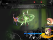
I feel like you have two very distinct looks going on here. The background and the party member portraits/info are very sleek and angular and shiny, while the monsters and the black pattern and the information box are very ornate and cursive and flowery. Both styles look very good, but they clash horribly with each-other, making the graphics, and by extension the game, feel cluttered and lacking in any sort of overall style. Based on the out-of-battle menu and the game description, I assume that the gothic, ornate look is what you actually want, but the scanlines in the menu are very futuristic and thus make it hard to tell.
If you want it ornate, I would add some sort of floral/vine pattern to the character HP/MP bars like you did to the top bars, remove the scanlines from the windows, and possible remove the italics. Also perhaps apply some sort of subtle wood-grain or other textured effect to the character portraits, since they're too nice to toss out but they don't fit at all.
If you want it sleek, I would remove all the floral/vine patterns from both this screen and the menu screen (sorry!), and give that Stay Alive information box the same tan scanlines that your normal windows have. You may also consider using monster graphics that more closely match your character graphics, especially the line work.
If you like both styles, that's fine, so do I. But use them in two different games.

 Add Review
 Subscribe
 Nominate
 Submit Media
 RSS
RSS