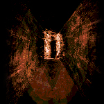
I think that the textures used at the back could use a very little amount of contrast.
As for the text, I find it to need a more defined hierarchy. There is three lines with almost the same size, every one with a different style. Or maybe it's just that the "DEMO" text is floating there, as if it was added at the last moment. Because without it, everything is gorgeous <3.

 Add Review
 Subscribe
 Nominate
 Submit Media
 RSS
RSS
 Elder71