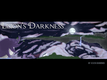
It's not very good art, in my opinion. Or, at least, it's not something I'd post on a commercial project. The lighting on the hair doesn't seem correct. The tools used to make the clouds don't work well, and look really bad when the painted areas overlap, and look kind of bad all the time. The line work needs help, but you'd have to ask someone with more experience in drawing what's wrong with that aspect. At a guess I'd say the lines might be too thin? It looks like a rough sketch, somehow.
Also, from a technical aspect, currently the image is so wide that there's no website you could display it on. That's fine, having different sizes is good. Just, when you make smaller versions, be sure you make the original photoshop/gimp file smaller, rather than shrinking down this image. That will re-render the font at a lower size, which will look much better than just shrinking it.
The landscape is the best-drawn part of it by far, I like it a lot, the structure of it is very eye-catching and intriguing. The colors work extremely well, and I like the overall layout of the piece. The image fits well with the title and would catch my interest if I enjoyed fantastical otherworldly mysteries and phenomena.


 Add Review
 Subscribe
 Nominate
 Submit Media
 RSS
RSS
 SevenDiamonds


