


PIXEL ART TUTORIAL
Everyone can make pixel art.
 Bonehead11
- 12/10/2010 07:57 PM
- 10591 views
Hey all, I was shocked that there isnt any fully fledged pixel art tutorial...sooo here I am, sacrificing mine precious free time, to teach rpg maker people about pushing pixels. Its pretty easy, its just another form of painting and as you know, everyone can paint. I will show you mine tips and tricks I came to trough mine time of working with pixels, procedures etc. etc. I will show you its not mystery, that its really easy.
So hooraaay, the pixel way, Im no expert, but I will try mine best, what worked for me.
Step one: Get some equipment.
You need an bitmap editor, like duh, there are many many many many to choose from. The most known is
Adobe Photoshop, its nice, easy to use, great functions...the list could go on, the best choice for most people. Next I could say is GIMP a powerful, free, bitmap editor, comes with tons of addons and that stuff, if you are really interested in pimpin out your ride. Graphics gale is another great option, its nice, easy to use, but its not free.There is one is very interesting option Grafx2,your oldschool bitmap editor, from pixelartists to pixelartists, its free, awesome stuff. I havent worked with others so I dont know much about others, only that they exist.... I wont be listing all programs, because it has been done ago, go here if you need a list-http://rpgmaker.net/forums/topics/1649/
Of course Grafx2 isnt there so here is the link:
http://www.eclipse-game.com/?dat=7
Step two: "Sketch"
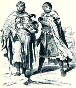
Now that we have program there is nothing to stop you from learning,only gay theories...I prefer practice over theories, because they are good for nothing,ofcourse they are good to know, its nice to talk crap about anything, but when you start working with it, all those theories fall. Set your canvas size on your liking, remember pixel art isnt good for large scales, of course you can go sadistic and change colour of tons little dots, wich will make you totally mad. Of course smaller doesnt mean easier, smaller means less details, wich means every fucking single pixel counts. Now that you thought what you want to do, now for general purpose of this tutorial I made 150x150 pixel canvas, wich is pretty easy. Now you want to realise your thought onto the canvas, doing it from mind is the hardest way, the easiest way is to use a reference, wich is highly advised. I generally dont use references, I use them when Im out of ideas,enough of douchebagery ,for the sake of this tutorial I will use a reference:
http://www.traditioninaction.org/SOD/SODimages/025TeutonicKnights.jpg
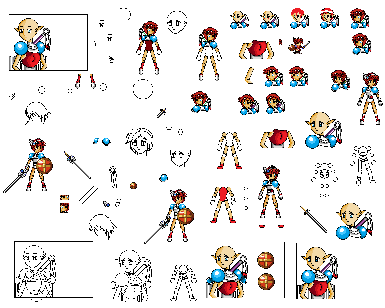
Now that we know how it will look like lets jump on it. Turn music on, or whatever floats your boat, pick the PENCIL TOOL, I cant put more emphasis on this one, choose white background, choose black colour of pencil,zoom in to about 400%, work on more if its too small, i personally work at 800%-600%, start drawing...from now its up to you, what is your drawing technique, there are TONS techniques, choose wich fits you most, or make one yourself...mine technique is made from, making a basic stick model using short quick brushes, next I add basic body parts, additionall important stuff. As you can see on this picture

If this technique doesnt work for you, try a different one, good one is choosing basic colours and by adding colourfull blobs, you define character, thing or whatever you choosed, of course you will need composition and that shit, but we wont be going trough that stuff, because we are just learning basic pixel art, you will ofcourse need basic art smarts, like composition, colour selection etc. etc...so lets get back to pixel art. I cant put more emphasis on this,but you will need to EXPERIMENT on your technique, its different for every person. If it doesnt look good, DONT WORRY OR GET STRESSED, its just start, the picture will change drastically, believe me, many times you will even start from scratch, again and again and again. Of course you can totally skip this step by making a normal sketch and scaning it on your computer.
Step three: Cleaning this shit.
Now we head on to the next step, if you are using your own distinct technique,skip this part, because this is only for mine sketch. Now we add new layer and make the lines clean and fixed, this is pretty long and boring part, but its nice to have clean lines, of course you can too skip it, but later you will have to clean it, so its better to do it at start, then at the end...its just personal taste. Lets do this mine way. Put on a new layer, if you dont have such contraption in your program no worries, you can do it without layer...but it will take a lot longer. Now redraw your "sketch" with clean long lines, like this.

There isnt much to say to this step, its just tedious and boring but when you will have some clean lineart, your heart starts pumping at your succes, so it keeps you motivated, thats why I do it!!!
Step four: Shading-defining shapes.
This is it ,this is when the fun starts, many people skip this EXTREMELY IMPORTANT step, DEFINING SHAPES, ADDING DEPTH , the biggest begginer problem is defining shapes, in almost every tutorial its all lightning and colour theory, but from mine personal experience and tips from I could say "pro"s, the biggest pitfall for all beginners is defining shapes, I cant put it out how much it is important. I saw alot of tutorials and only the good ones point this problem out, so thats why I am here, pointing it out, in this tutorial, at this moment...you need to make your picture look like its 3D. Sure it may have great colours, awesome lineart, but when its flat, it will suck. I am talking about this because it was one of mine major problems. You may know this also as shading. At start you will need 3 colours, one normal colour, one darker version of original,one brighter version of original one. Now choose source of light, the source of light will define shapes trough shading. Remember,think 3D, what is near to you is lighter, what is further is darkerThe lighter tone should be applied to surfaces facing towards the light source,the darker tone should be applied to surfaces facing away from the light source.You will need to adjust line to this accordingly, this just takes practice and practice and alot of imagination.
If you have reference picture its alot easier, if not you must take all your study,experience and imagination into it.

As you can see I somewhat defined basic shapes,its not perfect, but we will gradually work on it as we progress, no lightning, no details...yet, its not refined greatly, because it will undergo change again and again. If you did other techniques this is your product, for now, technique by shaping blobs can get you here too, it can get you here even faster, if you are good...but I prefer it this way.As you can see I stil havent defined shapes that much, it makes me want to skip this part, but remember and learn from mistakes of others dont try to skip it,fight the urge, this step is somewhat integrated when you do lightning, when you are more skilled, it makes the process faster, but for beginners, please DEFINE THOSE SHAPES.
Step five:Shading-Basic shading.
Now we move onto another fun step, full of twists and turns,now we shade it according to your chosen light source, as you can see on this picture.

Again we need to think 3D- Whats closer to the light source is brighter, whats further is darker. Yet again this is all about practice,imagination and logic.When you will make more complex pieces, you will need to know how light reflects, types of materials etc. etc...those things are basic art smarts, Im not teaching them now so I will pretend you know that stuff and move on.Now I will explain why we did step four. By doing basic shading people focus too much on "lightning", that they forget how basic shapes are looking. You can see that picture,that was before, helped us to make the shading correct, now its looking 3D. This is the biggest pitfall for beginner pixel artists, that I observed In mine time being. With skipping part of defining shapes, the picture looks flat, without any depth, unreal shading...of course mine picture isnt perfect, but thanks to step 4, it has its depth and its not flat.
Step six: Shading-Colouring madness!!!
*Insert colourwheel theory*
Oh yes, now we move onto the magical colour wheel!!! Many many many tutorials start smartass talk about colour theory while explaining NOTHING AT ALL . It took me ages until I understood that colour thingy and tons of tutorials, until I found what that stuff is actually about. The basic idea is about primary colours, red ,blue and green, secondary, everything else and complementary colours. Its pretty easy and not so important. Complementary colour is opposite colour, of your chosen colour on the colour wheel. For instance I choose purple colour,opposite colour is yellow, when the purle colour is painted on yellow background, the purple colour will catch your attention, will pop out and vice versa...yes thats it, thats the colour wheel theory. The IMPORTANT aspect of colours is what kind of emotions they evoke in you, for instance red could mean danger,blue calmness etc. etc. the rigt combination is mix of total randomness and what you want to tell about that piece,its pretty hard to balance everything from background to your character....Now we have a generic knight, we have chosen a firm stance we could:
-tell that he is relaxed and calm, so we will make the basic tone more blueish
-tell that he is pretentious and strong, we could make a mix of red, wich looks intimidating, yet cooling it with blue, adding calm peacefull colour, making it pretentious but not over pretentious
-tell that he is firmly standing but is scared, mixing blue and green colour
The list could go on forever, but you get mine basic point...to tell you the truth, when you will be choosing colours, you will be doing it like dancing around fire, choosing and choosing, over and over again, until you find the correct colours, so its pure randomness, EXPERIMENT, dont be afraid to use awkward colours, because ussually they work best, dont be afraid to use big contrast, let yourself go.

Now I will give you some good TIPS I have came trough:
-Keep your colour count low, basically you need only two colours:1 bright,1 darker. Trough dithering, we will explain it later, you can produce 3 colours, but thats only when you are more experienced. At start I advise work with...5 colours max for one colour, you wont need more.
-At beginning you dont need to dither, you will think " Wow dithering, this makes me pro"... WRONG, dithering is a technique good for making the colour count very low,while making colours blend in more,its reserved for final procedures. Amateurish dithering makes pixel art look crap, so I advise not to use it, when starting to use pixelart, ofcourse others may have different thoughts about it so its up to you and many awesome pixelartist dont use dithering, for instance:
http://www.gas13.ru/en_index.php
-If you want to have professinally looking pallete, make shadow purple or blue and highlights, yelowish or redish...you wont screw anything with it and it will increase the quality of your piece rapidly.
-EXPERIMENT EXPERIMENT EXPERIMENT, making palletes is mix of study and total randomness, so experiment with colours.
-Many pieces lack main thing, MATERIAL REFLECTION, allot of pieces suffer from overshininess, it may look good, but if you aim for realistic...tough luck. Look how polished iron reflects light, it has very high contrast and alot of reflections, but lets look at some fabric, its colours have alot lower contrast and almost no reflection. Look how every materials reacts to light and your pieces will look awesome.
Step seven:Too soft for lines.
Now we go to a pretty boring,yet important part...SOFTENING LINES. It just means that our black lineart/outlines, will be "softened" wich means we will make them brighter, this is a perfect opportunity for lineart repairs. Remember where its brighter, brighter lines, darker, darker lines. There is not much to say here, only that sometimes its better to erase lines totally, it will look better.

Now for a little composition trick, wich will make your piece easy to look at. Look at his face, as you can see I added 2 very bright pixels, do you see how it makes you want to look at his head? Now thats all, where you want to catch viewers eye, you make the point most bright, it will automaticly catch his attention. This is mainly used for "painting language", you make the most important parts most bright, the less important parts darker. It is used for "communication", for instance you have a picture of two people fighting with swords, the most bright point will be their angry faces, the second less brighter points would be their swords, it will make it more action like,another point could be a hidden dagger up a sleeve of one combantant, so you will indicate tell the viewer "Oh no, look out, he is dastardly!!!".
Optional-Second light source.
Now we can add that dramatic ZING!!! We are going to choose second light source, wich means more shading....but in the end It will look alot better, or worse depends on how you execute it. This step isnt needed, many artists do it. It looks cooler and you can shape the piece even more. How to do it you ask? Pretty simple, we choose the light source, we choose one brighter and one darker colour, you dont need more than 2 for second lightning,you can use your colour wheel theory...or better yet EXPERIMENT, try different combinations, choose wich one suits best, I choosed red colour, because it gives the intimidating effect and looks cool. Next you do thin lines, the colour should be pretty easy to see, dont be afraid to make it bright. Again you need to think 3D, shade according to light source and shape...its just all about practice and imagination. Remember, second light shouldnt be so dominant as your primary light, it should be less bright and mainly less detailed. This part is pretty easy, yet gives your piece the zing wich needs.

Its pretty hard to see because we are using white background...when we go to finishing steps,mainly background, you will see its beauty.
Step eight-Details,details...
You ask yourself, why the heck we didnt did this earlier? Good question and a good answer. From mine experience, adding details in pixel art means more pixel control, wich means more frustration. We didnt add any small details,because it means LESS WORK and EASIER PIXELING. As forely mentioned, pixelart is cruical on details, because you work on such small scale, that every pixel counts, every details counts. The more details you add, the more it will be hard to look at, will be smudged, wich means ugly. So this is pretty cruical point on how many details you will choose. In pixelart, less means more, dont add details unless they are A MUST, for instance a sword for a knight, compass for a navigator, hidden daggers for assasin...the list could go on. If you want add additional details THINK TWICE before adding. Now that I went trough this, we are adding some details for our knight, wich means we will be giving him insignias, some wrappings and detailing chainmail....these are a must,they give him character, when we will complete it we can add more details like torn cloak, battered shield, more weapons or armor parts...

Fight the urge to add more things,sometimes some little nitpicking may improve it, but any BIG details may ruin it.
Step nine-Finishing touches.
Now we move onto the polishing, the last brushes, the final placement...yes yes we are going to learn to dither, but more importantly AA a.k.a antialiasing.Now we make the final croppings to make the figure proportional, make curves smooth, make those colours blend more WITHOUT adding more colours, we will learn how to recycle colours and other nifty polishing stuff. Now first most, we do the LAST I mean LAST minor change of lineart,if that arm looks too long, that leg shouldnt be short, that line is too wide, DO IT NOW. Now we move onto something important, antialiasing. Antialiasing means smudging curves so that it tricks your eye, that that curve isnt jagged but smooth. Basicaly you just add more bright colours on the curve pixel spaces....its pretty hard to write it down so here are pictures of how it looks:
http://www.natomic.com/hosted/marks/mpat/aa.html
Antialiasing is art of its own, making smooth lineart is pretty hard, so practice practice practice, I myself am not good at it, because its tedious and boring...but this process is a milestone between sucky and awesome, jagged pixelart may be good , but when its jagged it looks like crap, so MAKE IT GOOD. But again it will increase your colour count.
Next is the most famous dithering!!! Yes, yes I know many of you are excited, but to tell you the truth, I personally dont use much dithering, so Im not that good at it. The basic principle of dithering is to replace additional colour with this technique, its just making a chaotic web of dots so you will break the continuity, wich will trick your eye, it will look like there is another colour, that those colours blend, but when you zoom in, you will see the famous dithering.
There are many types of dithering, the most classical is

Here are some advanced dithering techniques

There are even more, but these two are all you need to know. There are even some experimental, I myself experimented with mine own, but it sucked...as I said you dont need to dither, its optional, but if executed properly it can make your piece look better. Remember DONT OVER DO IT, its best to use it with thinking and at some places where the blending sucks. Now we should check if the piece is "pixel perfect". You ask yourself whats pixel perfect? I will answer, pixel perfect is a term, used by pixel artists, that if the pixels of the piece are "perfectly" placed, it means that any other changes arent necessary, thats pixel perfect.

This part is pretty tedious, boring and mind wrecking, you want to end it, but you need to hold on, FINISH IT. When its polished you can proudly say ITS DONE. Cherish this moment, because it wont hold for long. If you think it looks crap, DONT WORRY, it may be your first piece, but the main thing about it is, that you done it, you practiced all stuff, next time it will be better, find your mistakes and learn from them.
Optional -Background
This step really depends on what are you making, if you are making a tileset, game sprite...you dont need it.
If you are making a scene or painting, background is pretty important. For the sake of this tutorial we will give it nice, plain background. Do you remember mine rant about colours ? Now we can use it to our advantage!!! Now again choosing right colour...we can choose colour that can complement that secondary light effect. But we too need to evoke emotion wich we need. Green could evoke mystery, experience, his stamina, but with further dwidling we could add a little yellow so he would look noble,divine or make dark green with a scent of purple or red so he will be evil, cruel yet battle worn...so its up to you, I will choose red with purple, so he will look menacing, mysterious and cruel. Oh looky how it looks.

See how the second light source is now seen? Doesnt he look cruel,dark? You see how those colour evoke emotions, how those combinations make it cold and dark? Remember experiment.
Step twelve- Im with it in your faaaaaaceeee
This is pretty simple, NEVER SAVE IT AS .JPG, because when you save it as jpg, it will ruin your piece totally and I mean TOTALLY. Best choice is .PNG, I only save it at .PNG so I cant tell you about others.
Now that the tutorial is over,our piece is finished...by the way you can use this piece as an enemy in your game or whatever, but put mine big shiny name in credits...I hope you liked this tutorial, because you fucking should, I spent ALOT of time making it, pinpointing major problems, techniques etc...so at last I am going to give you some Tips and Tricks, if I still remember them:
-"Recycling colours" is a technique to lower colour count, it just means you will replace 2 identical colours with 1, it will lower your colours, low colours are e-penis in pixelart, the lower the colour count, the bigger your e-penis is.
-Find your own work speed and techniques, EXPERIMENT EXPERIMENT EXPERIMENT, otherwise you wont progress much.
-Browse trough pieces of other artists, they are inspirational, mainly for techniques.
-Practice
-The golden rule of pixel art: Less is more!!!
-STUDY MATERIAL REFLECTIONS, this will increase quality of your pieces sky high
-STUDY TEXTURES, again quality sky high
-Pixel art is just another type of painting, so dont think you wont need to know basic art shmarts
-Try different styles,there are many types of styles so go there and learn learn learn!!! Like for instance isometric, scenes, characters, portraits,tiles you may think they are all the same...WRONG!!! They are different and it takes time to learn them.
-Never use perfect white or perfect black, they are pretty but you will be "under fire" for it by other artists, I personally dont mind
-When you are at dead point in the process, go read some tutorials or work on another piece
-Dont be upset that your first 100 pieces will be crappy, but when you will do them, you will be rising star!!!
Thats all for now, I may update those tips but thats all. I am warning you, pixelart is mind numbing, eye soring activity. If you would like a tutorial on how to make rpg tiles...contact me and I will find some time...I just hope someone will actually read this.
Closing comments: Happy pixel hunting!!! Kepp your sanity.
So hooraaay, the pixel way, Im no expert, but I will try mine best, what worked for me.
Step one: Get some equipment.
You need an bitmap editor, like duh, there are many many many many to choose from. The most known is
Adobe Photoshop, its nice, easy to use, great functions...the list could go on, the best choice for most people. Next I could say is GIMP a powerful, free, bitmap editor, comes with tons of addons and that stuff, if you are really interested in pimpin out your ride. Graphics gale is another great option, its nice, easy to use, but its not free.There is one is very interesting option Grafx2,your oldschool bitmap editor, from pixelartists to pixelartists, its free, awesome stuff. I havent worked with others so I dont know much about others, only that they exist.... I wont be listing all programs, because it has been done ago, go here if you need a list-http://rpgmaker.net/forums/topics/1649/
Of course Grafx2 isnt there so here is the link:
http://www.eclipse-game.com/?dat=7
Step two: "Sketch"
Now that we have program there is nothing to stop you from learning,only gay theories...I prefer practice over theories, because they are good for nothing,ofcourse they are good to know, its nice to talk crap about anything, but when you start working with it, all those theories fall. Set your canvas size on your liking, remember pixel art isnt good for large scales, of course you can go sadistic and change colour of tons little dots, wich will make you totally mad. Of course smaller doesnt mean easier, smaller means less details, wich means every fucking single pixel counts. Now that you thought what you want to do, now for general purpose of this tutorial I made 150x150 pixel canvas, wich is pretty easy. Now you want to realise your thought onto the canvas, doing it from mind is the hardest way, the easiest way is to use a reference, wich is highly advised. I generally dont use references, I use them when Im out of ideas,enough of douchebagery ,for the sake of this tutorial I will use a reference:
http://www.traditioninaction.org/SOD/SODimages/025TeutonicKnights.jpg
Now that we know how it will look like lets jump on it. Turn music on, or whatever floats your boat, pick the PENCIL TOOL, I cant put more emphasis on this one, choose white background, choose black colour of pencil,zoom in to about 400%, work on more if its too small, i personally work at 800%-600%, start drawing...from now its up to you, what is your drawing technique, there are TONS techniques, choose wich fits you most, or make one yourself...mine technique is made from, making a basic stick model using short quick brushes, next I add basic body parts, additionall important stuff. As you can see on this picture
If this technique doesnt work for you, try a different one, good one is choosing basic colours and by adding colourfull blobs, you define character, thing or whatever you choosed, of course you will need composition and that shit, but we wont be going trough that stuff, because we are just learning basic pixel art, you will ofcourse need basic art smarts, like composition, colour selection etc. etc...so lets get back to pixel art. I cant put more emphasis on this,but you will need to EXPERIMENT on your technique, its different for every person. If it doesnt look good, DONT WORRY OR GET STRESSED, its just start, the picture will change drastically, believe me, many times you will even start from scratch, again and again and again. Of course you can totally skip this step by making a normal sketch and scaning it on your computer.
Step three: Cleaning this shit.
Now we head on to the next step, if you are using your own distinct technique,skip this part, because this is only for mine sketch. Now we add new layer and make the lines clean and fixed, this is pretty long and boring part, but its nice to have clean lines, of course you can too skip it, but later you will have to clean it, so its better to do it at start, then at the end...its just personal taste. Lets do this mine way. Put on a new layer, if you dont have such contraption in your program no worries, you can do it without layer...but it will take a lot longer. Now redraw your "sketch" with clean long lines, like this.
There isnt much to say to this step, its just tedious and boring but when you will have some clean lineart, your heart starts pumping at your succes, so it keeps you motivated, thats why I do it!!!
Step four: Shading-defining shapes.
This is it ,this is when the fun starts, many people skip this EXTREMELY IMPORTANT step, DEFINING SHAPES, ADDING DEPTH , the biggest begginer problem is defining shapes, in almost every tutorial its all lightning and colour theory, but from mine personal experience and tips from I could say "pro"s, the biggest pitfall for all beginners is defining shapes, I cant put it out how much it is important. I saw alot of tutorials and only the good ones point this problem out, so thats why I am here, pointing it out, in this tutorial, at this moment...you need to make your picture look like its 3D. Sure it may have great colours, awesome lineart, but when its flat, it will suck. I am talking about this because it was one of mine major problems. You may know this also as shading. At start you will need 3 colours, one normal colour, one darker version of original,one brighter version of original one. Now choose source of light, the source of light will define shapes trough shading. Remember,think 3D, what is near to you is lighter, what is further is darkerThe lighter tone should be applied to surfaces facing towards the light source,the darker tone should be applied to surfaces facing away from the light source.You will need to adjust line to this accordingly, this just takes practice and practice and alot of imagination.
If you have reference picture its alot easier, if not you must take all your study,experience and imagination into it.
As you can see I somewhat defined basic shapes,its not perfect, but we will gradually work on it as we progress, no lightning, no details...yet, its not refined greatly, because it will undergo change again and again. If you did other techniques this is your product, for now, technique by shaping blobs can get you here too, it can get you here even faster, if you are good...but I prefer it this way.As you can see I stil havent defined shapes that much, it makes me want to skip this part, but remember and learn from mistakes of others dont try to skip it,fight the urge, this step is somewhat integrated when you do lightning, when you are more skilled, it makes the process faster, but for beginners, please DEFINE THOSE SHAPES.
Step five:Shading-Basic shading.
Now we move onto another fun step, full of twists and turns,now we shade it according to your chosen light source, as you can see on this picture.
Again we need to think 3D- Whats closer to the light source is brighter, whats further is darker. Yet again this is all about practice,imagination and logic.When you will make more complex pieces, you will need to know how light reflects, types of materials etc. etc...those things are basic art smarts, Im not teaching them now so I will pretend you know that stuff and move on.Now I will explain why we did step four. By doing basic shading people focus too much on "lightning", that they forget how basic shapes are looking. You can see that picture,that was before, helped us to make the shading correct, now its looking 3D. This is the biggest pitfall for beginner pixel artists, that I observed In mine time being. With skipping part of defining shapes, the picture looks flat, without any depth, unreal shading...of course mine picture isnt perfect, but thanks to step 4, it has its depth and its not flat.
Step six: Shading-Colouring madness!!!
*Insert colourwheel theory*
Oh yes, now we move onto the magical colour wheel!!! Many many many tutorials start smartass talk about colour theory while explaining NOTHING AT ALL . It took me ages until I understood that colour thingy and tons of tutorials, until I found what that stuff is actually about. The basic idea is about primary colours, red ,blue and green, secondary, everything else and complementary colours. Its pretty easy and not so important. Complementary colour is opposite colour, of your chosen colour on the colour wheel. For instance I choose purple colour,opposite colour is yellow, when the purle colour is painted on yellow background, the purple colour will catch your attention, will pop out and vice versa...yes thats it, thats the colour wheel theory. The IMPORTANT aspect of colours is what kind of emotions they evoke in you, for instance red could mean danger,blue calmness etc. etc. the rigt combination is mix of total randomness and what you want to tell about that piece,its pretty hard to balance everything from background to your character....Now we have a generic knight, we have chosen a firm stance we could:
-tell that he is relaxed and calm, so we will make the basic tone more blueish
-tell that he is pretentious and strong, we could make a mix of red, wich looks intimidating, yet cooling it with blue, adding calm peacefull colour, making it pretentious but not over pretentious
-tell that he is firmly standing but is scared, mixing blue and green colour
The list could go on forever, but you get mine basic point...to tell you the truth, when you will be choosing colours, you will be doing it like dancing around fire, choosing and choosing, over and over again, until you find the correct colours, so its pure randomness, EXPERIMENT, dont be afraid to use awkward colours, because ussually they work best, dont be afraid to use big contrast, let yourself go.
Now I will give you some good TIPS I have came trough:
-Keep your colour count low, basically you need only two colours:1 bright,1 darker. Trough dithering, we will explain it later, you can produce 3 colours, but thats only when you are more experienced. At start I advise work with...5 colours max for one colour, you wont need more.
-At beginning you dont need to dither, you will think " Wow dithering, this makes me pro"... WRONG, dithering is a technique good for making the colour count very low,while making colours blend in more,its reserved for final procedures. Amateurish dithering makes pixel art look crap, so I advise not to use it, when starting to use pixelart, ofcourse others may have different thoughts about it so its up to you and many awesome pixelartist dont use dithering, for instance:
http://www.gas13.ru/en_index.php
-If you want to have professinally looking pallete, make shadow purple or blue and highlights, yelowish or redish...you wont screw anything with it and it will increase the quality of your piece rapidly.
-EXPERIMENT EXPERIMENT EXPERIMENT, making palletes is mix of study and total randomness, so experiment with colours.
-Many pieces lack main thing, MATERIAL REFLECTION, allot of pieces suffer from overshininess, it may look good, but if you aim for realistic...tough luck. Look how polished iron reflects light, it has very high contrast and alot of reflections, but lets look at some fabric, its colours have alot lower contrast and almost no reflection. Look how every materials reacts to light and your pieces will look awesome.
Step seven:Too soft for lines.
Now we go to a pretty boring,yet important part...SOFTENING LINES. It just means that our black lineart/outlines, will be "softened" wich means we will make them brighter, this is a perfect opportunity for lineart repairs. Remember where its brighter, brighter lines, darker, darker lines. There is not much to say here, only that sometimes its better to erase lines totally, it will look better.
Now for a little composition trick, wich will make your piece easy to look at. Look at his face, as you can see I added 2 very bright pixels, do you see how it makes you want to look at his head? Now thats all, where you want to catch viewers eye, you make the point most bright, it will automaticly catch his attention. This is mainly used for "painting language", you make the most important parts most bright, the less important parts darker. It is used for "communication", for instance you have a picture of two people fighting with swords, the most bright point will be their angry faces, the second less brighter points would be their swords, it will make it more action like,another point could be a hidden dagger up a sleeve of one combantant, so you will indicate tell the viewer "Oh no, look out, he is dastardly!!!".
Optional-Second light source.
Now we can add that dramatic ZING!!! We are going to choose second light source, wich means more shading....but in the end It will look alot better, or worse depends on how you execute it. This step isnt needed, many artists do it. It looks cooler and you can shape the piece even more. How to do it you ask? Pretty simple, we choose the light source, we choose one brighter and one darker colour, you dont need more than 2 for second lightning,you can use your colour wheel theory...or better yet EXPERIMENT, try different combinations, choose wich one suits best, I choosed red colour, because it gives the intimidating effect and looks cool. Next you do thin lines, the colour should be pretty easy to see, dont be afraid to make it bright. Again you need to think 3D, shade according to light source and shape...its just all about practice and imagination. Remember, second light shouldnt be so dominant as your primary light, it should be less bright and mainly less detailed. This part is pretty easy, yet gives your piece the zing wich needs.
Its pretty hard to see because we are using white background...when we go to finishing steps,mainly background, you will see its beauty.
Step eight-Details,details...
You ask yourself, why the heck we didnt did this earlier? Good question and a good answer. From mine experience, adding details in pixel art means more pixel control, wich means more frustration. We didnt add any small details,because it means LESS WORK and EASIER PIXELING. As forely mentioned, pixelart is cruical on details, because you work on such small scale, that every pixel counts, every details counts. The more details you add, the more it will be hard to look at, will be smudged, wich means ugly. So this is pretty cruical point on how many details you will choose. In pixelart, less means more, dont add details unless they are A MUST, for instance a sword for a knight, compass for a navigator, hidden daggers for assasin...the list could go on. If you want add additional details THINK TWICE before adding. Now that I went trough this, we are adding some details for our knight, wich means we will be giving him insignias, some wrappings and detailing chainmail....these are a must,they give him character, when we will complete it we can add more details like torn cloak, battered shield, more weapons or armor parts...
Fight the urge to add more things,sometimes some little nitpicking may improve it, but any BIG details may ruin it.
Step nine-Finishing touches.
Now we move onto the polishing, the last brushes, the final placement...yes yes we are going to learn to dither, but more importantly AA a.k.a antialiasing.Now we make the final croppings to make the figure proportional, make curves smooth, make those colours blend more WITHOUT adding more colours, we will learn how to recycle colours and other nifty polishing stuff. Now first most, we do the LAST I mean LAST minor change of lineart,if that arm looks too long, that leg shouldnt be short, that line is too wide, DO IT NOW. Now we move onto something important, antialiasing. Antialiasing means smudging curves so that it tricks your eye, that that curve isnt jagged but smooth. Basicaly you just add more bright colours on the curve pixel spaces....its pretty hard to write it down so here are pictures of how it looks:
http://www.natomic.com/hosted/marks/mpat/aa.html
Antialiasing is art of its own, making smooth lineart is pretty hard, so practice practice practice, I myself am not good at it, because its tedious and boring...but this process is a milestone between sucky and awesome, jagged pixelart may be good , but when its jagged it looks like crap, so MAKE IT GOOD. But again it will increase your colour count.
Next is the most famous dithering!!! Yes, yes I know many of you are excited, but to tell you the truth, I personally dont use much dithering, so Im not that good at it. The basic principle of dithering is to replace additional colour with this technique, its just making a chaotic web of dots so you will break the continuity, wich will trick your eye, it will look like there is another colour, that those colours blend, but when you zoom in, you will see the famous dithering.
There are many types of dithering, the most classical is
Here are some advanced dithering techniques
There are even more, but these two are all you need to know. There are even some experimental, I myself experimented with mine own, but it sucked...as I said you dont need to dither, its optional, but if executed properly it can make your piece look better. Remember DONT OVER DO IT, its best to use it with thinking and at some places where the blending sucks. Now we should check if the piece is "pixel perfect". You ask yourself whats pixel perfect? I will answer, pixel perfect is a term, used by pixel artists, that if the pixels of the piece are "perfectly" placed, it means that any other changes arent necessary, thats pixel perfect.
This part is pretty tedious, boring and mind wrecking, you want to end it, but you need to hold on, FINISH IT. When its polished you can proudly say ITS DONE. Cherish this moment, because it wont hold for long. If you think it looks crap, DONT WORRY, it may be your first piece, but the main thing about it is, that you done it, you practiced all stuff, next time it will be better, find your mistakes and learn from them.
Optional -Background
This step really depends on what are you making, if you are making a tileset, game sprite...you dont need it.
If you are making a scene or painting, background is pretty important. For the sake of this tutorial we will give it nice, plain background. Do you remember mine rant about colours ? Now we can use it to our advantage!!! Now again choosing right colour...we can choose colour that can complement that secondary light effect. But we too need to evoke emotion wich we need. Green could evoke mystery, experience, his stamina, but with further dwidling we could add a little yellow so he would look noble,divine or make dark green with a scent of purple or red so he will be evil, cruel yet battle worn...so its up to you, I will choose red with purple, so he will look menacing, mysterious and cruel. Oh looky how it looks.
See how the second light source is now seen? Doesnt he look cruel,dark? You see how those colour evoke emotions, how those combinations make it cold and dark? Remember experiment.
Step twelve- Im with it in your faaaaaaceeee
This is pretty simple, NEVER SAVE IT AS .JPG, because when you save it as jpg, it will ruin your piece totally and I mean TOTALLY. Best choice is .PNG, I only save it at .PNG so I cant tell you about others.
Now that the tutorial is over,our piece is finished...by the way you can use this piece as an enemy in your game or whatever, but put mine big shiny name in credits...I hope you liked this tutorial, because you fucking should, I spent ALOT of time making it, pinpointing major problems, techniques etc...so at last I am going to give you some Tips and Tricks, if I still remember them:
-"Recycling colours" is a technique to lower colour count, it just means you will replace 2 identical colours with 1, it will lower your colours, low colours are e-penis in pixelart, the lower the colour count, the bigger your e-penis is.
-Find your own work speed and techniques, EXPERIMENT EXPERIMENT EXPERIMENT, otherwise you wont progress much.
-Browse trough pieces of other artists, they are inspirational, mainly for techniques.
-Practice
-The golden rule of pixel art: Less is more!!!
-STUDY MATERIAL REFLECTIONS, this will increase quality of your pieces sky high
-STUDY TEXTURES, again quality sky high
-Pixel art is just another type of painting, so dont think you wont need to know basic art shmarts
-Try different styles,there are many types of styles so go there and learn learn learn!!! Like for instance isometric, scenes, characters, portraits,tiles you may think they are all the same...WRONG!!! They are different and it takes time to learn them.
-Never use perfect white or perfect black, they are pretty but you will be "under fire" for it by other artists, I personally dont mind
-When you are at dead point in the process, go read some tutorials or work on another piece
-Dont be upset that your first 100 pieces will be crappy, but when you will do them, you will be rising star!!!
Thats all for now, I may update those tips but thats all. I am warning you, pixelart is mind numbing, eye soring activity. If you would like a tutorial on how to make rpg tiles...contact me and I will find some time...I just hope someone will actually read this.
Closing comments: Happy pixel hunting!!! Kepp your sanity.
Posts 

Pages:
1
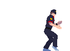
I am actually starting to learn how to do this. Check this out. I am still a beginner with this, but I like it so far.
author=Pokemaniac
Uggh. This is really messily written, and while you know what you're doing(that is a very nice sprite), you're really not communicating it well at all. This needs better formatting, spelling and grammar, for one. Also, you don't really explain what you mean on a lot of points and only half-explain things. Your explanation of dithering, for instance, is just confusing(and yes I do know what dithering is). You sort of leave everything too ambiguous, which is nice as it gives room for people to work for themselves, but this is a tutorial and the point of a tutorial is to guide someone through a process so they can do it for themselves later. As this seems to be a beginner's tutorial, you really need to make sure there are no prerequisites for following the tutorial, and all the basic rules are laid out and not ignored/alluded to vaguely. For instance, at no point do you explain line theory.
As I said though, I don't doubt that you can sprite, but you need to work on your writing.
Yeah I know, mine writing skills are near to zero, I have the same problem in mine native language too, everything I write, is chaotic and hard to read...so there. I wrote it as fast as I could, because I didnt had much time to work on this tutorial and that "sprite". Well lineart theory is just few stuff, but still I forgot about it...I had the option to write nothing about dithering, because for me its self-explenatory. I wrote this tutorial with the idea of pure pixel art tutorial with few art tips, because pixel art is just another style of painting,its like digital painting,oil painting, its not totally new art type, you will need to know your basic art and painting study,I even wrote it in the tutorial. If I would pinpoint every single thing about art....the tutorial would be, very very very long. Also the truth is,I even put too much emphasis on it, you need to experiment, tutorial wont make you god, its just a hint to show you how its done, but YOU must do it yourself,but yeah it is too ambiguous...I dont know if I should keep updating it or delete it, because if no one has shown interest, then it wont be worth the time. If people will show more interest, I could think about making another pixel related tutorials.
Uggh. This is really messily written, and while you know what you're doing(that is a very nice sprite), you're really not communicating it well at all. This needs better formatting, spelling and grammar, for one. Also, you don't really explain what you mean on a lot of points and only half-explain things. Your explanation of dithering, for instance, is just confusing(and yes I do know what dithering is). You sort of leave everything too ambiguous, which is nice as it gives room for people to work for themselves, but this is a tutorial and the point of a tutorial is to guide someone through a process so they can do it for themselves later. As this seems to be a beginner's tutorial, you really need to make sure there are no prerequisites for following the tutorial, and all the basic rules are laid out and not ignored/alluded to vaguely. For instance, at no point do you explain line theory.
As I said though, I don't doubt that you can sprite, but you need to work on your writing.
As I said though, I don't doubt that you can sprite, but you need to work on your writing.
Pages:
1

