


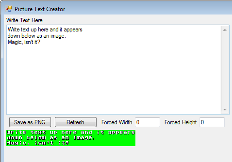
PICTURE TEXT CREATOR
Easily convert text into images for use in games
 hedge1
- 08/06/2017 11:07 PM
- 26174 views
2017 UPDATE:
- New Full Preview option (double click the normal preview to see).
- Toggle Anti-Alias on system fonts.
- Some minor responsiveness improvements.
RELEASE SOMETHING UPDATE:
- Exporting images with more than 256 colors.
- Saving text for use later.
- Saving text groupings to make things like font changes easier.
- Export all text from a grouping at once rather than one at a time.
- Drag-drop in image files to create a background.
This is designed to work well with Cherry's PicPointerPatch (http://cherrytree.at/cms/download/?did=19).
This program is entirely free to use and distribute. Just don't claim it as your own. Thanks!
Description:
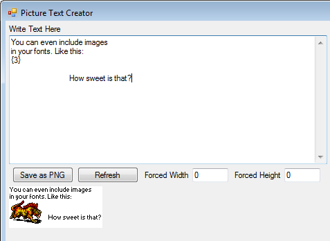
Use any standard installed font on your computer or one of your own making, type in a text box, and save as a 256-color picture for your game. No more copying from paint or manually arranging letters.
Instructions, along with a sample font (Small Font from windows, converted into the appropriate format), are included.
Known limitations:
Can only use the .TTF extension for system fonts. The .FON extensions, which include the standard rm2k(3) fonts, don't work. You'll need to convert .FON fonts into the custom pixel font format (which is any regular image, like PNG or BMP).
If you have more than 256 colors, make sure you uncheck the "256-color" option.
- New Full Preview option (double click the normal preview to see).
- Toggle Anti-Alias on system fonts.
- Some minor responsiveness improvements.
RELEASE SOMETHING UPDATE:
- Exporting images with more than 256 colors.
- Saving text for use later.
- Saving text groupings to make things like font changes easier.
- Export all text from a grouping at once rather than one at a time.
- Drag-drop in image files to create a background.
This is designed to work well with Cherry's PicPointerPatch (http://cherrytree.at/cms/download/?did=19).
This program is entirely free to use and distribute. Just don't claim it as your own. Thanks!
Description:
Use any standard installed font on your computer or one of your own making, type in a text box, and save as a 256-color picture for your game. No more copying from paint or manually arranging letters.
Instructions, along with a sample font (Small Font from windows, converted into the appropriate format), are included.
Known limitations:
Can only use the .TTF extension for system fonts. The .FON extensions, which include the standard rm2k(3) fonts, don't work. You'll need to convert .FON fonts into the custom pixel font format (which is any regular image, like PNG or BMP).
If you have more than 256 colors, make sure you uncheck the "256-color" option.
Details
- 49.3 KB
- 320
- 03/08/2024 04:54 PM
Actions
Posts 

author=Ljink
Wow that was fast!, this is exactly what I needed!
I'm not usually that fast. You just caught me on a good day. :)
author=hedge1
Ljink: I updated the program to do what I think you need for your project. Just double click the live update to see a bigger version.
Also, if you found the program useful, spread the word! RMN isn't very friendly for getting utilities known, so most people don't know this exists.
Wow that was fast!, this is exactly what I needed! Thanks! I will definitely try to spread the word about this program. I think the issue is that most developers just use stock fonts/message systems so they don't feel the need to use something like this but this program, for me, has allowed this game to feel unlike any other 2k3 game. It takes some work to make use of custom messages, text, etc. especially in 2k3 so most avoid it.
But don't get discouraged, this is a very well done piece of software and does exactly what it's supposed to do. I think if this had come out back in the hey day of 2k, 2k3 and XP it'd be much more widely known. You're also in the credits as special thanks for your program so hopefully more people see it through the credits sequence.
Again, you just don't know how much time this thing saved on Dragon Quest +, thank you much!
Ljink: I updated the program to do what I think you need for your project. Just double click the live update to see a bigger version.
Also, if you found the program useful, spread the word! RMN isn't very friendly for getting utilities known, so most people don't know this exists.
Also, if you found the program useful, spread the word! RMN isn't very friendly for getting utilities known, so most people don't know this exists.
Yo Hedge, I have a question for you. I'm currently making a staff roll image and your program has literally saved so much time on my project, however the staff roll image is going to be very, very long. The issue is when I get past a certain point in adding in the text, it's too long for the program to show via the live update in the I guess you would call, "view port". Is there any way to improve upon this like maybe adding a scroll bar for images that are extraordinarily long or am I just out of luck? It's no biggie if there's no remedy but I'd appreciate it if there was.
Again, I can't thank you enough for making this:)
Again, I can't thank you enough for making this:)
I've finally gotten around to researching this more, and found that there's no way to eliminate that extra pixel of space with the font renderer I'm using. As mentioned, when using anti-aliasing it spaces out correctly. So this is only a problem when using fonts that aren't anti-aliased, and only if exact consistent spacing is important (such as it was for Irog).
author=hedge1
Of course it might just be easier to shift everything over one pixel from your original images.
Indeed, I prefer this easy solution.
author=hedge1
I am sorry that this didn't work out for you.
Don't worry I have to modify the image only when I need a new font, not for every item description or dialogue.
I don't have a formal solution, but I did learn a few things.
The extra gap between the 0 and A doesn't occur again for 26 letters. This means you can put 10 spaces in the front, make your picture, and then crop it if needed. Of course it might just be easier to shift everything over one pixel from your original images.
The gap appears (in different places) with other fixed width fonts. However, with all such fonts no gaps appear when "anti-alias" is enabled. Just looking at things it seems like the gap is Windows trying to ensure the width of the anti-alias and non-anti-alias options remain identical. That said, I can't think of a reason why an adjustment would be needed in the first place.
I'm going to be out of the country for a couple of weeks without access to my computer, so if there is a solution, it'll be a while longer before I find it.
I am sorry that this didn't work out for you.
I'm not sure what's going on (I'm just tapping into Window's font renderer) but I'll look into it. I was confused what you were saying at first because I thought you meant there were errant pixels or things covering the letters or something, not that things were out of alignment.
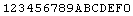
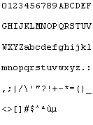
Yes, and this extra pixel of white space is always between the 10th and 11th character. On the first line of the PNG file in my previous post, the extra wide is between "9" and "A".
If the input is
the output becomes this, and the extra wide is now between "A" and "B".
If the input is
123456789ABCDEF0
So you're just saying that it's adding extra space at that point and making the column widths not uniform, correct?
author=hedge1
Are you seeing the white pixels all the way from top to bottom of the column?
Yes
author=hedge1
What foreground and background colors are you using?
In the lower right section, I've set "Font Color" to black and "Back Color" to white.
author=hedge1
And do you see the pixels before you "Save as PNG" or afterward?
Both before and after.
Here is the PNG output. When I take a print-screen of the application, the content of the PNG perfectly matches the section below "Save as PNG".
Are you seeing the white pixels all the way from top to bottom of the column? What foreground and background colors are you using? And do you see the pixels before you "Save as PNG" or afterward?
Thank you hedge1 for this great tool. It will come handy to quickly test fonts in my projects. A few days ago, I spent quite some time in Paint to built a PNG charter table. Your tool makes this process much faster. But I noticed it introduces a column of white pixels between characters of column 10 and 11 when I use the following text input
and system font: Courier New, regular, 10pt
0123456789ABCDEF

GHIJKLMNOPQRSTUV

WXYZabcdefghijkl

mnopqrstuvwxyz.:

,;|/\'"?!+-*=()_

<>[]#$^²ùµ
and system font: Courier New, regular, 10pt
Thanks! I'm glad it's working out for you! Note that while this page has been stale I've made some minor updates to the program itself (bug fixes, and better system font integration). So if you don't have version 2.5, it might be worth another download.
I just want to really thank hedge1 for this program. I have finished all image text for Dragon Quest +, which is a ton, for the menu systems in the matter of hours. Before this I copied and pasted text from a dummy file into the new text image and it took forever. This, in addition to Dreamaker, will also help immensely for the French translation of the game! I'll make the Dragon Quest III SNES font available in the near future for others to use.
I've created a font for this that emulates the default RM2K text style exactly. If anyone is interested, pm me and I'll send it your way.
-flap
-flap
Floating images. I said you could fit 3 to 4 lines easy. The next lines would begin at the top right side of the image and continue down. The indent would return to normal if the next line clears the floating image.
Although monospaced fonts are cool for retro gaming cred, they actually really hurt to read. You generally don't want to use them.
Although monospaced fonts are cool for retro gaming cred, they actually really hurt to read. You generally don't want to use them.
Definitely NOT limited to monospace, as the sample font included with the download demonstrates. The length of the lines on top of each letter is what determines the width of each character. The height is fixed for all characters and is determined by the distance between the top-left most line and the line immediately below it (specifically, it's the first non-background-colored pixel on the top-left and then the first similarly colored pixel found by going straight down; the background color is determined by the lower-right-most pixel in the original image). I chose to make it not automatically determine width because I wanted to allow for monospaced fonts, which would require extra space for letters like the lower case i or l.
I'm not quite sure what you're talking about with your second comment. If you mean that the program doesn't shift text over after using a picture, it actually does, but only on the first line. Afterward, you'll need to manually indent things yourself. That isn't optimal, but then again I'm mostly making this as a method to easy convert font sets from old video games into images (primarily for rm2k/3), not an actual layout program.
If you're talking about transparency and layering of images/text, all of the text is printed with the background color transparent, which means you can layer text on text (or, if you so choose, text on pictures you include with the font). You can actually drag/drop images into the background of the picture too, if you want. I plan to make a video today highlighting the features so people know what it can do.
Thanks for the information about the 32-bit error. I may look at my compiler options to see if I can fix that. I've been a hobbyist programmer forever, but this is the first time I've actually publicly release any code, so it is a bit of a learning experience. I coded everything in VB.net.
EDIT: I should also thank you for your interest. I built this for myself, but I figured it could be useful for the community as a whole. I'm also working on making some updates today to clean up the interface and what-not. I noticed RS!D a bit late and pretty much just threw out what I had sitting on my hard drive. So hopefully by day's end it'll be a bit better.
I use Windows Xp 32bits SP3 and it says when I run the exe "This isn't a win32 application"
I assume this is just some C/C++ application. This would mean hedge1's compiler is too new. I purposefully use Visual Studio Professional 2010 (all the Visual Studios I've used default to WIN32) since I've confirmed binaries made on that run on Windows XP.
Also
Is it limited to monospace? It can't automatically determine variable width characters for easier read text? And for the image, it can't float the image so you can have multiple lines of text automatically indented over the image (looks like 3 or 4 might fit)?
I'll share my font after I make my game a bit more. Might be awhile though.
What really helps about this program is that it automatically imports your pictures. No more errors with the bit depth and bitmap size when importing. I've used it just to make RM2K accept the pictures I've tried to import.
Thank you so much for sharing! My project was on hiatus because of the annoying import feature, and now I'm way into it again.
-flap

