


RPG MAKER TITLE SCREENS:
Posts

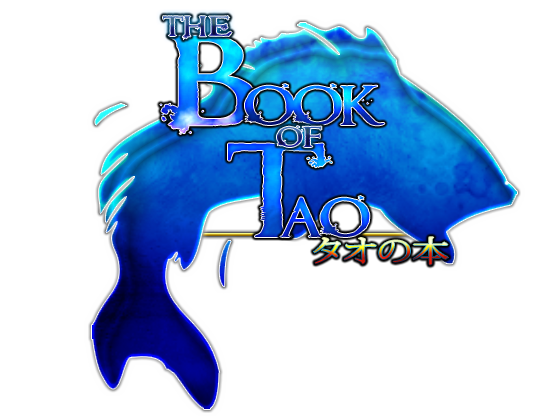
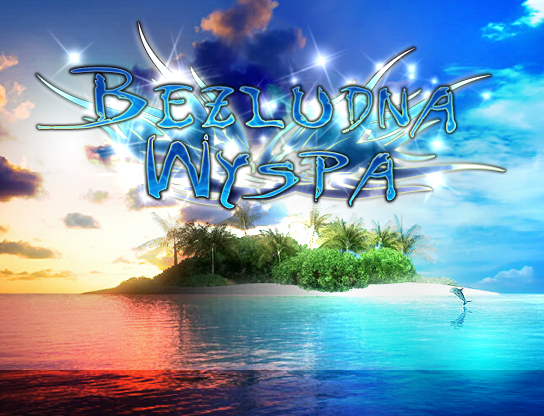
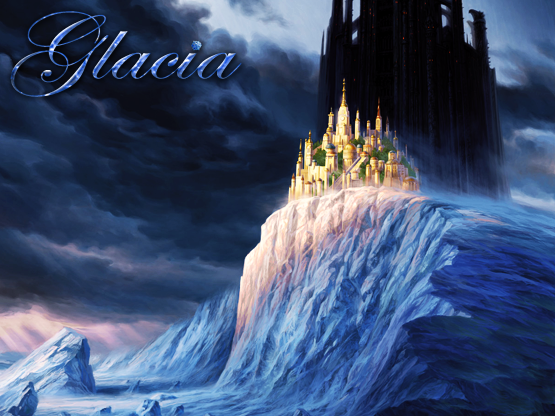
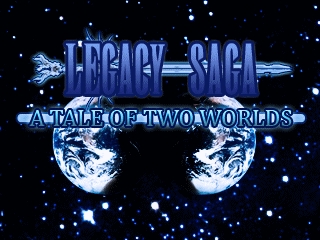
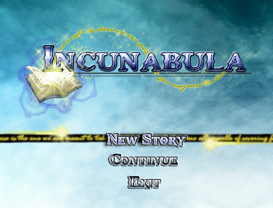
So, I've started collecting title screens from RMN games that catch my eye. I began noticing that many titles follow a similar trend, that I think started with VX but also trickled its way into a few RM2K3 games. They are generally very blue. More importantly, they have a blue oceany or cloudy pattern that fills the font and often have a glowy quality. My collection is only beginning but I anticipate it will grow steadily. Feel free to share title screens that have a similar vibe.


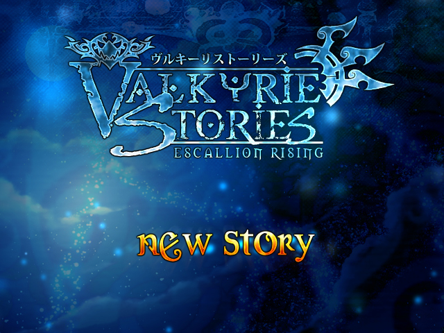


It's an easy way to get views for an otherwise shitty game. Valkyrie Stories is nothing but flash, for example.
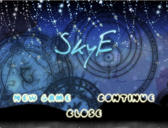
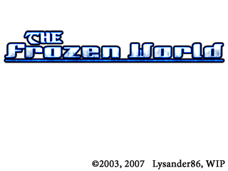
The only game on that list I could possibly recommend at all is SkyE, although I am not familiar with 2 or 3 of them. The Frozen World would be cool if the remake ever actually got out of limbo, but as-is it's a nifty but ultimately ancient Lys 2k game.
The only game on that list I could possibly recommend at all is SkyE, although I am not familiar with 2 or 3 of them. The Frozen World would be cool if the remake ever actually got out of limbo, but as-is it's a nifty but ultimately ancient Lys 2k game.

@Craze: I guess you can say that for VS, but I wouldn't use that generalization. Hero I despite its absurd title screen will ultimately end up being a good game especially since DHM is directing Sted.
Havent looked at the others but I think both Catharsis and Star Stealing Prince are two other note worthy TSs.
Havent looked at the others but I think both Catharsis and Star Stealing Prince are two other note worthy TSs.
Blue is an easy, inviting color.
It also might be because sky and/or water are in most title screens, and they happen to both be blue.
It also might be because sky and/or water are in most title screens, and they happen to both be blue.

Indeed. Blue is a very good color to read against too. And that's what title screens should be all about: readability. You're 'selling' your game through them, so it's important that the message is delivered clearly and effectively... Those cloudy/watery effects inside of letters often work against those concepts. In fact, all those ornaments, and silhouettes, and japanese lettering, are most often than not just unnecessary clutter. Why do people like so much that kind of stuff is beyond me.

Blue, you're a perfectly fine color and I can respect that.
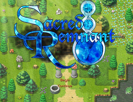
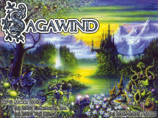
But god damn. I would love to see some color diversity! Get some gold or something in there. The designs for a lot of these just kinda blend together. At least Sacred Remnant has the courtesy to be on a non-blue background. Sagawind too I suppose, but what can I say! Never been a fan of the overly fancy swirl-filled fonts.
I recognize a couple of those as being made by rgangsta on VX.net. Dude does some awesome stuff, but seems to default to blue unless the request-ee otherwise specifies!

This is extra neat. I mean yeah, BLUE BLUE BLUE, but at least it's got variety to the blue!

I guess this meets the trend criteria too, but pushes waaay too far into gaudy territory for my tastes.

I know Archeia made this; dunno whether or not it ended up used, but I quite like it and it has all the blue(okay in the background BUT STILL THERE) and the sky without looking garish!
What mystifies me are people still using the Japanese subtitles. I mean at least VS was made by someone actually Japanese, though the entire game is in English...? Dunno where that sentence is going but okay
But god damn. I would love to see some color diversity! Get some gold or something in there. The designs for a lot of these just kinda blend together. At least Sacred Remnant has the courtesy to be on a non-blue background. Sagawind too I suppose, but what can I say! Never been a fan of the overly fancy swirl-filled fonts.
I recognize a couple of those as being made by rgangsta on VX.net. Dude does some awesome stuff, but seems to default to blue unless the request-ee otherwise specifies!
This is extra neat. I mean yeah, BLUE BLUE BLUE, but at least it's got variety to the blue!
I guess this meets the trend criteria too, but pushes waaay too far into gaudy territory for my tastes.
I know Archeia made this; dunno whether or not it ended up used, but I quite like it and it has all the blue(okay in the background BUT STILL THERE) and the sky without looking garish!
What mystifies me are people still using the Japanese subtitles. I mean at least VS was made by someone actually Japanese, though the entire game is in English...? Dunno where that sentence is going but okay
Those fit the bill completely--especially the top two. Maybe it's rgangsta that started the trend.
author=OctagonBuddyThe katakana trend seems to've diminished in the last couple of years. It still lingers a bit, though.
What mystifies me are people still using the Japanese subtitles. I mean at least VS was made by someone actually Japanese, though the entire game is in English...? Dunno where that sentence is going but okay

That Symphony of Vengeance logo is fucking beautiful. But in all honesty the title screen that left the best impact on me from Rpg Maker games would be the A Blurred Line.
Ashley_Lacure
Havent looked at the others but I think both Catharsis and Star Stealing Prince are two other note worthy TSs.
I adore Catharsis and its logo.
author=CrazeAshley_LacureI adore Catharsis and its logo.
Havent looked at the others but I think both Catharsis and Star Stealing Prince are two other note worthy TSs.
Pretty much everything about Catharsis' visuals are amazing.

author=JudeNever got the appeal in the first place! I like to think someday the trend will finally kick the bucket, but probably not. If people ever ask me for them in requests, they will probably get something along the lines "Tales of the Dump Demon: Stranded in Forest of Lost Toilet Paper". And it wouldn't make much difference!
Those fit the bill completely--especially the top two. Maybe it's rgangsta that started the trend.author=OctoBuddyThe katakana trend seems to've diminished in the last couple of years. It still lingers a bit, though.
What mystifies me are people still using the Japanese subtitles. I mean at least VS was made by someone actually Japanese, though the entire game is in English...? Dunno where that sentence is going but okay
author=tpasmallCatharsis' general interface/design visuals make me happy in my graphic design pants.author=CrazePretty much everything about Catharsis' visuals are amazing.Ashley_LacureI adore Catharsis and its logo.
Havent looked at the others but I think both Catharsis and Star Stealing Prince are two other note worthy TSs.
I guess to tangent into personal things I like, I am really quite a fan of contrast and color diversity. But I get all weird about what I think makes a good title screen, despite ultimately not caring beyond "OKAY TIME TO JAM ON THE NEW GAME BUTTON!" Along with Catharsis and SSP, I really like the titles of Avarice and Necropolis, along with Mirror's logo but that doesn't have a title yet so who knows what I will think of it! I am irrationally fond of this. I love that guy's face.
Edit: Ah-hahahahaha oh wow even I followed the trend a long time ago

Thogh I guess the sky background was because I couldn't be arsed to change the default one Hanzo used in the script. TRULY, THE SIGN OF AN ORIGINAL AND UNIQUE PROJECT.

LockeZ

I'd really like to get rid of LockeZ. His play style is way too unpredictable. He's always like this too. If he ran a country, he'd just kill and imprison people at random until crime stopped.
5958
I was gonna link to the title screens of all of Ocean's games but they don't actually have the title screens on the respective game pages and I'm too lazy to do the leg work.
Blue is a good color for lighthearted, friendly fantasy games.
Blue is a good color for lighthearted, friendly fantasy games.


Here's a few of my blueish title screens that I'm proud to show off. They may not look as flashy as some of the other ones, like "Skye," etc., but the title screen really doesn't make a whole game. Still, it helps to have something to draw people into your game.
I guess if I wasn't still using 2k3, or -- actually -- spend more time on my logos, I could probably pull off something more "creative," but meh.
author=kentona
...expand your colour gamut...
No. I am looking for a specific style, as referenced in my opening post.


