SCREENSHOT SURVIVAL 20XX
Posts

author=Momeka

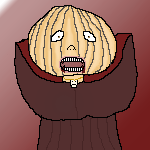
The avatar has a shadow but the monster doesn't. Intended?

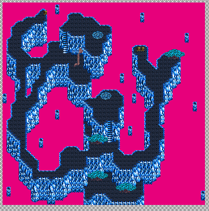
Last map I'll be posting for a good while until I finish these final floors. I said I wouldn't post them, but thought I'd at least post this one just to show WHY I'm not posting the others. Anyone that's seen my Dimensional Rifts will know this is pretty much the exact same as those. Nothing really special, no special gimmicks or anything like that. Just straightforward dungeon with strong enemies, and a boss every other map (because this dungeon has a loooot of bosses, even with half of them cut out!). This leaves about 8-9 more maps to go, with this monotonous mapping. Zzzz...

author=LouisCyphre
The avatar has a shadow but the monster doesn't. Intended?
Nope, not intentional, I had just completely missed that.
author=FroggeI am try to improve me pixel art
Am bad

I like it, specially that patterned wallpaper.

Thanks. The wallpaper was basically just a ''fuck it'' after I tried like 10 different patterns and none of them turned out good.
Edit:

at this point I'm willing to admit that I'm pretty good at making sprites
but not tiles
I like how the palm tree, window light and wall turned out but damn that couch and that glass table is ugly
Edit:
at this point I'm willing to admit that I'm pretty good at making sprites
but not tiles
I like how the palm tree, window light and wall turned out but damn that couch and that glass table is ugly
I agree, glass table could use some work. Maybe make it less transparent? Or add frames to it? I do love your sprites. A lot of character in them! ^^
Anyways, just decided to drop in to show some new battle animation. My game is not 100% solo project anymore as I got a friend to make some battle animations. I'm really liking the smoothness :O
Anyways, just decided to drop in to show some new battle animation. My game is not 100% solo project anymore as I got a friend to make some battle animations. I'm really liking the smoothness :O

Xenomic: I like the layout of that map! It's interesting enough to keep the player engaged, but not confusing at all. If you could litter some objects over the ground (rocks and whatnot) that would help a lot, but I understand that the tileset you're using is probably quite limited.
Frogge: Simply adorable. I think your tiles are great! My only issue is that the coffee table (?) seems very tall compared to the couch. Maybe make it one or two pixels shorter. If it's not actually a coffee table, I apologize.
orange-: Woah! That looks so cool. Serious Dark Souls vibes! I'm extraordinarily impressed by the art and presentation of that shot. The battle animation looks great too. I never quite know what to say when I can't think of anything to improve of at all, which is the case here.
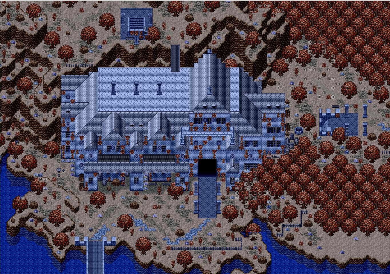
Here's the screenshot of a map I've been working on! It's an abandoned cathedral, the making of which involved very creative use of a town tileset. I'm quite proud of this one. It's not quite finished yet, but it was finished enough that I figured I'd post it here and possibly get some feedback.
WARNING: PRETTY BIG IMAGE
And as always, I have to shamelessly plug the game that this is from, Exile's Journey, my epic 15+ hour RPG that is nearing completion!
https://rpgmaker.net/games/3841/
Frogge: Simply adorable. I think your tiles are great! My only issue is that the coffee table (?) seems very tall compared to the couch. Maybe make it one or two pixels shorter. If it's not actually a coffee table, I apologize.
orange-: Woah! That looks so cool. Serious Dark Souls vibes! I'm extraordinarily impressed by the art and presentation of that shot. The battle animation looks great too. I never quite know what to say when I can't think of anything to improve of at all, which is the case here.
Here's the screenshot of a map I've been working on! It's an abandoned cathedral, the making of which involved very creative use of a town tileset. I'm quite proud of this one. It's not quite finished yet, but it was finished enough that I figured I'd post it here and possibly get some feedback.
WARNING: PRETTY BIG IMAGE
And as always, I have to shamelessly plug the game that this is from, Exile's Journey, my epic 15+ hour RPG that is nearing completion!
https://rpgmaker.net/games/3841/

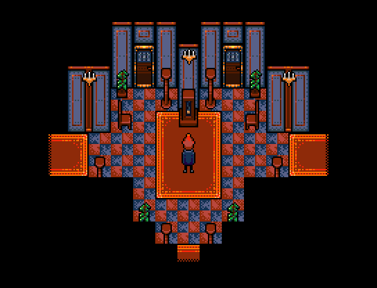
author=dethmetal
Here's the screenshot of a map I've been working on! It's an abandoned cathedral, the making of which involved very creative use of a town tileset. I'm quite proud of this one. It's not quite finished yet, but it was finished enough that I figured I'd post it here and possibly get some feedback.
This looks really good, like an actual real world building. Very cool (hah) color palette as well.

So I'm going to make a 1.35 update on Save Your Mother today, here's something to celebrate the occasion.
dethmetal that is simply amazing
looks like the type of mansion you'd find in a quality horror game
looks like the type of mansion you'd find in a quality horror game

Teach me the way of pixel art, Frogge-san!
@Tuomo: That's pretty creepy, but I like it! Reminds me of a recent game idea I had where you
A quick little tileset test. The clock is animated in-game.
I suck at this. Dx Must...crawl back into the pixel art woodshed.
@Tuomo: That's pretty creepy, but I like it! Reminds me of a recent game idea I had where you
crawl inside someone's asshole on a mission to exterminate a bug.
A quick little tileset test. The clock is animated in-game.
I suck at this. Dx Must...crawl back into the pixel art woodshed.

@orange~ Absolutely haunting, everything is so clean, yet so drab. I'm in love with those colors
@dethmetal- Gorgeous as always
@ Lui- and yeah buddy, those tiles are awesome :)
@dethmetal- Gorgeous as always
@ Lui- and yeah buddy, those tiles are awesome :)
@Frogge: I love the characters and the room. I would not make the glass table see through at all, it looks a bit odd. The texture on it already sells it as a glass table.
@Orange: God damn, man, I love the enemies, background and battlers. Not super fond of the battle animation, on it's own it looks really great and smooth. But together with the rest it looks a bit cartoonish, think it might be the lack of details compared with the rest of the art in the scene.
@Dethmetal: Not much feedback to give really, looks great.
@Luii: I love that art style, I would defiantly play a game that looked like that.
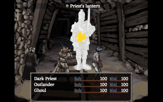
Pretty big gif of secret areas and getting a health power up:
It still very much a work in progress. The health power up is a really simple button mashing "minigame". It still need some work, mostly additional animations on the player as you attack the orb and one when you get powered up.
@Orange: God damn, man, I love the enemies, background and battlers. Not super fond of the battle animation, on it's own it looks really great and smooth. But together with the rest it looks a bit cartoonish, think it might be the lack of details compared with the rest of the art in the scene.
@Dethmetal: Not much feedback to give really, looks great.
@Luii: I love that art style, I would defiantly play a game that looked like that.
Pretty big gif of secret areas and getting a health power up:

It still very much a work in progress. The health power up is a really simple button mashing "minigame". It still need some work, mostly additional animations on the player as you attack the orb and one when you get powered up.
HOLY SHIT, LUIISHU, YOUR GAMEBOY PALETTE ART WAS GOOD BUT GOOD GOD YOUR COLORED ART LOOKS LIKE SOMETHING THAT FELL FROM HEAVEN
ALSO YOU MOMEKA. YOU ARE PERFECT TOO.
YOU ARE ALL PERFECT AND VERY TALENTED ARTISTS <3
Ps: You guys have a great point about the coffe table, though I'm not really going back to change it now since it was just me playing around with pixels and it wasn't actually for a game.
ALSO YOU MOMEKA. YOU ARE PERFECT TOO.
YOU ARE ALL PERFECT AND VERY TALENTED ARTISTS <3
Ps: You guys have a great point about the coffe table, though I'm not really going back to change it now since it was just me playing around with pixels and it wasn't actually for a game.
@Momeka, you got a point with the battle animation. The guy making it raised the same point with one other animation he was doing. In the game the animation passes by so fast, so you don't really get to see it that clearly, so it wasn't a problem to me. But let's see where it goes. I think I got pretty weird way of doing pixel art, so it isn't that easy to mimic that. oh and your screenie looks awesome again! :)
@Luishu, What are you talking about?? :O That looks awesome! Keep at it! I especially like the floor tile, but there's nice contrast between floors and the rest of the tileset!
@dethmetal, I'm really liking that cathedral! Problem with that big maps is that the player never gets to see all the work that went into it, unless you can fly around or something. Anyways, I get a feeling we might have a bit similar inspirations with our games :D
Thanks for the support, guys. I'm pretty new to the 16-bit size and the use of actual color, so I'm not really too sure about how everything works ATM.
@Momemka: That looks great! I really like your clean style.
@orange: Your game's art style looks really interesting. It reminds me of Dark Souls. Do you use painting tools for everything?
@deathmetal: Red and blue are a great combo.
@Momemka: That looks great! I really like your clean style.
@orange: Your game's art style looks really interesting. It reminds me of Dark Souls. Do you use painting tools for everything?
@deathmetal: Red and blue are a great combo.

Started to mess around with the Time Fantasy some more on another castle tonight. This was the WIP result (I haven't decided what to do with the second level that butts up against the towers yet).

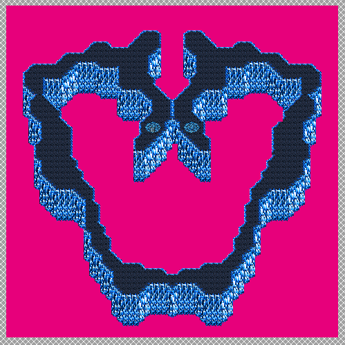
Actually took me a bit to do this one map. Ironically enough, I didn't intend for it to resemble a pelvic bone. I just kinda did a thing and mirrored it on the other side, which is why it took so long to do. Btw, this map #9 of 11, meaning 2 more maps left to map and that's that! Just one boss room and one more stretch! Hurray!
Would anyone happen to have any good ideas for Heart of Pandora, in terms of layout and tileset??
author=Luiishu535Everything is made in Photoshop so in that sense, yea. I'm just too lazy to do proper pixel art, so I paint with PS brushes and then fix it up on pixel level where I see necessary. Battle graphics so far have ended up more painting-like, but there's more pixel work done with tilesets and sprites. Dark Souls certainly is one of the influences, probably doesn't come as a surprise :)
@orange: Your game's art style looks really interesting. It reminds me of Dark Souls. Do you use painting tools for everything?