


SCREENSHOT SURVIVAL 20XX
Posts

Gosh Darken, that was very cinematic! You've done things I've never even thought of attempting. Didn't really have anything to critique at this early state. It's surprisingly well polished and fluid. Sexiest bridge I've seen, and I'm not usually attracted to inanimate objects.
Blind, that's a really well put together map, and while I think the tile set is very nice my eyes were almost immediately drawn to the steps in the top left. I don't pretend to know anything about pixel art but there's quite a harsh line between them and the rock face. I feel like it could be integrated a bit better. Got to say though, another sexy bridge - I think I might have a problem.
Blind, that's a really well put together map, and while I think the tile set is very nice my eyes were almost immediately drawn to the steps in the top left. I don't pretend to know anything about pixel art but there's quite a harsh line between them and the rock face. I feel like it could be integrated a bit better. Got to say though, another sexy bridge - I think I might have a problem.


ESBY
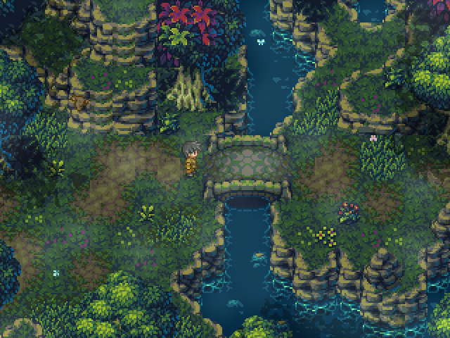
hi craze, i did this map for the birthday thing. i hope you like it.
also, happy groundhog day sweetie

the last of us part 2????


My first time using this particular lighting effect. Curious what criticism can be drawn from it, to help me improve on the design of this map.
LockeZ

I'd really like to get rid of LockeZ. His play style is way too unpredictable. He's always like this too. If he ran a country, he'd just kill and imprison people at random until crime stopped.
5958
It looks more like you combined seven different lighting effects
why are there glaring sunbeams coming from the corner of the screen at night
why is the area around the lightpoles even harder to see than the darkened areas
why is there furniture in the forest
why are there glaring sunbeams coming from the corner of the screen at night
why is the area around the lightpoles even harder to see than the darkened areas
why is there furniture in the forest

Not rpgmaker, but here is something I've been tinkering on the last few days:

and a level editor for it as well
and a level editor for it as well


author=Momeka
Not rpgmaker, but here is something I've been tinkering on the last few days:
and a level editor for it as well
What is this witchcraft and what other features does it hold? :O
I have a few accessible menus when you're standing on a save point. Do you think it's overkill to inform the player which button to press to access sub menus throughout the whole game, or should I just tell them once and hope they remember (even after periods of not playing)?
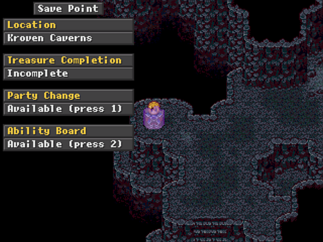

I think people would learn over time what buttons to press for those options, as well as that those options were available at save points.
author=visitorsfromdreams
What is this witchcraft and what other features does it hold? :O
It's the ancient crafts of C# and Monogames, this conjuration has such a thrilling features as turning around and walking forward!
So far I'm mostly just building a raycasting engine. Maybe I'll make a game out of it someday.

@Blind:
I totally missed that screenshot, but it looks amazing. Those are grade A tiles and some great mapping.
@Architect:
That lighting is nonsense. The underlying map is nice, though.
@LWG:
Why not little "1" and "2" icons instead of words? I feel like most people can remember two buttons, but the fact that they're included with the same spacing and graphics as the non-interactive options is a bit weird. I'm very intrigued by this Ability Board, though...
@Momeka:
I'm sorry, but screenshots that aren't from Official Licensed RPGMaker Brands aren't allowed here and you're going to have to board this train to a gulag.
author=Kaempfer
@LWG:
Why not little "1" and "2" icons instead of words? I feel like most people can remember two buttons, but the fact that they're included with the same spacing and graphics as the non-interactive options is a bit weird. I'm very intrigued by this Ability Board, though...
I thought about icons actually but I have no talent creating anything like that haha. I see what you mean but I'm a stickler for consistency to a fault!
The reason they are even included at all is because both options do get locked at certain story events and my beta tester believed it was a bug when he couldn't access them. Both options are only ever accessible at save points so it just gives a quick view of what's available. Maybe it's the wrong way of tackling the issue but I don't think it effects the game in a negative way (just not overly positive I suppose).
It's nice that your intrigued but it's a fairly standard skill equip menu. Thanks for your helpful feedback :)
LockeZ
I'd really like to get rid of LockeZ. His play style is way too unpredictable. He's always like this too. If he ran a country, he'd just kill and imprison people at random until crime stopped.
5958
If it's something that only comes up once every half hour or less, like a save point or a shop, I would suggest having a text choice box for the options instead of keybindings. You don't need specific keys for that anyway, and a lot of people won't remember which is which. Plus it makes it a lot easier to play the game with a controller.
If you do leave it with a keybinding for each option, I would definitely show them on screen.
If you do leave it with a keybinding for each option, I would definitely show them on screen.

author=kentona
remind me to tweet some of this cool shit on rmn's twitter
Hey you should tweet some of this cool shit on RMN's twitter
Thanks for all the feedback everyone, it was really helpful. I think I'm going to have to go back to the drawing board and have a think about how I can make it work. Perhaps it will have to be a menu that pops up and you have to manually scroll to the different options instead.
Thanks again :)
Thanks again :)
I like to stop in and see what cool stuffs people have been working on.
This is my latest.
@ishyrodriguez on Twitter


This is my latest.
@ishyrodriguez on Twitter

momeka release one of these things you coward
infinite that is a ridiculously huge and bright dash animation, potentially distracting? if it's the basic dash then i'd consider toning it down. if it's limited then it's probably okay

infinite that is a ridiculously huge and bright dash animation, potentially distracting? if it's the basic dash then i'd consider toning it down. if it's limited then it's probably okay


