


SCREENSHOT SURVIVAL 20XX
Posts

That looks lovely, Deckiller :O

Testing some new desert tiles. Oasis-side ruins, perhaps? ;0
Might have to desaturate or lighten the Hero sprite a little.

Might have to desaturate or lighten the Hero sprite a little.
Corfaisus

"It's frustrating because - as much as Corf is otherwise an irredeemable person - his 2k/3 mapping is on point." ~ psy_wombats
7874
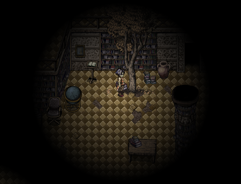
Copied from gamepage: "I know it's a limitation of the graphics, but those ruins still look quite livable. Look, the goose doesn't seem to mind."
I feel like more could be done to make it look ruined. Like, tear the roof off the place and have dusty stones litter the floor or something.
I feel like more could be done to make it look ruined. Like, tear the roof off the place and have dusty stones litter the floor or something.

@Momeka - water moves in last animation is strange when hero moving verticaly, in horrizontaly is OK.
@Deckiller - Why screens from dungeons have diferrent resolution (black frame vs black lines in up and down)? In before screens all tilesets have 2x2 size of piksels, but parralaxes and light picure have 1x1 size of piksels so these is little untidy. Generaly I don't like time fantasy style...
@Blind - This light picture do that screeen seems be not sharp in up left corner. And is problem with shadows. Why mountains not make shadows, I know this is very hard and long time that make this - but all things have a shadow (except hero!) only walls of mountains not. This is problem which I also have in my game, maybe someone know the solution, bacause shadows is great and make that map seems is more 3D but this is usually not add shadows in mountains, so this is inconsistent in whole game...
author=Dragon_Kamillo
@Blind - This light picture do that screeen seems be not sharp in up left corner. And is problem with shadows. Why mountains not make shadows, I know this is very hard and long time that make this - but all things have a shadow (except hero!) only walls of mountains not. This is problem which I also have in my game, maybe someone know the solution, bacause shadows is great and make that map seems is more 3D but this is usually not add shadows in mountains, so this is inconsistent in whole game...
Thanks for the feedback!
Yeah, it's actually something I'm thinking over. It'd be a lot of tedious extra work to add shadows to every single cliff edge, but it might be worth doing for the sake of consistency.


Oh man! So gorgeous! I love the color palette! And for once, I actually like square hilltops. Really flawless Deckiller!
@Darken, I love the art style! Really cool use of light and shadows.
Here's something from me too:
@Darken, I love the art style! Really cool use of light and shadows.
Here's something from me too:
Cheers :D
That's a pretty sexy style there! Is there a face or a mask in the pillar on the bottom-right?
Darken, that's also a really neat style there - something you don't see often around here. I like the glowing effects in particular.
That's a pretty sexy style there! Is there a face or a mask in the pillar on the bottom-right?
Darken, that's also a really neat style there - something you don't see often around here. I like the glowing effects in particular.

@Deckkiller: Not the biggest fan of time fantasy, but pure mapping it looks really nice. Looks really homely and fitting for a rural village.
@Orange: Looks great as always.
Some screens from the Grimp expansion:


@Orange: Looks great as always.
Some screens from the Grimp expansion:
Corfaisus
"It's frustrating because - as much as Corf is otherwise an irredeemable person - his 2k/3 mapping is on point." ~ psy_wombats
7874
I love that penguin's walk cycle. I'd play the game just to watch it. He's just wooble-wobbling around.
author=Corfaisus
I love that penguin's walk cycle. I'd play the game just to watch it. He's just wooble-wobbling around.
Same thoughts. If I were playing this game, I wouldn't want this penguin to die in any stage, because he's way too cute. xD
Greetings,
Tw0Face

But he blows like a bubble when he dies
That's too cute.
That's too cute.
author=Deckiller
Cheers :D
That's a pretty sexy style there! Is there a face or a mask in the pillar on the bottom-right?
Darken, that's also a really neat style there - something you don't see often around here. I like the glowing effects in particular.
Hey thanks! There is a face on the pillar yeah!
@momeka, those enemies on the sides throwing bombs, remind me of Bomberman games where the defeated players would end up on the edges of the map where they'd annoy players by throwing bombs. Really professional looking game. For some reason it gives me really nostalgic DOS-game vibes too.

Very interesting aesthetic, Darken, I like it.
Deckiller splendiferous use of Time Fantasy. I was going to ask what tileset it was because I genuinely couldn't figure it out but thanks to momeka I didn't have to. It's funny because I own Time Fantasy I've just never used it yeti like the RTP too much
orange- I'm AFRAID I'm HUNGRY to play more of your game. (actually all joking aside I am afraid I have permanently damaged my physical/mental health by obliterating my sleep cycle and I am hungry because I haven't eaten in 36 hours, but puns seemed more important)
momeka retro GOLD as always.
Well now, after all those beautiful, interesting screenshots, have some RTP trash I've been dying to share:
These are not inchronological any order:

(Ulrika has her moments.)
(This was the only time I broke the forth wall.)
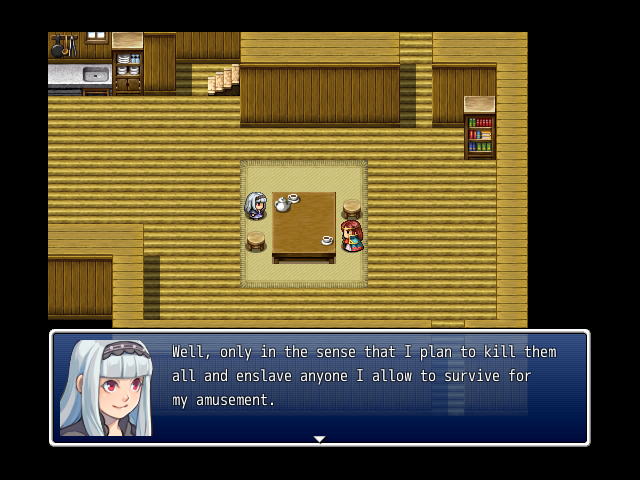
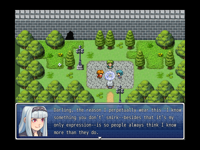
Caroline is the best, and by best I mean worst, and by worst, I mean BEST.
Deckiller splendiferous use of Time Fantasy. I was going to ask what tileset it was because I genuinely couldn't figure it out but thanks to momeka I didn't have to. It's funny because I own Time Fantasy I've just never used it yet
orange- I'm AFRAID I'm HUNGRY to play more of your game. (actually all joking aside I am afraid I have permanently damaged my physical/mental health by obliterating my sleep cycle and I am hungry because I haven't eaten in 36 hours, but puns seemed more important)
momeka retro GOLD as always.
Well now, after all those beautiful, interesting screenshots, have some RTP trash I've been dying to share:
These are not in
(Ulrika has her moments.)
(This was the only time I broke the forth wall.)
Caroline is the best, and by best I mean worst, and by worst, I mean BEST.
@StormCrow I really like yer maps, but those interiours are gigantic! You can definetely scale them down.

A little running around the Bug Kingdom town and canyon dungeon. I know I need more stuff in the canyon to break up the monotony..was mostly trying to show the town with some NPCs.
@Momeka - You are a machine! Everything looks super polished and far far away from being recognized as rm2k3. (it is still 2k3 right?)
Kingdoms of the Dump looks more and more fun the more I watch footage of it. Also, man, I bet designing the maps for it can't be an easy task, what with having to consider every weird thing the players may want to do with the platforming mechanics and stuff.

