


SCREENSHOT SURVIVAL 20XX
Posts

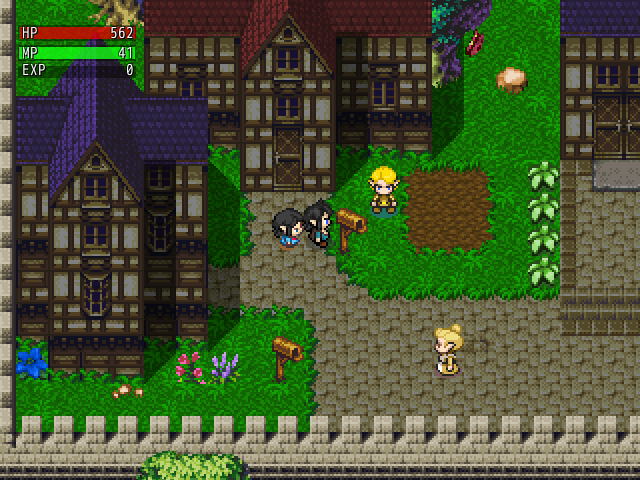
author=BlindmindVery pretty, happy to see you're still working on this game. Question do you experience heavy lag with all the events taking place simultaneously on one map?
xD Per some suggestion, expanding/remaking the city areas.


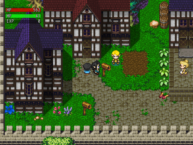
author=AlphaOmega247Like how you lightened the buildings, I would say that the grass is a little too bright. Also is there a way to create dynamic shadows for your sprites on the map, I see some shading between the sprites legs I assume this is a shadow but I don't think all the shadows are the same color.
I was told that my town's buildings were too gloomy for the rest of the map, and that my streets were too boring.
BEFORE:
AFTER:
I think the buildings probably need a little more tweaking, but I'm much happier with the street.
Thank you for the compliment :).
author=kory_toombs
@Ashley Lacure- That is godly mapping. I bow down to your greatness.
Thanks man, trying. Just wait until I finish some of these new forest tile sets.
author=suzy_cheesedreamsThank you, updates coming soon.
@Ashley_Lacure, those maps look nice, especially the forest.
author=nemojbatkastleThank you man, I am using MS Echo by East.
Ashley_Lacure, good use of the old RTP. Worked for Hero's Quest, works for you. What font is that you're using?
author=Tau
I wonder whatever happened to this game?
Man that game was sexy, no idea what happened to it though

author=Ashley_LacureThank you! ^-^ Nope, no lagging! It is surprisingly considering nearly every object is an event.. lol.
Very pretty, happy to see you're still working on this game. Question do you experience heavy lag with all the events taking place simultaneously on one map?
author=Ashley_LacureI noticed that as well. I suggest removing the flat shadows in the character sprites. Doesn't really fit with the auto-shadows!
Like how you lightened the buildings, I would say that the grass is a little too bright. Also is there a way to create dynamic shadows for your sprites on the map, I see some shading between the sprites legs I assume this is a shadow but I don't think all the shadows are the same color.
Edit: I'm probably posting too much. XD Here's the finished version of the two screenies above.

author=TauHoly shit!
I wonder whatever happened to this game?
https://www.youtube.com/watch?v=hqdtVk-fN04
Someone who uses the picture events like that who isn't me!
@Louis Cyphre: Ah side projects, always fun!
Hellcat actuaslly started out as a side project, then one of my friends asked me to finish it for his birthday.
So I did, lol. Finish a demo, yes...
@yuna21 - Wow, those are the most beautiful maps I've ever seen 0.0
@Nemo - That map looks fantastic, I never thought 8-bit could look so nice..
@Craze - Your game concept looks really interesting... It will be funny to see the dialogue
between the kids and watch them duke it out with monsters etc.
@LouisCyphre - Your battle system looks excellent period. I like the look of the
characters and how you have things lined up.
Well, I'm quite new to RMN and RPG Maker VX. I just got back into it after a long 4-yr period.
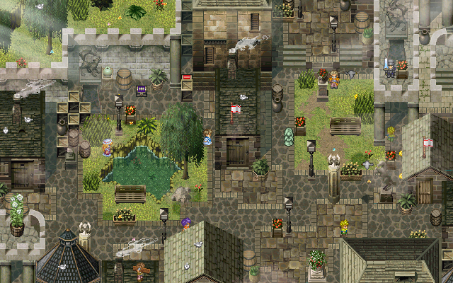
I'm looking for feedback and suggestions regarding mapping. Here is a little Village I made.

This is a dungeon that I made to test out mechanics that I scripted out.

I'm trying to figure out a way to make my dungeons look better, with that being said I think it's best to explain
what's going on here. I'll do my best without breaking topic rules.
First of all, the player can jump at anytime, which is why there are so many gaps and black empty space.
A good example of using the jump is being able to hop over a fence, trees or a cliff.
Secondly, there are four actions that the player can do, which are a simple basic attack and three Skills
that the player can equip and use on the map. The player can use their basic attack to dispose of rocks and weaker monsters.
I don't want to open up some of the areas, because the way they are setup is vital
to my gameplay. Such as having to time jumps to avoid traps, timing the use of your
Skills to take down monsters if you wish, avoiding monsters if you are low on supplies and don't want to engage in a battle, etc.
@Nemo - That map looks fantastic, I never thought 8-bit could look so nice..
@Craze - Your game concept looks really interesting... It will be funny to see the dialogue
between the kids and watch them duke it out with monsters etc.
@LouisCyphre - Your battle system looks excellent period. I like the look of the
characters and how you have things lined up.
Well, I'm quite new to RMN and RPG Maker VX. I just got back into it after a long 4-yr period.
I'm looking for feedback and suggestions regarding mapping. Here is a little Village I made.
This is a dungeon that I made to test out mechanics that I scripted out.
I'm trying to figure out a way to make my dungeons look better, with that being said I think it's best to explain
what's going on here. I'll do my best without breaking topic rules.
First of all, the player can jump at anytime, which is why there are so many gaps and black empty space.
A good example of using the jump is being able to hop over a fence, trees or a cliff.
Secondly, there are four actions that the player can do, which are a simple basic attack and three Skills
that the player can equip and use on the map. The player can use their basic attack to dispose of rocks and weaker monsters.
I don't want to open up some of the areas, because the way they are setup is vital
to my gameplay. Such as having to time jumps to avoid traps, timing the use of your
Skills to take down monsters if you wish, avoiding monsters if you are low on supplies and don't want to engage in a battle, etc.

@Max McGee - Oh yea, you're right, I don't know how I missed that!
All of those scripts you see, I wrote them myself, after taking the time to learn RGSS2.
All of those scripts you see, I wrote them myself, after taking the time to learn RGSS2.
author=CalmOneYou're gonna go far, kid.
@Max McGee - Oh yea, you're right, I don't know how I missed that!
All of those scripts you see, I wrote them myself, after taking the time to learn RGSS2.
Plsying Trial (by trial-jin) again made me yearn to do a game that all meshed together artistically, so I might make Hellcat: Born Again, that game.
It, Perseverance or Exile. Hell, maybe even... all three? :0
We'll see.

I've got a question.
Would a faceset in this style look cute, or just dull?
(Tileset from the Chapsets thread :DDDD)
Would a faceset in this style look cute, or just dull?
(Tileset from the Chapsets thread :DDDD)

@Unity, it looks cute. I think the eyes are just big enough and fluttery to be cute rather than dull!

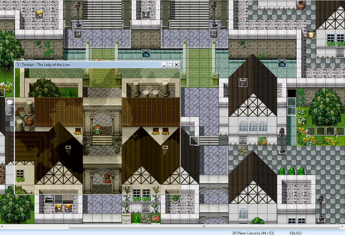
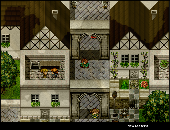
More Tristy stuff. Almost 10 hours into the game now. ><


I need to stop posting natural areas and start working on that 70x70 Imperial Capital already, orz.
I need to stop posting natural areas and start working on that 70x70 Imperial Capital already, orz.
author=yuna21The attraction to the unfaltering serene nature of earth and life is understandable.
More Tristy stuff. Almost 10 hours into the game now. ><
snop1
snop2
I need to stop posting natural areas and start working on that 70x70 Imperial Capital already, orz.
Mapping Planet Haven was definitely one of the highlights of developing Menagerie.
author=unityOnly problem I have with it is the mouth placement. i think it's too high up and maybe too far to the right.
I've got a question.
snop3
Would a faceset in this style look cute, or just dull?
(Tileset from the Chapsets thread :DDDD)

Yuna, I like that the character has those pauldrons. It's kinda cute, as is the mini-crystal ~ !
This is RM* sacrilege to say, but I think the foggy/misty effects are rather heavy. Then again, I'm a biased old geezer who has thought that they look silly and cheap since 2005. Your maps already look great; I think not clouding them over so much would let that show.
All those plant edits are great. I need to start doing some of that.
^ I guess the tints and stuff just give my maps that extra pizzazz. XD Then players can instantly tell, "Hey, that's a Yuney map!". Yes, I still like them as is in the editor, but a simple tint and a subtle overlay can work wonders for creating atmospheric maps.
See the difference? ^^ Yes, I do average around 300+ maps for every 10 hours of gameplay ><.
See the difference? ^^ Yes, I do average around 300+ maps for every 10 hours of gameplay ><.
Oh, I love tints! I just feel meh toward overlays unless it's like, actually a smokey area or what-have-you. Feel free to ignore the ravings of an old* man.
Here, a recent meteor crater that was being mined until EVILGOD adultnapped all the above-17s of the world for his slave pits:

Why do I have cutscenes in EMDE!2's sorta-sequel? I don't know, I think I'm going nuts.
*i'm 23
Here, a recent meteor crater that was being mined until EVILGOD adultnapped all the above-17s of the world for his slave pits:
Why do I have cutscenes in EMDE!2's sorta-sequel? I don't know, I think I'm going nuts.
*i'm 23

>.<)b
That is looking really nice, Craze. Also, cutscenes are awesome~ I miss them in your games. :<
Guess who was inspired by a certain chapsettening?

I'm moving some of my own edits to Ace so that people can use them.
That is looking really nice, Craze. Also, cutscenes are awesome~ I miss them in your games. :<
Guess who was inspired by a certain chapsettening?
I'm moving some of my own edits to Ace so that people can use them.
author=yuna21
^ I guess the tints and stuff just give my maps that extra pizzazz. XD Then players can instantly tell, "Hey, that's a Yuney map!". Yes, I still like them as is in the editor, but a simple tint and a subtle overlay can work wonders for creating atmospheric maps.
Yeah, agreed. xD I love those original two shots Yuna. Very crisp, beautiful.
The atmosphere is subtle enough that it visually enhances the maps, rather than detracts, which is how it should be. Lmao I hope my own game can look as great when I make the jump to VXA. ;P
author=CrazeBoorish pleb, you ain't even my age.
Feel free to ignore the ravings of an old* man.
*i'm 23
I act a lot younger than I am, twenty-six-year-old masterrace awwyeah.
@Yuna21: It comes down to personal preference, (and scripts not being reprehensible wastes of fucking time and effort, too but shhh!) I think the methods to induce atmosphere that you use are really cool.
I also thought I was legitimately the only clever motherfucker who took screenshots in that manner.

An updated version. Instead of allowing the player to actually walk around on maps, this game will have you interact a bit differently - even in dungeons. It's something like a point and click adventure game, but not quite, where you scroll through points of interest and explore the world that way.
IDK, I'm just messing with it and liked the idea.
i know what site you got that from and that's, like, the only sprite that's not a mostly-naked chick with a triangular rack. hopefully it's a short game with few characters lol...

Blindmind: Since that screenshot is mind-blowingly beautiful my only gripe is that the mounted flag posts on the roofs of the buildings are two bright? I guess that would be the phrasing for it. They stand out against the dark, very HD surroundings.
Obviously this is very minor and maybe I am the only one who sees it, but at this point it's worth looking into, right?
Obviously this is very minor and maybe I am the only one who sees it, but at this point it's worth looking into, right?

