


SCREENSHOT SURVIVAL 20XX
Posts

LockeZ

I'd really like to get rid of LockeZ. His play style is way too unpredictable. He's always like this too. If he ran a country, he'd just kill and imprison people at random until crime stopped.
5958
Man. I always liked the lighting overlays, even when they made no logical sense. I'm just too lazy to do them in my own games.

Oh, overlays are great when they're not sunlit streams set to 60% transparency set with an obnoxious yellow tint. >.<;
Subtle is always best when it comes to overlays but a lot of people don't get that. The same kind of people who make very dark tints for night and caves (desaturation adds so much to those darker tints while still making things visible.)
Subtle is always best when it comes to overlays but a lot of people don't get that. The same kind of people who make very dark tints for night and caves (desaturation adds so much to those darker tints while still making things visible.)


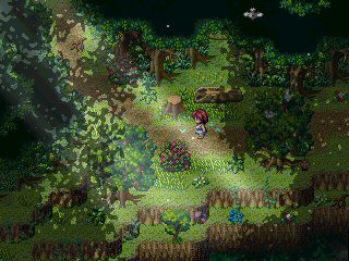
Testing a tileset I put together today. About 1 1/2 hours of work, not too bad. The biggest questions on my mind right now are:
1. Are the houses looking properly scaled in relation to the player? This is the first project to use my new big sprite template, so I don't know if I've gotten used to it yet.
2. Is the colour palette good looking? I've been trying to minimize my palettes recently and attempting to be clever about reusing colours and all that.
The map is just a test area for the tileset. It will probably be a bit more tightly mapped in the final area.

Looking good Pizza. The only color that irks me is the red. I would desaturate it a bit. But I'm also a sucker for washed out colors so I may be biased. Trees look particularly great.

author=LibertyI can't tell if you did that just for me or by happenstance.
but it's no surprise many newbodies don't know of it.
author=LibertyYou should add me on Skype, just search Bizarre Monkey trust me i ain't very subtle, location is Step off, Australia since I've probably been cloned somewhat.
It's both a good and bad thing. There used to be a lot of interesting things coming out of the community when the focus was more on creating systems and interesting gameplay elements than graphical competency, but still, eyes are drawn to pretty stuff so...
author=LibertyShit.
But yeah, impromptu history lesson. For Homework I want you all to create a map that uses the 3 tile rule, then dissect what is wrong and right with it.
Can't, I'm not even USING tilesets anymore, bwahaha.
Oh yeah, here's a video, just of a test map.

Pizza, how do you do it? (hours of laborious work I'm sure) You're a spriting G.
author=Crazelololol craze!

author=nurvuss
Pizza, how do you do it? (hours of laborious work I'm sure) You're a spriting G.
Basically you have to be on the verge of going completely insane from work related exhaustion. Constantly.
Anyways, the tileset and associated town map are finally fucking finished. UHGGHGH.


I've since fixed that double-black line caused by the positioning of the overhead wires.

Pizza, I really, really like the colour scheme. Like, a lot. The grass and trees are just... hnnnng~<3
One thing I would (and do) recommend: longer grass patches. That is all.
One thing I would (and do) recommend: longer grass patches. That is all.
Corfaisus

"It's frustrating because - as much as Corf is otherwise an irredeemable person - his 2k/3 mapping is on point." ~ psy_wombats
7874

This place is actually a massive tree, carved out hollow for the purpose of housing a military of wolves. Still a WIP (it lacks NPCs).
EDIT: Thank you for your time, Liberty, but I feel like those tiles won't work well with how the area is designed.

@Pizza I absolutely love those powerlines. Looks so cuuuute!
@Corfaisus That place looks totally cute. I would seriously consider not adding too many decorations because the simplicity is cute. But NPCs should be fine :)
@Corfaisus That place looks totally cute. I would seriously consider not adding too many decorations because the simplicity is cute. But NPCs should be fine :)

@Corfaisus: It is looking a little brown but that can't be helped much when the wood and ground are, well, brown.
Also... I, uh, whipped these up. I dunno, I was thinking instead of cave walls, something more wooden in appearance. >.<;

If you like one, just copy/paste it into the relevant tileset.
Also... I, uh, whipped these up. I dunno, I was thinking instead of cave walls, something more wooden in appearance. >.<;
If you like one, just copy/paste it into the relevant tileset.


@Pizza
I love everything about those visuals oh man. It feels like it's emulating earthbound while still being it's own style. It's hard to explain but I dig it immensely.
@yuna21
Well, you really do excel at making things look pretty! I really like the UI menu, it's clean while still having a bunch of information.
Corfaisus
"It's frustrating because - as much as Corf is otherwise an irredeemable person - his 2k/3 mapping is on point." ~ psy_wombats
7874

~Mmm.~ Our tea PEEEEEE!
It's amazing what two subtle overlays and a Google image background can do to a map. Music track is FF7's Cosmo Canyon.
EDIT: I personally like the backdrop because - while it is an actual photo - it's not immediately obvious that it is one and instead melds perfectly into the atmosphere of the surrounding branches. Also, I'm so good, I made a tree out of a mountain.
author=Corfaisus
~Mmm.~
Our tea PEEEEEE!
It's amazing what two overlays and a Google image background can do to a map. Music track is FF7's Cosmo Canyon.
Still @Liberty has the truth. It does look more like flying isle or something. It needs wooden structure.
author=yuna21
@Pizza. What everyone else said.
Seems I only excel at making things look pretty. ;_;
Journal looks fantastic!
Corfaisus
"It's frustrating because - as much as Corf is otherwise an irredeemable person - his 2k/3 mapping is on point." ~ psy_wombats
7874
author=Cap_Hauthor=CorfaisusStill @Liberty has the truth. It does look more like flying isle or something. It needs wooden structure.
~Mmm.~
Our tea PEEEEEE!
It's amazing what two overlays and a Google image background can do to a map. Music track is FF7's Cosmo Canyon.
I'm quite sure that it would look like burning ass if I applied smooth hand-crafted plank tiles to the exterior of the tree, seeing as tree bark is typically rough and uneven.

