SCREENSHOT SURVIVAL 20XX
Posts

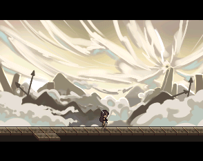
First actual screenshot from my current project.
In a few more years I might have enough assets for three screenshots and a gamepage!

Yeah, that's fucking badass

author=Red_Nova
Well, um... *nervous cough* They're backpacks. Looks like I'm gonna have to redo those sprites completely.
Haha, no, I can see it. They're just a bit too nondescript. I get that you're trying to keep them to scale with the character, but size them up a bit so you have room for details (buckles?).
@Blindmind, I love the concept of your forest/cavern hybrid! Also the mood is already well established. There are some tiling problems I think or the map just generally looks a bit diffucult to comprehend. Maybe it's better when you're actually playing the map. Still awesome work!
@Erilex, That looks so awesome! caught my attention for sure :O
@Erilex, That looks so awesome! caught my attention for sure :O

Erilex that looks really good.
Finally got to the mapping stage after about a year of working on menus and combat systems. Hopefully I'll improve with time.
Finally got to the mapping stage after about a year of working on menus and combat systems. Hopefully I'll improve with time.

Hey chilly, great start.
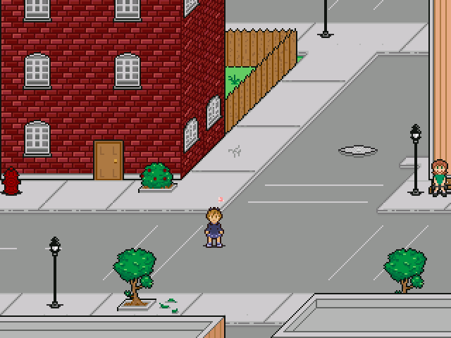
Everyone knows I love that oblique angle..
I would either lighten the front of the brick building, or darken the side. At a glance its hard to tell.
The lamp posts seem a little tall, and the manhole? is a bit too "eyelid" shaped, I think it should appear a little more from the top down and be more oval.
:)
author=Dookie
I would either lighten the front of the brick building, or darken the side.
The lamp posts seem a little tall, and the manhole? is a bit too "eyelid" shaped, I think it should appear a little more from the top down and be more oval.
author=Sated
The lamp-posts aren't too tall, but the trees are too small! The door is also too small, but I'm being picky.


That does look better! If I had to suggest that something look a little disproportional, it'd be the bench, but I can't get a clear view of it. Although it looks like the arm of the bench is about as big as or perhaps smaller than the girl who's sitting on its leg and it doesn't even go above her lower back.
Tl;Dr bench is too small?
Tl;Dr bench is too small?


Our programmer testing out looks for regular world map travel and eventual airship flight..
The boring blue one color sky is just a placeholder.


I see no shame either, it looks pretty impressive. Although the effect itself isn't very good imo, making it a bit flatter (it looks too round / can-y / pipey for my taste) could be better. But yeah, nice direction!
Also a very neat screen @chilly! I'd love to play it!
Also a very neat screen @chilly! I'd love to play it!
Hehe, still playing around with it.
It does appear a bit cylindrical in airship view particularly, good call.
It does appear a bit cylindrical in airship view particularly, good call.