


SCREENSHOT SURVIVAL 20XX
Posts

whenever you're transforming anything, there's usually a box that appears. There's a bit where it says ''cubic''. If you set that to ''none'' you should be good to go :D
not sure about how to do it in ps.
not sure about how to do it in ps.

author=Frogge
whenever you're transforming anything, there's usually a box that appears. There's a bit where it says ''cubic''. If you set that to ''none'' you should be good to go :D
not sure about how to do it in ps.
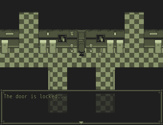
Used your advice, and others, and finally, created this


Daaamn, that's looking nice!

That's a lot better, Phantasmi! I still think that the diagonal walls look a bit weird. The placement of the wooden bucket (behind the desk) looks a bit odd as well. Also, there seems to be a bit of a graphical bug on top of the empty bookcase. Otherwise, it's a pretty nice improvement! :)
I've created my very first window skin! ^^
I also created some school tiles. Still thinking about what I should do with all of these graphics. Too many game ideas ATM. >.< I may release them later as free resources if I find them good enough.
I've created my very first window skin! ^^
I also created some school tiles. Still thinking about what I should do with all of these graphics. Too many game ideas ATM. >.< I may release them later as free resources if I find them good enough.

...Is that the painting reflected in the floor? It'd be a bigger gap between the edging and the reflection since it's higher up on the wall. Also, you might want to shadow under the bottom of the book cases and shelves and anything else that actually touches the floor, since it looks very strange that there's light underneath them. Aaaaaand there's no reflections from the stuff in the hallway which is inconsistent.
Actually, there's a lot of inconsistencies. You wouldn't be able to see the book that is on the desk - the reflection wouldn't show anything that was 3/4 view, that is anything on top of something. Just flipping the sprite upside down wouldn't work because there's a lot of parts of the pieces that we can see from that 3/4 view that wouldn't be seen in a reflection (just as you can't see the top of your head if you're looking straight-on into a mirror). You'd get a reflection of the bottom 3/4 and things would look warped and weird.
Also, with the colour of the walls, they'd probably be reflected as well. At the very least the edging of the walls would be.
Here's a few images to give you the general idea:

You can't see the top. What you can see is stuff poking over the top. Also the images are foreshortened and a bit warped. You can also see the walls reflected.

This is more like it. The plant pots are 3/4 view from us but the reflection doesn't show the 3/4 view. It shows the bottom lips of the pots, not the top part with the basin. Check those shadows out. Also, the wall edge and wallpaper.
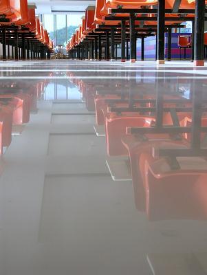
Again, only the underside areas are shown.
Actually, there's a lot of inconsistencies. You wouldn't be able to see the book that is on the desk - the reflection wouldn't show anything that was 3/4 view, that is anything on top of something. Just flipping the sprite upside down wouldn't work because there's a lot of parts of the pieces that we can see from that 3/4 view that wouldn't be seen in a reflection (just as you can't see the top of your head if you're looking straight-on into a mirror). You'd get a reflection of the bottom 3/4 and things would look warped and weird.
Also, with the colour of the walls, they'd probably be reflected as well. At the very least the edging of the walls would be.
Here's a few images to give you the general idea:
You can't see the top. What you can see is stuff poking over the top. Also the images are foreshortened and a bit warped. You can also see the walls reflected.
This is more like it. The plant pots are 3/4 view from us but the reflection doesn't show the 3/4 view. It shows the bottom lips of the pots, not the top part with the basin. Check those shadows out. Also, the wall edge and wallpaper.
Again, only the underside areas are shown.

Two WIP shots of a new area in Evoker:

I know that the overall style is a little too complex for the simplicity of the sprites, and I'll probably simplify the ground tiles by removing a shade. I need to run some tests, but I thought I'd get some feedback first.
Also, I know the wheat tiles too obviously, and I'm working on that, too!
I know that the overall style is a little too complex for the simplicity of the sprites, and I'll probably simplify the ground tiles by removing a shade. I need to run some tests, but I thought I'd get some feedback first.
Also, I know the wheat tiles too obviously, and I'm working on that, too!


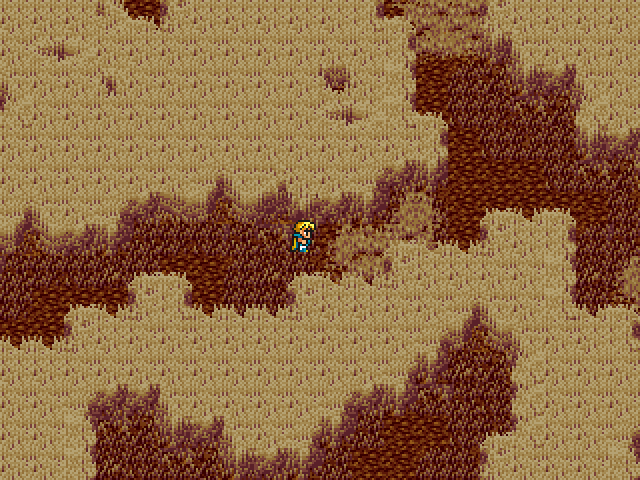
Well, that took entirely too long to do...yay or nay for first main area of Hokkai? I'm trying to go with different paths for the dungeon, all but one path are either optional stuff or dead-ends. The player can come back later for actual optional stuff, but for now, a lot of areas won't have much purpose, as most areas that seem to have no purpose are in the game. I'm trying to go for that "sealed region of Makai" feel with what tilesets I have, and this is what I already used for one of the premonition scenes in Hokkai with Sariel in Hokkai...also yes, those big circles? Those ARE teleporters that take you to regions you cannot access by foot at all. I'm trying to actually do mapping now to get the final 3-4 dungeons done, and Hokkai's next on the list since Palanquin Ship is already fully mapped (but not evented). Once I finish Hokkai, I have Hakurei Shrine Forest (super short mini-dungeon), End of Gensokyo (shouldn't be too bad to do, also short), The Void (lots of various mash-ups as usual), and Heart of Pandora (no idea how to handle the tileset for this one...any suggestions of what the lands inside Pandora's Box may look like?!).

Forgive the RTP and general lack of polish here, but, I'm a bit concerned that...

...this screen might not be clear enough about the fact that those numbers by each character's name is how much experience they are actually receiving. I'mapparently trying to emulate/approximate how guys earn exp in Suikoden.
What the hell am I doing to myself?
...this screen might not be clear enough about the fact that those numbers by each character's name is how much experience they are actually receiving. I'm
What the hell am I doing to myself?
@Xenomic:
The cliff heights in that map are so non-Euclidean M.C. Escher is going to use them in a painting.
edit: I have now deduced that the top section is somehow suspended above the rest of the map. The effect needs a lot of work.
The cliff heights in that map are so non-Euclidean M.C. Escher is going to use them in a painting.
edit: I have now deduced that the top section is somehow suspended above the rest of the map. The effect needs a lot of work.

author=KaempferI love what you did in this map, conceptually speaking. But visually, it didn't really register that those were tall stalks of wheat. In fact, it probably wouldn't have at all if I hadn't read your description. XD
Two WIP shots of a new area in Evoker:
I'm not sure if it's an issue with the shading, or actual structure and design of the tiles. Perhaps adding a few more objects that are obscured by the tops of the stocks, or a 'rustling' sound effect when the player walks through them can communicate the sense of depth better.

@Kaempfer:
Glad you like the name. And I like the first screenshot but the second one is pretty noisy.
@Cap_H:
Yeah, I'm planning on doing a border as I want a smaller map size. But it's not going to be that small and it's not going to be a gbc.
Glad you like the name. And I like the first screenshot but the second one is pretty noisy.
@Cap_H:
Yeah, I'm planning on doing a border as I want a smaller map size. But it's not going to be that small and it's not going to be a gbc.
LockeZ

I'd really like to get rid of LockeZ. His play style is way too unpredictable. He's always like this too. If he ran a country, he'd just kill and imprison people at random until crime stopped.
5958
Marrend, I would actually get rid of the "Base XP Earned" at the bottom, since it's not a useful value to the player really. It's useful to you as the developer, because it's how you calculate the individual values, but the player only cares about the individual values. It's more likely to confuse them than provide any insight.
Instead I would put next to each character:
and so forth. This not only clearly shows that the number is how much each character gained (both because it's got a + next to it and because it's the only number shown), but also helps the player understand why different characters are gaining different amounts.
Instead I would put next to each character:
Eric      Level 5

          +600 XP


Natalie   Level 6

          +300 XP


Terence   Level 7

          +200 XP
and so forth. This not only clearly shows that the number is how much each character gained (both because it's got a + next to it and because it's the only number shown), but also helps the player understand why different characters are gaining different amounts.
@BlindMind/Momeka:
Noisy and confusing? Welp, frig. Sounds like I have a lot of work ahead of me. I'll try to reduce the noise and increase the detail of the wheat, although... that's sort of what wheat looks like at this resolution. It's hard to coax a lot of clarity out of it.
Noisy and confusing? Welp, frig. Sounds like I have a lot of work ahead of me. I'll try to reduce the noise and increase the detail of the wheat, although... that's sort of what wheat looks like at this resolution. It's hard to coax a lot of clarity out of it.
LockeZ
I'd really like to get rid of LockeZ. His play style is way too unpredictable. He's always like this too. If he ran a country, he'd just kill and imprison people at random until crime stopped.
5958
Do sort of a reductionist thing where one wheat stalk tip out of every 6 or 8 tiles is rendered in oversized detail, and the rest of it looks like it does now. That's how grass tiles work in a lot of games. Just green fuzz, except there's a clearly visible oversized tuft of grass every once in a while.
Something like this except not shitty:
Something like this except not shitty:
author=Kaempfer
@Xenomic:
The cliff heights in that map are so non-Euclidean M.C. Escher is going to use them in a painting.
edit: I have now deduced that the top section is somehow suspended above the rest of the map. The effect needs a lot of work.
A lot of work how? I wouldn't know how else to make it seem like it's suspended at all. Also, not quite what that first line was all about. o_o;
@LockeZ:
Yeah, that's sort of the idea I'm working with now, only less oversized. My plan is to first clean up all the gross noisy pixels I can, then re-add actual detail via carefully placed areas of variation and more noticeably wheat-shaped wheat, like you said.
@Xenomic:
The first line was before I realized that that suspended area existed. The cliff heights make zero sense before you realize it's there. There are two major ways to show depth correctly: shadows and shaped top-layer tiles. Shadows would have a greater impact, here. You also need a pillar or something to show support for the massive weight of that stone ledge. The pillar will double in the visual storytelling.

Playing around with a new style. Temporarily in monochrome because palettes will be the death of me.


