


SCREENSHOT SURVIVAL 20XX
Posts


I'm currently experimenting with a basic RGB palette for my latest project.
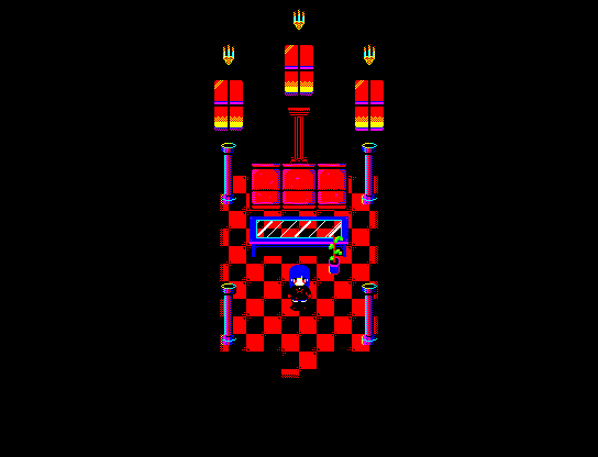
Still a noob at it, by I'm getting better. Let me know what you think.
Still a noob at it, by I'm getting better. Let me know what you think.

Oooo I like that first one! Love the checkered ground
author=Luiishu535You're welcome! Sorry not really helpful on anything technical :P
Thanks, bro!

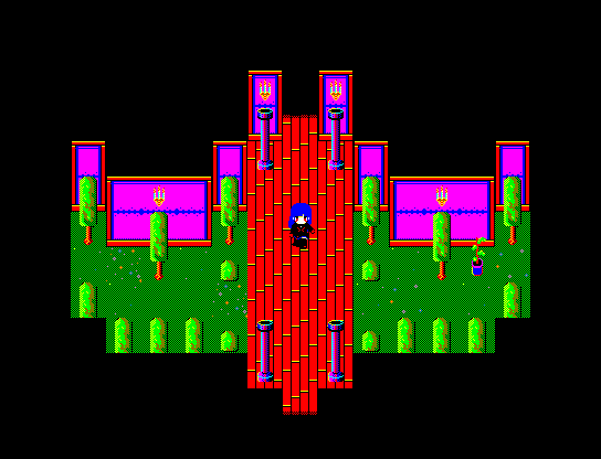
I really like the style you have going there luiishu! All I have to say is try to make the repeat on the third pic's carpet better. The dots repeat too close together at one point and it makes the tile too obvious.
It's stylisized, but I also think the grass could work without the dithered effect. Same with the wall on third pic. I'm not sure if it's bad or good, thought I definitely get what you're going for.
It's stylisized, but I also think the grass could work without the dithered effect. Same with the wall on third pic. I'm not sure if it's bad or good, thought I definitely get what you're going for.

I can't lie, luiishu. Your color palette is burning my retinas.
Those screenshots quite literally hurt to look at. I understand what you're trying to do, but those colors need to be toned down a lot. Otherwise I think it looks good, but for me personally, your game is unplayable with that current color palette.
Those screenshots quite literally hurt to look at. I understand what you're trying to do, but those colors need to be toned down a lot. Otherwise I think it looks good, but for me personally, your game is unplayable with that current color palette.
@Luiishu535: I like it, L. The only thing is that the pitch black tiles in the first screenshot blends in with the character a lot.
I'm working on some menus

I'm working on some menus
Dude, Momeka, you're a badass. And that is beautiful
Red_Nova

Sir Redd of Novus: He who made Prayer of the Faithless that one time, and that was pretty dang rad! :D
9192
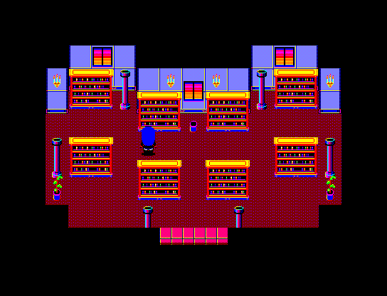
I agree with dethmetal, Luiishu. The colors are so strong it's actually physically painful to the eyes. It's especially damaging because all objects in the pictures pop out at the same time thanks to the lack of contrast. While all the colors should lose some saturation, it's especially important to do so for the ground tiles. You don't need the ground tiles to pop out as much as the main character or objects they can interact with.
Here's a trick I learned to judge whether I've done a good job with contrast. open up a screenshot in an image editor and drop the color saturation completely. Here, I'll do that for your first image:
As you can see, the player character's hair blends in with the background, the shading and shine of many objects like the pillars and windows has vanished, and objects like the plant and table are almost completely invisible. Go find an old school NES game like the original Megaman games and give that trick a shot. Even with the loss of colors, you can still tell what's going on in the image. Adjust your palette accordingly so that anyone can still tell what's going on even without any color at all.
Hope that's helpful!
Here's a trick I learned to judge whether I've done a good job with contrast. open up a screenshot in an image editor and drop the color saturation completely. Here, I'll do that for your first image:

As you can see, the player character's hair blends in with the background, the shading and shine of many objects like the pillars and windows has vanished, and objects like the plant and table are almost completely invisible. Go find an old school NES game like the original Megaman games and give that trick a shot. Even with the loss of colors, you can still tell what's going on in the image. Adjust your palette accordingly so that anyone can still tell what's going on even without any color at all.
Hope that's helpful!
If Luiishu kept that strong colour, she'd have a game right out of the Commodore 64 era. Burn your eyes upon this perfect game!
Meh, I accidentally removed my comment, so I'll make a short recap:
- Thanks for the feedback, everyone!
- The style I'm going for here is something similar to the PC-88/99 games.
- The player will be able to choose a darker/less saturated palette for the graphics if it wants.
- The sprite shown is from Noyemi K's Nightmare Castle. As I'm just using it for test purposes, I have not edited it to make it suit my own graphics.
- Using an RGB palette can be quite difficult at times. xD
author=Delsin7That's it. That's going to be the game's tagline. Thank you!
If Luiishu kept that strong colour, she'd have a game right out of the Commodore 64 era. Burn your eyes upon this perfect game!
author=MomekaYou're welcome! And you should be proud. It's simple but also perfect. I too like the way it turned out!
Thanks, Infection.
This might be stupid, but I'm really happy with how this marker turned out.
author=Frogge
Early practice map in Zelda style since our team wants to make something like that for McBacon :D

someone yell at me on twitter when I can play this, it's important
@Momeka = that menu is bad ass. I like the black and white simplicity. Especially the sword/shield icons, etc... Tiles look interesting.
I'm working on improving my parallax mapping ability. Currently working on how to design cliffs and various different height levels.
I'm working on improving my parallax mapping ability. Currently working on how to design cliffs and various different height levels.

@ESBY, that is pretty! everything fits together perfectly!
@Luishu, I'm loving the eye-hurting color scheme. Really. :D Looks interesting and the blue haired girl has a cool look!
@kory_toombs, That's a really cool look you got there! The isolated cliff looks a little off though. Looks a bit too auto-tiley, if that makes any sense. But otherwise it's really impressive!
I've been slacking on my game project because of various reasons, but here's an update (I also updated my game page)

That's so amazingly beautiful and awesome, orange~


