SCREENSHOT SURVIVAL 20XX
Posts


author=NecrileYes! Agreed :)
Momeka that looks fantastic! Everything you touch seems to turn to gold.

@Momeka Not sure why you even post here anymore. You know you're boss... That's great stuff.
@Grindalf That looks nice as well! Haven't seen anything else from you. What do you have going on there?
@Grindalf That looks nice as well! Haven't seen anything else from you. What do you have going on there?
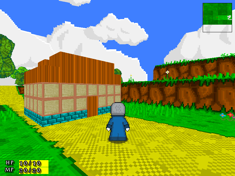
@theloathableone
its a procedurally generated retro rpg.(kinda like cubeworld if you've seen that)
heres the last trailer I made. It shows a bit more of the gameplay so far
https://www.youtube.com/watch?v=Uez37DRINIE
its a procedurally generated retro rpg.(kinda like cubeworld if you've seen that)
heres the last trailer I made. It shows a bit more of the gameplay so far
https://www.youtube.com/watch?v=Uez37DRINIE

Temple Telindra, "reskin" of the classic Refmap cathedral tiles. Really happy with how these came out. The only thing I think might be worth changing is the color of the walls, since it may be a little too similar to the original.


That looks pretty good both graphically and mapping-wise! Is Calladium still creating the custom stuff for the game? Those trees do remind me of REFMAP, but I don't recognize them completely.
EDIT: I feel like the left part of the grave/wall in the center could use an outline on the left side as well.
EDIT: I feel like the left part of the grave/wall in the center could use an outline on the left side as well.
She is! Yes, this tileset is mostly custom, aside from a few things. The trees are totally from scratch, and the cathedral tiles are all from scratch as well except that the layout and like... the size of the windows and things like that are all copied from Refmap, but none of their actual tilework was used (so far as I know).
Came out great and saves me from having to remap everything. I'm quite pleased.
Came out great and saves me from having to remap everything. I'm quite pleased.

I've been considering doing my exteriors, namely my towns and such. So, any thoughs?


Calladium's new stuff does use considerably less dithering than REFMAP so what's new is quite visible. I like the reduced dithering!
Good map.
@Phantasmi I think that looks a bit... Empty? Maybe its not the maps but the actual tiles, this floor tile looks rather flat and such, there's only so much you can do with that. I'd try to make it a little smaller maybe but I honestly am a bit tired of telling everyone to make their maps smaller, there are probably better ways to critique XD
author=JosephSeraph
Calladium's new stuff does use considerably less dithering than REFMAP so what's new is quite visible. I like the reduced dithering!
Good map.
@Phantasmi I think that looks a bit... Empty? Maybe its not the maps but the actual tiles, this floor tile looks rather flat and such, there's only so much you can do with that. I'd try to make it a little smaller maybe but I honestly am a bit tired of telling everyone to make their maps smaller, there are probably better ways to critique XD
Empty? @_@ me no follow o:
Lots of areas that show tiling very heavy, and I'm not particularily fond of how these tiles loop. May be a fault of the tileset, rather than the mapping.

LockeZ

I'd really like to get rid of LockeZ. His play style is way too unpredictable. He's always like this too. If he ran a country, he'd just kill and imprison people at random until crime stopped.
5958
Also get rid of the yellow overlay around the light fixture. Unless you're intentionally trying to create a blinding glare, you should always mask the areas without light, never the lighted area. Tinting the tiles is ok, but I'm 99% sure that's not tinting, that's actually a yellow circle you're overlaying on top of the map.
Also, much more importantly, the light bulb has a shadow. what the fuck. that is not how shadows work.
Also, much more importantly, the light bulb has a shadow. what the fuck. that is not how shadows work.
author=LockeZ
Also get rid of the yellow overlay around the light fixture. Unless you're intentionally trying to create a blinding glare, you should always mask the areas without light, never the lighted area. Tinting the tiles is ok, but I'm 99% sure that's not tinting, that's actually a yellow circle you're overlaying on top of the map.
Also, much more importantly, the light bulb has a shadow. what the fuck. that is not how shadows work.
Actually, that lamp comes with the shadow @_@ I didn't put it there myself
EDIT: I did tint the tiles, but, is the lighting too strong? Kind of slow, so, sometimes I don't get things very quickly~
author=Phantasmi
Actually, that lamp comes with the shadow @_@ I didn't put it there myself
...yeah we know. He's saying you should remove it.
About the tinting Lockez is complaining: Adding opaque colors on top of tiles like that doesn't look like proper lighting, let me do an example real quick:

lighing is what makes you see things, not what hides things from you. So it should never be opaque : )
Hope you're benefitting from this critique.
author=JosephSeraphauthor=Phantasmi...yeah we know. He's saying you should remove it.
Actually, that lamp comes with the shadow @_@ I didn't put it there myself
About the tinting Lockez is complaining: Adding opaque colors on top of tiles like that doesn't look like proper lighting, let me do an example real quick:
lighing is what makes you see things, not what hides things from you. So it should never be opaque : )
Hope you're benefitting from this critique.
I am only good at making interiors, exteriors, especially cities, I have zero experience in, so, any critique I receive, I make sure to follow up on~