


SCREENSHOT SURVIVAL 20XX
Posts
Red_Nova

Sir Redd of Novus: He who made Prayer of the Faithless that one time, and that was pretty dang rad! :D
9192
Badluck, the hooded man's angle doesn't seem to match up with the woman's or the environment's. Based on the positioning of his upper body, it looks like he's fighting something directly to his left instead of the woman.
The lighting on the man's right leg makes it look closer to the viewer's position than his left leg, which is a terrible stance to block an attack from. I get that it's following the light source from the ship cabin (or possibly the sparks from the weapon collision), but the lack of a proportion difference on the legs means that the one with the highlights will pop out more.
EDIT: Again with the page breaks. Welp, at least it's not my own screenshot this time.
Corfaisus

"It's frustrating because - as much as Corf is otherwise an irredeemable person - his 2k/3 mapping is on point." ~ psy_wombats
7874

Went out for a ride when I found myself outrunning a thunderstorm, bright flashes of lightning reflecting off my glasses. I decided to use this instance as inspiration for an in-game proverb. I may tweak it later, but this is what I came up with.
Essentially, lasting progress is rarely pleasantly made. Oftentimes it requires a jarring push, otherwise we'll end up rolling back on old habits.

I like it. Personally I tend to forget about coming up with good dialogue sometimes, with the rain of features that I try to shower my game with. This is a good reminder.
Also, that RTP makes me full of nostalgia goodness. Nice use of it.
//----
I'm not really good at making new sprites. Tried for a good few hours last night and got nothing worth showing. Then I decided to just try and edit the LoG ones a bit, make them a little less chubby, this is what I came up with:

In game, with one of Sphere's 2x filters:


Would love to hear feedback and suggestions.
Also, my game page got approved! yay!
https://rpgmaker.net/games/9695/
Also, that RTP makes me full of nostalgia goodness. Nice use of it.
//----
I'm not really good at making new sprites. Tried for a good few hours last night and got nothing worth showing. Then I decided to just try and edit the LoG ones a bit, make them a little less chubby, this is what I came up with:
In game, with one of Sphere's 2x filters:
Would love to hear feedback and suggestions.
Also, my game page got approved! yay!
https://rpgmaker.net/games/9695/

author=Corfaisus
Would make front side of the roof use blue roof tiles as well. Otherwise, looking good.
author=East
I'm not really good at making new sprites. Tried for a good few hours last night and got nothing good. Then I decided to just try and edit the LoG ones a bit, make them a little less chubby, this is what I came up with
Yeah, less chubby looks cooler.


@Momeka:
Not at all. So long as you keep a good bit of solid ground in the center of the player's view (as you did here), the peripheral animation is just sweet sweet eye candy.
Not at all. So long as you keep a good bit of solid ground in the center of the player's view (as you did here), the peripheral animation is just sweet sweet eye candy.

That looks pretty sweet
Looks good. I might take the animation of the water(?) boarder down a bit, though. That's the only thing that stands out to me as distracting.

The lamps, trees, and wooden posts kind of clash with everything else. The aforementioned tiles have a kind of a smooth, simplistic texture to them, where as everything else has sort of a highly detailed, grainy texture. Mostly just the grass and dirt pathways. The water and wooden bridge are in kind of a grey area where they could match with either or. I'd change one of the styles to fit the other to avoid mismatched graphics.
Other than that, looks great. I especially like the fish silhouettes in the river. Not something I often see done. Keep up the good work! uwu
Other than that, looks great. I especially like the fish silhouettes in the river. Not something I often see done. Keep up the good work! uwu

Finally getting around to working on the battle system for my game. This is the first enemy design I came up with.
author=Pancaek
Finally getting around to working on the battle system for my game. This is the first enemy design I came up with.
Looks great! The visual effects framing the scene really add to the creepy atmosphere.
A quick tour of the protagonist's house, from my current project:

Those graphics look awesome, they're not pixel art right? (Cant see the details on phone), looks more like vector art, and detailed!

@Pancaek That is amazing, I really like the style you went for. Kinda reminds of Hyper Light Drifter.


I like what I see here.
Look, I've made some cavern tiles...
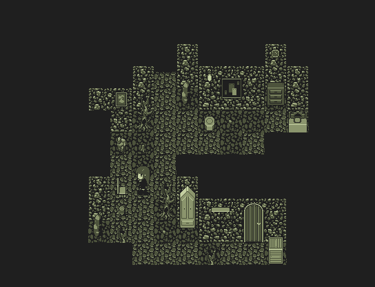
Still WIP, of course. My plan is to create some new floor tiles that are less detailed to give contrast to the walls and other detailed fluff.
Look, I've made some cavern tiles...
Still WIP, of course. My plan is to create some new floor tiles that are less detailed to give contrast to the walls and other detailed fluff.

author=Miraki'm guessing hand drawn
they're not pixel art right?
author=Momekagive the shields eyes, because skulls > shields
Spinning shields, the best kind of protection

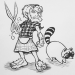
pay your toll to the snowtroll

You gotta pay the snowtroll's toll to get in!
Snowtroll!
What'd you say?!
Snowtroll!
Snowtroll!
What'd you say?!
Snowtroll!

