


SCREENSHOT SURVIVAL 20XX
Posts

author=bulmabriefs144
Is that guy lifting a grandfather clock?
nah it's just an ITEM GET pose because the potion happened to be inside the clock or something.

i suck at making gifs lel
author=Frogge
Insert my obligatory pixel clash and autoshadow complaint here.
Can I ask what you mean by pixel clash here? It's not a term I've heard before. Sorry if it's a stupid question. I'm kind of new to pixel art, and just picked it up by looking at and trying to emulate the art in some of the games I played growing up rather than by reading tutorials and the like, so I'm not really familiar with a lot of the terminology and common pitfalls just yet.
author=Mary 4D
nah it's just an ITEM GET pose because the potion happened to be inside the clock or something.
i suck at making gifs lel
I really like the style of your graphics. :) Did you draw the tiles yourself?

My pixel clash comment was directed at Mary 4D
It basically means that all the pixels aren’t the same size. In Mary’s case, the font and the potion icon are 1x1 pixels while everything else is 2x2.
The same issue is in Link’s image what with the sword either being 3x3 or 4x4 while everything else is 2x2.
It basically means that all the pixels aren’t the same size. In Mary’s case, the font and the potion icon are 1x1 pixels while everything else is 2x2.
The same issue is in Link’s image what with the sword either being 3x3 or 4x4 while everything else is 2x2.
author=Frogge
My pixel clash comment was directed at Mary 4D
It basically means that all the pixels aren’t the same size. In Mary’s case, the font and the potion icon are 1x1 pixels while everything else is 2x2.
The same issue is in Link’s image what with the sword either being 3x3 or 4x4 while everything else is 2x2.
Ah, yeah, I knew you were talking about Mary 4D's image. I was just curious about what you meant, as it wasn't a phrase I was familiar with. Thanks for the explanation! :) I hadn't really looked all that closely at the font and the icon, but I get what you mean now.
Except that’s not an excuse not to fix it because it looks fucking horrendous

@Frogge
In some cases I don't see it as an issue.
Font for instance feels separated from the game world. Its not something the characters in game would be able to see, just us as an observer so it feels ok.
The potion is part of the world and should match the pixel size of the rest of the world.
And as for the sword in Links legend 3 images the less said the better.
they made it a pixel font so I don’t see any reason why not to go the extra mile to make it not clash
setting the font size to 16 (given that the font is 8) and removing the outline should solve the issue.
It’s good to keep things consistent, part of the game world or not. I feel like your point kinda makes it sound like it’s okay to put fully pink, vibrant ui in a silent hill game because the ui is seperate.
Edit: you should always remove the default rm text outline anyway tbh


not quite done (i need a few more details) but i won't be able to work on it tomorrow so
edit: oh my god i have to move that stove/counter up a few pixels, it's bugging me so much

Ive been experimenting with giving Shooty and the Catfish more of a Gameboy Color aesthetic and making its aspect ratio the same as the GBA instead of the original Gameboy. Getting mixed feedback from folks.


@Visitors: I' say keep the original. While the new art looks good there is nothing wrong with the old look. And remaking all the art feels a bit like a feature creep that will just take up a bunch of your time.
author=Momeka
@Visitors: I' say keep the original. While the new art looks good there is nothing wrong with the old look. And remaking all the art feels a bit like a feature creep that will just take up a bunch of your time.
I'm so glad you said feature creep, that's why I scaled the game down in the first place. Ill save these changes for my next project or a potential DX version down the road. I just need to focus on getting this thing done and released.

@Craze:
I think the main room needs a bit more colour along that back wall. Right now it's very... grey/brown. Even the carpets are from Big Bill's Brown Bazaar. The kitchen is nice and colourful! Be more like the kitchen, main room.
@visitors:
Doing the entire game in regular GB and then later releasing a refined/updated version as a "DX" version sounds like the perfect solution, and nets you a lot of extra nostalgia points, too!

@visitorfromdreams: I really like the palette and custom art. I think perhaps the character should be in the same perspective as the rest of the scene?

(I had fun with your little character, really like the design of it).
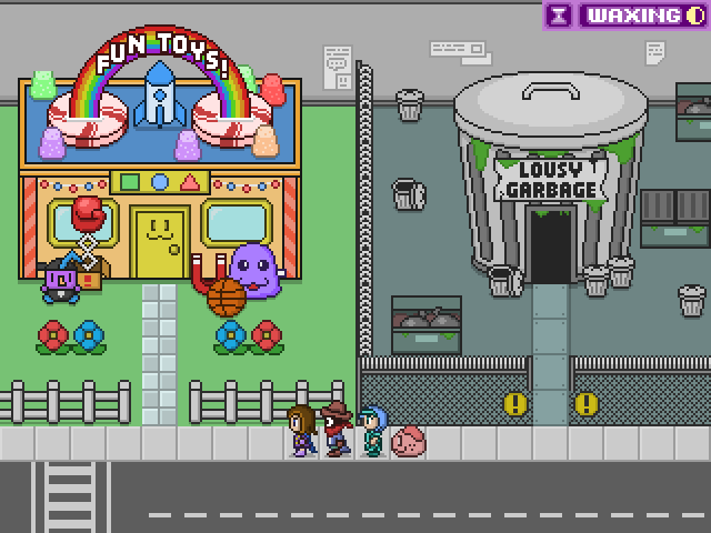
Great stuff, I like the humor. Perhaps adding texture to the grass/pavement would be something to consider? Just a suggestion.
I'd like some feedback on my own screen please. It's a gamebook (like fighting fantasy) with both text and visual representation.

Here are my questions:
1. Font readable enough?
2. Would it be better to align all four tabs? It looks better but it makes less sense page positioning wise.
3. Is the separation between book and the game area distinct enough?
4. Is there enough text being displayed at once?
5. Is the text spaced out enough, it is easy to read enough?
(I had fun with your little character, really like the design of it).
Great stuff, I like the humor. Perhaps adding texture to the grass/pavement would be something to consider? Just a suggestion.
I'd like some feedback on my own screen please. It's a gamebook (like fighting fantasy) with both text and visual representation.
Here are my questions:
1. Font readable enough?
2. Would it be better to align all four tabs? It looks better but it makes less sense page positioning wise.
3. Is the separation between book and the game area distinct enough?
4. Is there enough text being displayed at once?
5. Is the text spaced out enough, it is easy to read enough?
Kaempfer
@Craze:
I think the main room needs a bit more colour along that back wall. Right now it's very... grey/brown. Even the carpets are from Big Bill's Brown Bazaar. The kitchen is nice and colourful! Be more like the kitchen, main room.
hmm, i agree. good eye.
toaster_team, i think making the lines lighter or raising the text up 1p would help legibility. i'm bad at differentiating blues/purples and the lines aren't doing me any favors here.
if this is a short segment, the font is fine. if not, get a sans-serif font meant for tiny resolutions.


@toaster - there's a part that reads "or going to back to welfare" one too many 'to' me thinks!
edit: Much more readable though!
edit: Much more readable though!
Oh yes, you're right! I'll fix it, I have yet to proofread anything.
Just so we remain on topic:

This is still WIP which is why it looks incomplete though. Any criticism, any nitpicking would be great.
Thanks.
Just so we remain on topic:
This is still WIP which is why it looks incomplete though. Any criticism, any nitpicking would be great.
Thanks.


