


NEW DEVELOPER MAPPING HELP THREAD
Posts

Deleted..
I can't somehow put a spoiler tag?
Will edit this when I figured it out
EDIT: I got way too used with RMW.. I discovered you use hide tag here!
Any feedback is welcome. I am willing to improve.:)
I can't somehow put a spoiler tag?
Will edit this when I figured it out
EDIT: I got way too used with RMW.. I discovered you use hide tag here!


Any feedback is welcome. I am willing to improve.:)
@Haroo
It seems like you know about shiftmapping already, which is good, you just haven't learned to apply it properly yet. Some cliffs are not properly mapped plus the ponds with the hedges over them have some depth issues. Let me try and explain how you can improve these.
Here's a little tutorial on how you can better map ponds with things going above them.
When you want to map ponds or any body of water with something going over them, it's always best to map the body of water first, like so:

After that you want to map the area that is gonna go above the water:

After you have done that, you can use shiftmapping (shift + right click) to copy the segments that go above the water and then use shift + left click to place them where you want without altering any of the adjacent tiles:

And voila! You should now have a hedgerow going over your pond without the pond losing any feeling of depth!
Here's also a gif showing the enetire process:

In general, just mess around a lot with shiftmapping and you'll get used making some neat maps very fast. You can apply this method to anything really, not just bodies of water. Like for example grass.
It seems like you know about shiftmapping already, which is good, you just haven't learned to apply it properly yet. Some cliffs are not properly mapped plus the ponds with the hedges over them have some depth issues. Let me try and explain how you can improve these.
Here's a little tutorial on how you can better map ponds with things going above them.
When you want to map ponds or any body of water with something going over them, it's always best to map the body of water first, like so:
After that you want to map the area that is gonna go above the water:
After you have done that, you can use shiftmapping (shift + right click) to copy the segments that go above the water and then use shift + left click to place them where you want without altering any of the adjacent tiles:
And voila! You should now have a hedgerow going over your pond without the pond losing any feeling of depth!
Here's also a gif showing the enetire process:
In general, just mess around a lot with shiftmapping and you'll get used making some neat maps very fast. You can apply this method to anything really, not just bodies of water. Like for example grass.

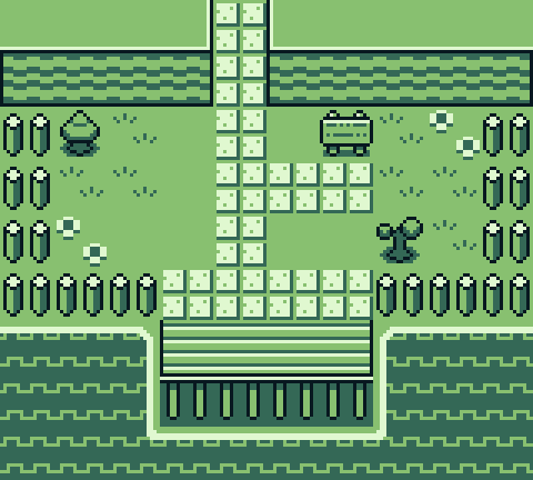
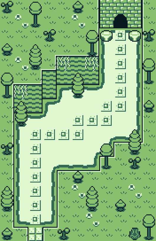
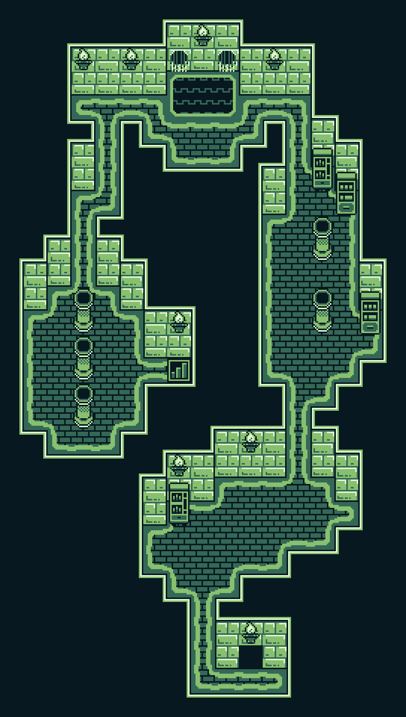
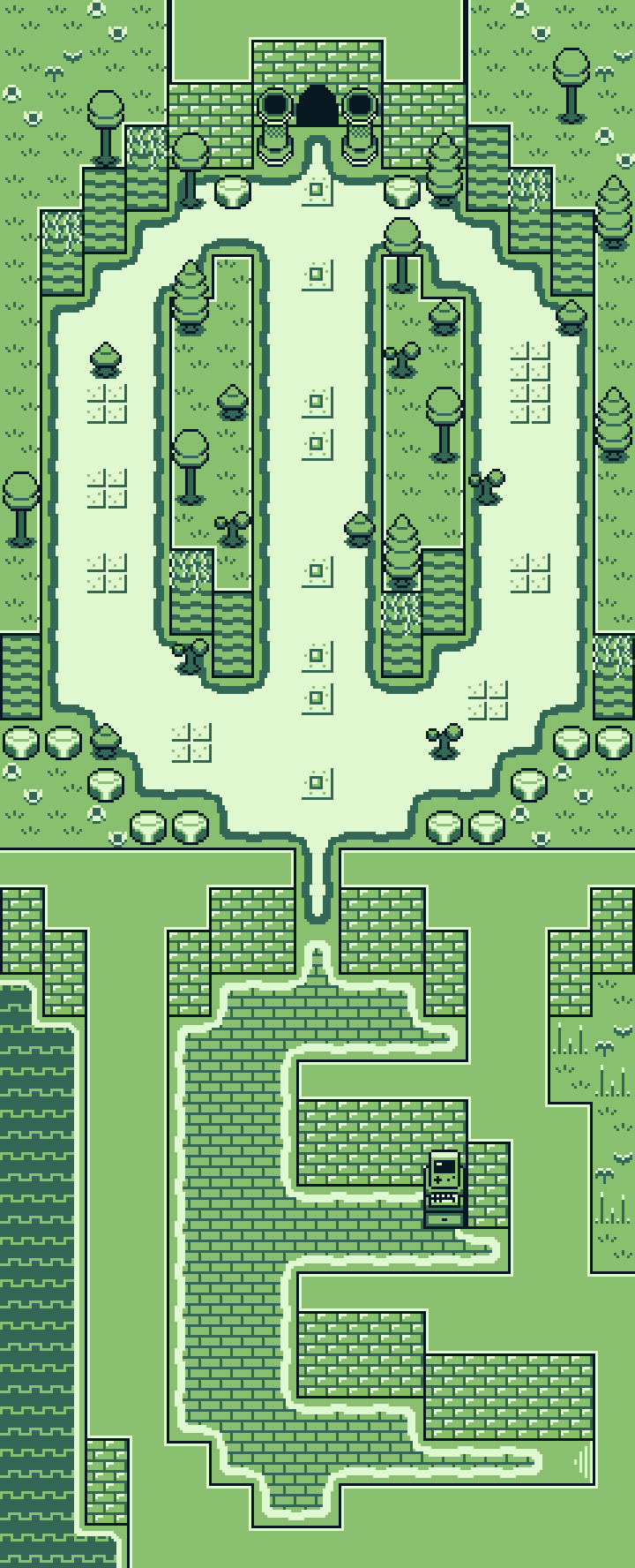
Working on some mapping for my second game project Shooty and the Catfish, a game that's sticking largely to the limitations of the original Gameboy. These maps don't have the events in them in these screens but I would love some feedback! Im a big lover of compact maps, and the game will have on map encounters so I need space to set up patrols and ambushes etc. These maps make up the tutorial area.
Thanks in advance folks!
Thanks in advance folks!

These look mostly great, visitor. Space-wise they're super functional and balanced.
You might want to try shift-mapping, tho. Just hold shift while right-clicking on a tile on a map and placing it to get the exact copy of that tile. With this you can make water end where you need it to.
You might want to try shift-mapping, tho. Just hold shift while right-clicking on a tile on a map and placing it to get the exact copy of that tile. With this you can make water end where you need it to.
author=Cap_H
These look mostly great, visitor. Space-wise they're super functional and balanced.
You might want to try shift-mapping, tho. Just hold shift while right-clicking on a tile on a map and placing it to get the exact copy of that tile. With this you can make water end where you need it to.
Thank you!
A few other people have brought up the water issue. I actually did it as a design choice, I feel like the game (VX and MV games in general) has too many harsh edges. Water in real life tends to either have sand, moss, guttering etc around it which is something I wanted to try to capture. Im sure I will use the more traditional shift based tiles (around things like bridges and the like in some later areas) but yes, your not the first person to think that those auto tiles were a mistake ha ha.

I'm still getting used to the mapping and all that I still dont feel like im great but I think i might be improving i dunno its always good to hear what other people think I have redone thing map a few times but these are the ones i like the most i fee like that need some where though i am not sure where to start whihc why i am coming here.
i felt like this first was too spacey and big but i liked the lay out of it

I liked the size of this one and the differences in the lay out

i was introduced to partials not too long ago so i tired a few partial plants at the bottom of the screen i dont know if i like them though
i am also not fully done with the map i want to tint it as well so its darker
i felt like this first was too spacey and big but i liked the lay out of it
I liked the size of this one and the differences in the lay out
i was introduced to partials not too long ago so i tired a few partial plants at the bottom of the screen i dont know if i like them though
i am also not fully done with the map i want to tint it as well so its darker

I'd make it even smaller, Rouge. Does each room need a bookshelf, a closet and a dresser? Do the rooms need to be as tall as they are? Do you need a computer desk and a reading desk right beside one another?
I'd suggest 1-2 large pieces of furniture per room, reduce the height by 2 and the width by 3 or 4. Obviously, you'll need to remove the number of boxes and bloodstains as well, but you won't lose anything by doing that.
Don't forget windows and doors.
I'd suggest 1-2 large pieces of furniture per room, reduce the height by 2 and the width by 3 or 4. Obviously, you'll need to remove the number of boxes and bloodstains as well, but you won't lose anything by doing that.
Don't forget windows and doors.
its closed off for a reason unless i make another map i have no need for doors other than that thank you ^^

Also, the middle partition has a 1 high wall when it should be the same as the other walls connected by that ceiling tile (meaning, 2 high). Think of it this way - the bottom of the wall is sitting on the same level as all the other walls in the room. They're also connected to the same ceiling, meaning that they're the same height. Thus, the walls should all be the same amount of tiles when the same floor and ceiling are touching them.
You can really cut down the sizing a LOT more, as Badluck pointed out. You can also make use of the idea of there being space behind the bottom wall (since it's two high, then there's two tiles of space behind it - you've kinda done that with the plants but you can do more) to add some overlap and give the room a more realistic feel, whilst adding more detail. Nab some edits (there's plenty out there for sprucing up maps) that include cabinet tops and side-view cupboards, putting them on an E Tile.
For example:

The rooms are much smaller, there's less junk trying to fill the areas up, and cabinet top/sides make it seem like there's room behind the bottom walls.
You can really cut down the sizing a LOT more, as Badluck pointed out. You can also make use of the idea of there being space behind the bottom wall (since it's two high, then there's two tiles of space behind it - you've kinda done that with the plants but you can do more) to add some overlap and give the room a more realistic feel, whilst adding more detail. Nab some edits (there's plenty out there for sprucing up maps) that include cabinet tops and side-view cupboards, putting them on an E Tile.
For example:
The rooms are much smaller, there's less junk trying to fill the areas up, and cabinet top/sides make it seem like there's room behind the bottom walls.


Trying to make a tower kind of like Rapunzel, princess is hidden at the top blah blah. I need help getting the the tower to look better because I know it doesn't really look good. For the ground tilesets I'm using one of Mack's resources.

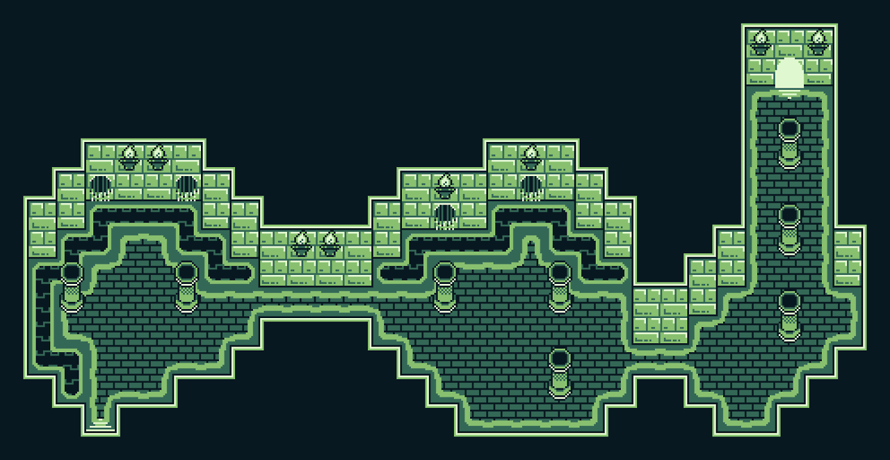
I think I'm a pretty decent mapper, I had to relearn everything from being out of this for so long though. Though I found out that after I gave myself a 'refresher course' I've been pretty solid. I'm currently working on this map, which still needs a TON of work... (god, why do I make maps so sprawling?!?!) This one I think sit's at 85 x 100. So... be brutal, don't care, been doing RPG Maker since 99.
PS: I know I leave a ton more open to connect to the next map, I can't stress how this isn't an issue with the type of script I'm using. I just need to align it up to the previous map.
PSS: Can someone give me pointers on how to post... idk... a small thumbnail of a screen or a smaller screenshot maybe so I don't fudge up the forums too much. =C
Hello guys, I am back!
@OzzyTheOne Thanks for the tip. Highly appreciate it and will apply it to the maps to come
@Aneko I prefer the skeletons are reduced to one? I dunno. IMO, a single dead body that's interactable and the reaction of the MC to it can give much impact?
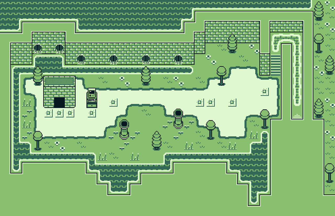
Here is a map I was supposed to use. But story changes in the game development makes me think it won't be implemented. I kind of post it here to gain feedback to improve myself.
NOTE: I kind of intentionally made it without too much details. I am stumped on what details can I insert without it being crowded? Thanks :) Any opinion/suggestions for that matter is welcome.
@OzzyTheOne Thanks for the tip. Highly appreciate it and will apply it to the maps to come
@Aneko I prefer the skeletons are reduced to one? I dunno. IMO, a single dead body that's interactable and the reaction of the MC to it can give much impact?
Here is a map I was supposed to use. But story changes in the game development makes me think it won't be implemented. I kind of post it here to gain feedback to improve myself.

NOTE: I kind of intentionally made it without too much details. I am stumped on what details can I insert without it being crowded? Thanks :) Any opinion/suggestions for that matter is welcome.
LockeZ

I'd really like to get rid of LockeZ. His play style is way too unpredictable. He's always like this too. If he ran a country, he'd just kill and imprison people at random until crime stopped.
5958
What... is it? Like, those stone structures aren't connected to each-other, and I don't understand their purpose at all. Are they supposed to be watch towers? They aren't tall enough to see over the... whatever that green barrier is supposed to be around the settlement. What is that U-shaped structure blocking off the south entrance supposed to actually be?
Speaking of that green barrier around the settlement, don't use that. I have no idea what you're trying to do with it, but it's not meant for that and it doesn't make any sense. It's designed to be used in a hedge maze...
Once you figure out what this place IS, and what each of these buildings is used for and who lives there, then decorations will become a lot easier for you to figure out. People will fill the empty spaces with the tools and carts and tables and structures that are needed for whatever it is they are doing there.
The overall structure of the "town" looks pretty obnoxious, by the way. Visually the buildings look far enough apart that the player should be able to walk between them, and it makes absolutely no sense for someone to build a house where their front door can only be accessed by climbing across someone else's roof. It's good to create a shape and structure for your town, but you overdid it. I think you can add gaps between the buildings and still keep the spirit of what you were going for.
Thank you @LockeZ
Actually, the village is supposed to be a place where the magical hedge maze cannot invade..hence, the green barrier thingy. But I see your point and I am willing to improve.
Now I am stumped how to deliver a settlement with the above setting in mind.
Actually, the village is supposed to be a place where the magical hedge maze cannot invade..hence, the green barrier thingy. But I see your point and I am willing to improve.
Now I am stumped how to deliver a settlement with the above setting in mind.
Apparently, I messed up my maps so badly that my game page got denied. This is the style I want to use.
https://rpgmaker.net/media/content/games/9476/screenshots/newscreen2.png
https://www.rpgmakerweb.com/a/rpg-maker-mv-tileset/fantastic-buildings-medieval
https://youtu.be/AwWYoB0xa84?t=150
Catch is, I want to have taller sprites in order to use this style. Using the chibis doesn't help.
These are the maps I ended up making.
https://rpgmaker.net/media/content/games/10684/screenshots/Screen_Shot_20180811_at_33706_PM.png
https://rpgmaker.net/media/content/games/10684/screenshots/Screen_Shot_20180811_at_23857_PM.png
https://rpgmaker.net/media/content/games/10684/screenshots/Screen_Shot_20180811_at_25652_PM.png
https://rpgmaker.net/media/content/games/10684/screenshots/Screen_Shot_20180820_at_32705_PM.png
Corfaisus

"It's frustrating because - as much as Corf is otherwise an irredeemable person - his 2k/3 mapping is on point." ~ psy_wombats
7874
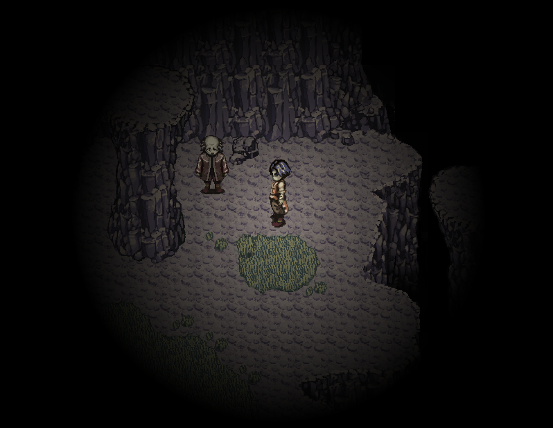
I don't see the problem with your maps. Obviously we all have room for improvement, but only the first one is truly "bad", and that's only because there should be variation to a naturally occurring cave.
Can you provide what exactly the denial message said?
Can you provide what exactly the denial message said?
author=Corfaisus
I don't see the problem with your maps. Obviously we all have room for improvement, but only the first one is truly "bad", and that's only because there should be variation to a naturally occurring cave.
Can you provide what exactly the denial message said?
Denied
Reason: Mapping needs a bit of work when it comes to understanding tile usage. I recommend checking out some tutorials and making use of feedback threads.
Corfaisus
"It's frustrating because - as much as Corf is otherwise an irredeemable person - his 2k/3 mapping is on point." ~ psy_wombats
7874
Well, if it's tile usage, then there's only a few things I could recommend.
Number 1: I'm not certain what the tile around the room is supposed to be, but it almost seems like it should be a wall tile? I don't know. One thing I know for a fact is that there is an autotile specifically for the walls of the cave so that they're not 1x1 tiles like you have along the northern edge. The shadow tool is used much too frequently in this map, I'd say.
EDIT: Also, the tile used for the floor of this room should be for the raised platform near the stairs and that tile exchanged for the floor. That way you'll have a border around the raised part.
Numero dos: Basic, yes, but there's absolutely nothing "wrong" with it aside from the roof tile being used as a ceiling tile. There should be tiles with clear borders around them on all sides; these are the ceiling tiles.
Ah-three *crunch*: This is by far your best map. The desk near the lamp perhaps should be against the wall, but the only thing that absolutely should be fixed is the wall by the door. You used two tiles for the height of the room, so that should be the height of the wall at the door. I can tell what you were going for with using the top of the cabinet as a threshold, but it's simply incorrect.

author=MagiaVW
Apparently, I messed up my maps so badly that my game page got denied. This is the style I want to use.
https://rpgmaker.net/media/content/games/9476/screenshots/newscreen2.png
https://www.rpgmakerweb.com/a/rpg-maker-mv-tileset/fantastic-buildings-medieval
https://youtu.be/AwWYoB0xa84?t=150
Catch is, I want to have taller sprites in order to use this style. Using the chibis doesn't help.
These are the maps I ended up making.
https://rpgmaker.net/media/content/games/10684/screenshots/Screen_Shot_20180811_at_33706_PM.png
https://rpgmaker.net/media/content/games/10684/screenshots/Screen_Shot_20180811_at_23857_PM.png
https://rpgmaker.net/media/content/games/10684/screenshots/Screen_Shot_20180811_at_25652_PM.png
https://rpgmaker.net/media/content/games/10684/screenshots/Screen_Shot_20180820_at_32705_PM.png
The third and fourth map literally do not look like they were made by the same person as the first and second map. I am bamboozled.
Edit: Actually, I did spot a couple incorrectly used tiles in Map #3, I think. Namely, I'm pretty sure that the thing you have as a "doorway" is supposed to be the top of a cabinet, like the other cabinets in the map.

