BUFFS AND DEBUFFS
Posts


rasalhage - Today at 20:20
alright post it
(and put small text implicating me at the top thx)
Should buffs, positive effects, and stat boosts be red/orange? Or should they be green/blue?
This is a complicated and sensitive design choice that dramatically impacts how players approach your game. Setting the mood associated with your increases and decreases affects the overall tone of your menus, battles, and subtly nudges the immersion of your player. But how should you assign colors to the realms of "positive" and "negative?"
Red is often cited as a passionate, zealous color that signifies conflict. It attracts the eye more than any other hue, and is the first thing a player will notice on their interface. But does that mean it's better suited for indicating what a player gains, such as a big attack jump from a new weapon? Or should it be used to bring attention to urgent debilitations that require immediate attention?
Blue is, by contrast, often associated with calm and collected emotions. It encourages the player to carefully consider their options available. But does that mean it should be used to reassure the player that their powerful damage buff is in effect? Or should it be used to remind them that for every point they greedily gain one one stat, another stat must suffer?
Green and Yellow sometimes play into these dynamics, serving as comforting and peaceful colors. They can help the player find solace in increased strength, or they can take the sting of off nasty ailments. Do these have any place in your game, or do you require something more polar?
These colors can adjust the mood of anything in your UI, from damage and healing fly text, to equipment previews, to help text and ability descriptions, to even health and resource bars!
Where SHOULD these colors be used? What's the correct way to use them? And, more importantly, which methods are wrong?

To me the tried and true is Red for damage, Blue for buffs, Green for healing. Yellow can sometimes be a bit poisony maybe. Also armour. I believe in Mass Effect it was armour. Though that was for bars. Red for health, Yellow for armour, Blue for shield.
I guess that is also similar to the old red health, blue magic, yellow stamina or random third stat.
Except for health bars changing a text colour red is rarely good. Like if it used to be neutral white and it's suddenly red then that usually (nearly always) means something is wrong. So if there was something that was wrong it would be red as a plus. Unless it was themed very well. (like the colour-coding being elements so red is fire or whatever)
Like red is incredibly well established so trying to buck that trend is always going to be a bit of a challenge.

Red is very typically associated with damage and health in video games. Sometimes green can be too (health bars are frequently red or green) but when you take damage, your screen flashes or tints red.
I'd argue that red is definitely the right color for negative effects, while green or blue are better for positive effects. That said, this depends entirely on your game's battle system, and isn't universal - an FPS operates differently than an RPG. Someone glowing red in an FPS or third-person action game means they're "dangerous" or "powered up" - typically this is an enemy, but it might be you after using a special item.
One thing I would highly recommend, at least for RPGs, would be keeping things the same between you and your enemies - if blue effects are good for you and red effects are bad for you, blue effects on your enemies should be good for your enemies, etc. Again, there can be exceptions, especially by genre: games like Overwatch use red to signify "bad for you, specifically" so that you know if you see something giant & glowing red, you want to avoid it (and something glowing blue is good for you).
The long and short of it is you probably want to consider what makes the most sense based on genre conventions, and playtest plenty to make sure.
LockeZ

I'd really like to get rid of LockeZ. His play style is way too unpredictable. He's always like this too. If he ran a country, he'd just kill and imprison people at random until crime stopped.
5958
I try not to use color as the sole way to communicate whether something is good or bad, since I can't remember how the different types of color-blindness work and which pairs of colors look different to everyone. Or if I do, I make sure that the only colors I use are white, gray, and one other color, because there's no type of color-blindness that makes other colors look white or gray (I'm pretty sure) (edit: NOPE I WAS WRONG ABOUT THAT ONE). Gray is a color that very clearly communicates "don't do this," so it's good for showing things like reduced stats when choosing equipment or a poor score after completing a stage, but it's not as good for showing debuffs in battle because that's not what you're trying to communicate.
Like Slash said, red communicates "danger" and therefore is good for... enemy buffs or player debuffs. You should definitely not use the color for opposite meanings like that though! That's super confusing! Gold communicates "shining power-up" so I use that for buffs on both sides instead. Then for debuffs I can either use gray, or just use my normal text color (whether that's white or black).
But seriously WTF is up with that screenshot of a menu on the upper right where the increased stat numbers are red and decreased ones are blue? That's confusing as hell. Don't do that.
Edit: The correct nomenclature is "BUFFS AND DUFFS"

author=rhyme
Where SHOULD these colors be used? What's the correct way to use them? And, more importantly, which methods are wrong?
You have to be careful about not using the WRONG methods for colors. For every three buffs, you need to change colors. Otherwise, the unbroken pattern looks inorganic. For example, you will be shunned if you display four buffs of the same color.
With stats, we have a bit more leeway. Because an equip menu is an inherently inorganic space, we can having potentially all stats with the same color as their amount changes in the same direction. What's important instead is what stats you increase or decrease - I suggest alternating stats, or doing pairs. For example, ATK up, DEF down, MAT up, MDF down would create a pleasant green-red-green-red pattern. G-G-R-G, conversely, would look like shit and should never be done.
I've seen red as good in football games. Where red basically means being on a "hot streak" while turning the bad into blue ("cold"). I think maybe International Superstar Soccer did this with smiley faces and red-to-blue colours. (though for some reason I also recall a green there in the middle meaning "Good, but not hot".
author=Shinan
Like red is incredibly well established so trying to buck that trend is always going to be a bit of a challenge.
author=LockeZ
But seriously WTF is up with that screenshot of a menu on the upper right where the increased stat numbers are red and decreased ones are blue? That's confusing as hell. Don't do that.
This is actually exactly what I meant! I don't SEE red being such an established color for "bad". I come from playing a lot of games where they use red/orange as the "positive" color and blue as the "negative" color, extending all the way to yes, stat changes! It came to mind when I was discussing my buff icons with a friend and he pointed out that they were upside down because he expected the buffs to be blue and debuffs to be red, while I had the natural instinct otherwise. Show me a picture of a game where the negative stats are red and it made me do a double take.
Also all the screenshots on the right side are games that use red as a positive color! (default rm only applies that to the standard buff icons though!)
Red is often used as a color for happiness, courage, success, strength, and fortune and so on, especially in China (see all their red ceremonial stuff? thats why), while blue can also just as easily indicate damage (turning blue, bruise, sadness, torment)
Notably, green is almost never used for a negative effect, though. At most, it would be the color for Poison visual effects or icons. Generally when green is paired with red, red becomes a negative color, but when paired with blue, it's not always the case.
While the opening post is worded rather divisively (its all chaos) I feel there is definitely a solid ground to think that "red is strong and blue is weak" can easily be communicated to a player. (Also because some of the games I've been recently playing do that color coding its been working on me)
On the other hand, I have a hard time seeing blue being used to signify something positive. Blue, as much as I try to interpret it, doesn't really scream "powerful" at all. Its loyal, humble, and calming, but it isn't "strong". I feel like it is wrong to use blue as a "buff" outside of maybe MP regeneration/healing/protective effects.
Bloodborne is one of those games where they change the positive stat increases to red, and the negative to blue. It still throws me off.
One thing to consider, if you want to use red for a positive increase, is perhaps changing the negative not to blue, but to yellow. I believe there was a psychological study that explained how yellow was a naturally unsettling color. It could provide contrast, symbolizing caution.
Alternatively, instead of red and blue numbers, maybe green and yellow? Green tends to resonate with people as a color for growth, vitality, development. So if I see a stat screen with green and yellow, I immediately know which one is good.
Also a good color for consideration, is orange. It can be rather enthusiastic, without being as intense as red.
LockeZ
I'd really like to get rid of LockeZ. His play style is way too unpredictable. He's always like this too. If he ran a country, he'd just kill and imprison people at random until crime stopped.
5958
Like Gredge said, you can get away with one weird color as long as the opposite one you're pairing it with makes sense. However, I really don't think yellow makes sense for a penalty.
Green/red as a pair of colors instantly communicates good/bad without even having arrows because practically every human being on the planet will associate that pair of colors with traffic lights, at least on a subconscious level. But the problem is that red-green color-blindness is the most common type of color-blindness, affecting about 5% of men. Which I'm pretty sure is basically the only reason why any other pair of colors is ever used. So... if you're gonna use red and green, at least use different shades of red than green. For example, make the green lighter and slightly yellow tinted, and the red somewhat desaturated. This will create noticable contrast between the two colors even to a color-blind person.
Green/red as a pair of colors instantly communicates good/bad without even having arrows because practically every human being on the planet will associate that pair of colors with traffic lights, at least on a subconscious level. But the problem is that red-green color-blindness is the most common type of color-blindness, affecting about 5% of men. Which I'm pretty sure is basically the only reason why any other pair of colors is ever used. So... if you're gonna use red and green, at least use different shades of red than green. For example, make the green lighter and slightly yellow tinted, and the red somewhat desaturated. This will create noticable contrast between the two colors even to a color-blind person.

I'm constantly surprised by strategy games that use red for my chars and blue or green for enemies.
Generally, these are how I associate colors:
Red & Orange = damage, HP, fire
Green = healing, sometimes poison, nature/plant
Blue = MP, buffs, water/ice
Yellow (Gold) = criticals, air/lightning
For those concerned about colorblindness, the safest colors seem to be Purple, Orange, Yellow, Cyan, and of course White and Black.
https://24ways.org/2012/colour-accessibility/
(A site I found one day when I was wondering if it was even possible to make a colorblind accessible CCG.)
LockeZ
I'd really like to get rid of LockeZ. His play style is way too unpredictable. He's always like this too. If he ran a country, he'd just kill and imprison people at random until crime stopped.
5958
No one ever wrote the word WARNING! in all caps in blue.
LockeZ
I'd really like to get rid of LockeZ. His play style is way too unpredictable. He's always like this too. If he ran a country, he'd just kill and imprison people at random until crime stopped.
5958
OK, but I absolutely guarantee that the next three posts in a row after this one will not all do that also. I feel sure about this one.
The way I see it color doesn't matter as much as the symbol. A plus/minus, or arrow up/down. If you don't have any symbol it doesn't matter which colors you pick, people will be confused.
I don't see any method as right/wrong. Basically the dev picks something and the player learns it. Everybody will have different ideas and choices anyways. I can't imagine any consensus on this heh
I don't see any method as right/wrong. Basically the dev picks something and the player learns it. Everybody will have different ideas and choices anyways. I can't imagine any consensus on this heh

LockeZ
But seriously WTF is up with that screenshot of a menu on the upper right where the increased stat numbers are red and decreased ones are blue? That's confusing as hell. Don't do that.
Rhyme
Red is often cited as a passionate, zealous color that signifies conflict. It attracts the eye more than any other hue, and is the first thing a player will notice on their interface.
I actually think a teal-y blue will attract the eye more than any shade of red will ever do. Of course, it depends on which is your background color, the overall colors used in the system composition etc. but hey:

As you can see the bright, strong tealy blue draws much more attention than the red on a dark background, which makes what lockez cited look extremely bad (the debuff blue is drawing more attention than the buff orangey-dull-red)
anyway not a definite input and im not sharing an opinion but just reminding that relative values are something we often wind up ignoring in these situations (ie. the colors' effects on eachother)
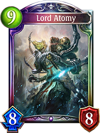
Here's a new one from a CCG I just tried out:
Green = mana cost
Blue = attack
Red = defense (actually health)
Green = mana cost
Blue = attack
Red = defense (actually health)