


FAVORITE EXAMPLES OF MENU DESIGN?
Posts
Pages:
1
What are some of your favorite examples of menus in video games? Either from purely a functional standpoint, or sheer aesthetics. Post specific examples!
One beautiful example I think about often is the menu for Dishonored.
Wish I could find a video that showcases the in-game menu, but man. It's pretty!
What else?
One beautiful example I think about often is the menu for Dishonored.
Wish I could find a video that showcases the in-game menu, but man. It's pretty!
What else?

Fixed the youtube link for ya. You gotta use the full https://www.youtube.com/watch?v=D4raZ7J5l38 like that for youtube tags. And no extra bits. It's a little finicky. >.<;
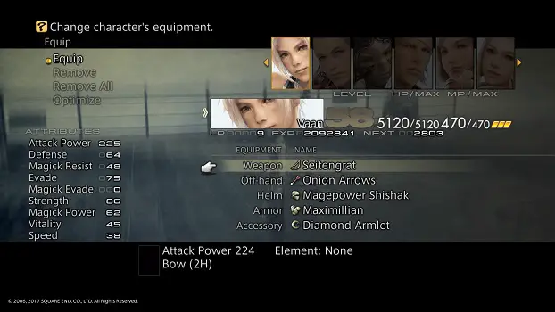
Menu design, huh? I think Persona 5's menu design is super classy and slick. I prefer more stylistic, minimal choices personally, with sharp looks and graphical consistency. Easy to read and understand, easy to use but looking good.
Menu design, huh? I think Persona 5's menu design is super classy and slick. I prefer more stylistic, minimal choices personally, with sharp looks and graphical consistency. Easy to read and understand, easy to use but looking good.
I love Dark Cloud's menu. If your game requires heavy menu use, it's nice to have a menu that you don't mind spending time in. Dark Cloud is very good for that.
Oh another thing I forgot to mention is menus that you don't need to faff about in to actually do what you want. So ones where it uses good controls and you can go in and out really fast if need be.
(One thing I really don't like and wish would be done away with is the floaty menus where you have to wait until you can do something. Granted, Persona 5 has this issue but it's so stylish that I don't mind waiting a second to get into the meat, but most other games just have it like, load for a second before you can move your cursor and it's like... I don't care about your floaty ass windows, just send me in coach.)
(One thing I really don't like and wish would be done away with is the floaty menus where you have to wait until you can do something. Granted, Persona 5 has this issue but it's so stylish that I don't mind waiting a second to get into the meat, but most other games just have it like, load for a second before you can move your cursor and it's like... I don't care about your floaty ass windows, just send me in coach.)

Simplicity of basic source menus is one of my all times favourites. I think more complicated fancy looks often look off. They don't trust the game to sell on its own. Many small games and walking sims have very pleasant menus too. Sacramento and Proteus might be 2 3d examples. FTL and Into The Breach 2d examples.
And ofc, I love various Might and Magic menus.
And ofc, I love various Might and Magic menus.
author=narcodis
One beautiful example I think about often is the menu for Dishonored.
Damn, now I want to have a title screen of this quality for my own games.
Personally, I like this type of main menu especially in strategy games.
author=Cap_H
Simplicity of basic source menus is one of my all times favourites. I think more complicated fancy looks often look off. They don't trust the game to sell on its own.
I see your point here. However, the title screen is the first thing you see about a game and therefore it's important for the first impression. That's why I understand it when a developer puts a lot of effort into it to make it look as fancy as possible.
Greetings,
Tw0Face

Dead Space and Prey are the only modernish game menus I remember liking, mostly cause they have a lot of "immersive-ingame" interfaces. Everything else I remember are kind of generic Scaleform stuff. Most hated has to be Smash Ultimate's my god, never have I been uncertain about a multi-diagonal menu select that takes way too many steps to get a match going.

Pages:
1

