


SHOW ME YOUR SCREENSHOTS - FALL EDITION
Posts
I must say I'm surprised that you squeezed in "taking personal offense to something I didn't even make or post" in between your busy schedule of licking YDS' feet and working on your collaboration project.
What the hell?
Come on guys, I just posted some shots that I thought looked cool. Geez.

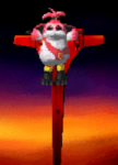
http://npshare.de/files/d1ddb298/valkyrie.png
This looks good. And actually looks navigable in real gameplay. So many screenshots look "good" but also look like they would be a pain in the neck in real gameplay.
Nightblade, cool that shit. Stop trying to fight with everyone everywhere for every reason.
Azn, cool that shit. You don't have to defend YDS's internet honor all the time.
Everyone stop arguing and talk about Darken's screenshot.
Azn, cool that shit. You don't have to defend YDS's internet honor all the time.
Everyone stop arguing and talk about Darken's screenshot.
post=101617
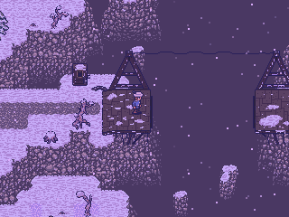
HELLO DARKEN, HOW ARE YOU TODAY.
I think this screenshot is fanfuckin'tastic. I love anything from that crazy secret snow game of yours. I even see a little Mother 3 art influence in there.
Now then, where have you put Garland in your game so I can get that bridge rebuilt?
post=101688
I want to see more tardis screenshots.
EDIT:Also...post=101640
Nightblade, cool that shit. Stop trying to fight with everyone everywhere for every reason
Hey, fuckos. Stop this pointless fagdance before I dump this topic.

Contrary to popular belief, Karsu and WIP are not the same person.
Darky: I like it. The fog might even be extraneous, I think the snow effect might suffice. But I'd have to see it in motion to adequately critique the atmosphere.
Darky: I like it. The fog might even be extraneous, I think the snow effect might suffice. But I'd have to see it in motion to adequately critique the atmosphere.

Hello Darken I am going to give you some rather heavy C&C since, while I think your graphics are great, they could be much better! If you want to ignore the advice, that's cool because you will already impress most people with them as is. However, if you want to reach for the stars...
One thing I noticed immediately is how weak the shading is on the rock face: I would probably elongate the rocks vertically so they are not so round, but that is mostly a stylistic choice. However, the rocks themselves seem almost to exist as a black background with round rocks glued on to it as opposed to a solid piece of rock with pieces jutting out, which is what any cliff face is. Don't be afraid to sharpen the shading on the rocks themselves and lessen the shading between the rocks to make them look like they all belong together. I think one thing is that each rock is trying to hard to be it's own rock, outlined in black- you can easily outline a shape (in this case, a rock) by using the darker shades of brown if they are up against the lighter shades of brown, since that implies the shape with forcing it: black isn't always the answer.
Another thing I think is lacking is cohesion between individual pieces of the chipset: the trees don't look organic, instead bulging randomly. Again, though, that is a stylistic choice. One thing that does bother me is that certain objects seem to be floating on the snow, instead of buried under it. Roots, for instance. The larger snow drifts are nicely done, but the shading isn't pronounced enough; I'd probably add another shade for the snow to give it some more depth.
The smaller drifts- the ones that are only a couple of pixels- look literally like you randomly applied white pixels in MS Paint. One thing you have to remember is that certain snow piles wouldn't be large enough to appear to the player's eye, and if they are large enough they would have some detail to them to be worth it. The snow itself also seems to have detail applied randomly. When applying detail, remember that there is a logic behind it- is the wind blowing it in one direction? Is dirt peeking through here and there? The dirt looks pretty good, although I'd alter the edges a little to make it appear more organic and less "oh hey an autotile".
I think the idea of the struts holding up the wooden platforms is a great one, as is the overall idea of the map, but they need a little bit more substance to look appropriately detailed and, as it stands, they look detached from the rocks.
Like I said, I really like it so far, it just needs a little polish. The composition is wonderful, but the details aren't holding up there end of the bargain.

post=101617
Making cliffs was fun, I was going to put some flowing mist in the middle to make it more atmospheric but it didn't work out so well.
What is this game? It looks gorgeous.


I really like the menu but it seems like your overusing it.
Feld: Looks great in terms of making the menu follow the appearance of the default menu. Have you considered consolidating the information? Like the equip menu, for example; the top half shows items you can make, and the bottom half will show which items you can combine to create them. At least as a way of avoiding putting only two items per page.

I have to agree with SFL. That's some very inefficient menu design right there. My suggestion would be to place recipes vertically in a window on one side and another window with the required materials on the other side. The amount of recipes you could show per page would be much larger then.
Otherwise, I like how you made it match your chosen window system. nice touch.
Otherwise, I like how you made it match your chosen window system. nice touch.
Partiality what those two are saying and the fact that its all the same style/color. I would suggest color coding some of the text and maybe not putting everything in the same text box.
Have fun repositioning all the picture events, MOG!
If it's a lot of work, I'd just leave it like it is. It looks good, and unless you have billions of useless recipes, I'm sure two per page won't be so bad. You might want to make switching pages easy, though (perhaps reassign Right-Left?). It looks good! I wouldn't bother with a background.
If it's a lot of work, I'd just leave it like it is. It looks good, and unless you have billions of useless recipes, I'm sure two per page won't be so bad. You might want to make switching pages easy, though (perhaps reassign Right-Left?). It looks good! I wouldn't bother with a background.
post=101806
Partiality what those two are saying and the fact that its all the same style/color. I would suggest color coding some of the text and maybe not putting everything in the same text box.
Having every menu box the same style is the formula that most RPGs follow, and not doing it just to be able to use cool menus looks irresponsible and messy.
post=101807
Have fun repositioning all the picture events, MOG!
If it's a lot of work, I'd just leave it like it is. It looks good, and unless you have billions of useless recipes, I'm sure two per page won't be so bad. You might want to make switching pages easy, though (perhaps reassign Right-Left?). It looks good! I wouldn't bother with a background.
I think I can see what I can do.


