SCREENSHOT SESAME STREET (40TH ANNIVERSARY EDITION)
Posts
Nightblade
I should be a grinch like abomination with no facial features, not an old man.
You sure do hate facial features!
edit: oh for Christ's sake how do I keep pulling top of the page?
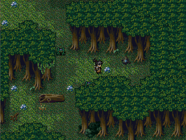
Look at how bad my old game was!
@Darken: I'm not trying to win an argument. This is not about winning or losing anything. This is about me making my game even better than it is now.
This is about you showing off and getting pissed off at people making good criticism and you thinking they have to show something for it.
Okay...posting again, in the hopes it won't get totally ignored this time:
from me last page
All right, now that the HUD looks okay and I got the core mechanics all figured out, I'm working on stage aesthetics.
I still have the green crisscross tile for other levels, but it contrasted too badly with the red walls here (the area's fire-themed). I made that wall tile from scratch, but wasn't sure if it blended well enough with the more highly detailed future chipset. Any thoughts on what's pictured here? Not just the walls, but the whole bit?
@YDS: This is going to be the best game ever.
Edit: @Kaempf: If that's bad looking, I'm stoked for your next game.
Edit: @Kaempf: If that's bad looking, I'm stoked for your next game.
Nightblade i'm not going let you start an argument that messes up the screenshot topic.
You obviously want to argue with me. Nightblade i'm the wrong guy to try to argue with....but you seem intent on getting set straight. So come on and come at me like you've been doing everytime I post a video or screen. I'm not going to hold myself back this time. You think you're some kind of badass but you're not.
You're just a no life having 24 year old who trolls.
I'm here now, come at it.
This guy means business. I'm frightened.
post=109269
Okay...posting again, in the hopes it won't get totally ignored this time:
from me last page
All right, now that the HUD looks okay and I got the core mechanics all figured out, I'm working on stage aesthetics.
I still have the green crisscross tile for other levels, but it contrasted too badly with the red walls here (the area's fire-themed). I made that wall tile from scratch, but wasn't sure if it blended well enough with the more highly detailed future chipset. Any thoughts on what's pictured here? Not just the walls, but the whole bit?
I still think the ceiling tile is a bit too loud. The color is fine (the green was fine too), but for tiles that aren't interacted with, darkening it might draw more attention to the playing field.
yeah that ceiling is far too distracting. i would suggest using the black colour solidly with the red and gray as trim.
@halibabica: Is the a platform or a ceiling? Can you explain the HUD? I think you need some effects glowing effects to make it look more futuristic.
@hali: Maybe it's just me, but I can't help shaking the feeling that those criss-crosses are under the player. I don't think it's too loud (everything is pretty pronounced) but maybe make the interaction border with the other tiles a pixel or 2 thicker?
post=109243
uh oh
anyone who is following the christmas card game understands the relevance of this screenshot to the direction of this thread
in this screenshot afrenchdreamer presents his uncle a crisp abs. however his uncle is not pleased and screams at him to get out! get out! it is up to you to save the day and instill in nightblade a sense of christmas spirit
5 welps out of 5 welps
needs more george bailey and clarence
in fact leave all it's a wonderful life references alone and SEE ACTUAL TOPIC
in fact leave all it's a wonderful life references alone and SEE ACTUAL TOPIC
That's more like it : )
squares = HP
triangles (would appear below HP) = power level
circles (would appear to the right of HP) = shield level
Damage you take comes out of shields first, then HP. At best, you can take a grand total of five hits. Each triangle in your HUD is 1 point of damage in your attack. It can do 3 damage at the most (for a single hit). There's no way to use them up.
I think I'll pass on glowy effects. I might be using a future chipset, but lighting effects wouldn't add much here. Or did you mean glowy effects on the HUD?
Thanks, everybody!
from S.F.LaValleI toned it down a shade, but I can try one more. The green lines contrasted badly with the red walls, so I'm reserving them for other stages where it blends better.
I still think the ceiling tile is a bit too loud. The color is fine (the green was fine too), but for tiles that aren't interacted with, darkening it might draw more attention to the playing field.
from geodudeSo...just keep the edges colored, leave the rest as darkness? I think I'll try toning the colors down first; there's a lot of space out there because I have to keep the hero in the center of the screen. Leaving it all black could be unappealing.
yeah that ceiling is far too distracting. i would suggest using the black colour solidly with the red and gray as trim.
from arcanThe crisscrossed lines are a 'ceiling.' The HUD tells you the only three things you need to know:
Is the a platform or a ceiling? Can you explain the HUD? I think you need some effects glowing effects to make it look more futuristic.
squares = HP
triangles (would appear below HP) = power level
circles (would appear to the right of HP) = shield level
Damage you take comes out of shields first, then HP. At best, you can take a grand total of five hits. Each triangle in your HUD is 1 point of damage in your attack. It can do 3 damage at the most (for a single hit). There's no way to use them up.
I think I'll pass on glowy effects. I might be using a future chipset, but lighting effects wouldn't add much here. Or did you mean glowy effects on the HUD?
from DrakonaisSince it's set in a computer, the wall spaces aren't really meant to be defined as anything tangible, so that sense of disorientation is kind of what I'm going for. I'll try defining the edges of the tile better, though.
Maybe it's just me, but I can't help shaking the feeling that those criss-crosses are under the player. I don't think it's too loud (everything is pretty pronounced) but maybe make the interaction border with the other tiles a pixel or 2 thicker?
Thanks, everybody!
To me it looked like the brown tiles were the ceiling and the net was the parallax background.
Okay, for sake of comparison, side by side:

The darker one is on top (drrrr). Is it still too loud? I also remapped the room a little to make the elevation more obvious, and filled out the HUD to its capacity. Is this any better?


