


SCREENSHOT SESAME STREET (40TH ANNIVERSARY EDITION)
Posts

Viewed against a black background, both would probably be visible now that I squint. I have an abnormally dark monitor.
I really thought there was more off to the side that I was missing, though. It looks good, but there are a tonne of weird colour specks which hurt my pixel art side.
I really thought there was more off to the side that I was missing, though. It looks good, but there are a tonne of weird colour specks which hurt my pixel art side.

post=109626
IIt looks good, but there are a tonne of weird colour specks which hurt my pixel art side.
this is completely intentional- it fits with the generally overly-gritty graphical style of the game, and the scene takes place in a particularly mineral- and ore-rich tunnel.

Ghost hammers on the piano while Lolallzen grumpily serves his customers drinks. I have no idea WTF Darken is doing because he is talking to a disconnected receiver! D-Bones and Neok drinks while Manifesto is dealing his cards.


post=109688
Looks nice, JoRu. I like the cliff and camp especially.
Thanks! Those are the ones I'm the most proud of. :)

post=109640Ghost hammers on the piano while Lolallzen grumpily serves his customers drinks. I have no idea WTF Darken is doing because he is talking to a disconnected receiver! D-Bones and Neok drinks while Manifesto is dealing his cards.
Very nice, very nice. Which one is me? Regardless, my skin needs to be changed. Noone there is a nice mocha brown!

post=109628
Top of the page, Kaempfer, you know what you have to do.
I didn't even realise and now it's too late since we're almost on page 19. DARN
post=109629
this is completely intentional- it fits with the generally overly-gritty graphical style of the game, and the scene takes place in a particularly mineral- and ore-rich tunnel.
You're making Pipes in Cave the Game, right? The two graphical styles do not mesh. FF6/whatever else you're using don't have weird colour flecks (which just looks like weird colour loss issues to me) so... At the same time, if the scene is moving I doubt I'll even notice. Screenshots tend not to capture the best in terms of details like that.
(no insult here, I think your game looks great)
Back when I was working with XP I was really interested in isometric games. This was a unfinished mockup for a game I was hoping I could do in the future. The character was drawn separately from the background and that's why he's too tall for it. It was a pain to put all these tiles in the correct spots.
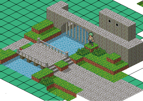
edit: There is something about green hair that I really like.
edit: There is something about green hair that I really like.
holy cocks, arcan- did you make all that from scratch!? that is incredible. i love isometric games so much.
oh believe me, in-game, they mesh a lot better than screenshots on a website with a white backround. this one sticks out to you because it's oversaturated a little bit. there's a loss of saturation when overlays are used, ergo i know have to oversaturate a lot of things beforehand.
and it's a very moving scene, as a matter of fact. ;)
i'm offended why can't you suck my dick when i post screenshots arggggh
post=109780
You're making Pipes in Cave the Game, right? The two graphical styles do not mesh. FF6/whatever else you're using don't have weird colour flecks (which just looks like weird colour loss issues to me) so... At the same time, if the scene is moving I doubt I'll even notice. Screenshots tend not to capture the best in terms of details like that.
oh believe me, in-game, they mesh a lot better than screenshots on a website with a white backround. this one sticks out to you because it's oversaturated a little bit. there's a loss of saturation when overlays are used, ergo i know have to oversaturate a lot of things beforehand.
and it's a very moving scene, as a matter of fact. ;)
(no insult here, I think your game looks great)
i'm offended why can't you suck my dick when i post screenshots arggggh

YDS, I always enjoy a good community game and this looks promising. Can I be someone's hat or maybe a weapon or something? That would be cool.
Title screen for my rmvx game (if the name is familiar, its a standalone episode, not a remake). I wonder if someone would help me improve this screen if I gave them the .psd elements that made it. The parts I would like to keep are the font, the red background and a logo thats form is a black shadow.

Title screen for my rmvx game (if the name is familiar, its a standalone episode, not a remake). I wonder if someone would help me improve this screen if I gave them the .psd elements that made it. The parts I would like to keep are the font, the red background and a logo thats form is a black shadow.

@Arcan: nice isometric field. I can understand you not following through with it for real, though; it looks pretty challenging to setup without using a large, preset piece.
Do you like my hair? =)
@illustrious: I can make out a faint background picture, but from a distance, it looks pretty empty. maybe make it brighter? Do that for the subtitle text beneath the logo, too - it blends too much with the background.
post=109798
edit: There is something about green hair that I really like.
Do you like my hair? =)
@illustrious: I can make out a faint background picture, but from a distance, it looks pretty empty. maybe make it brighter? Do that for the subtitle text beneath the logo, too - it blends too much with the background.

