


RANDOM ART TOPIC
Posts


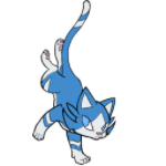
Super cute Joseph!
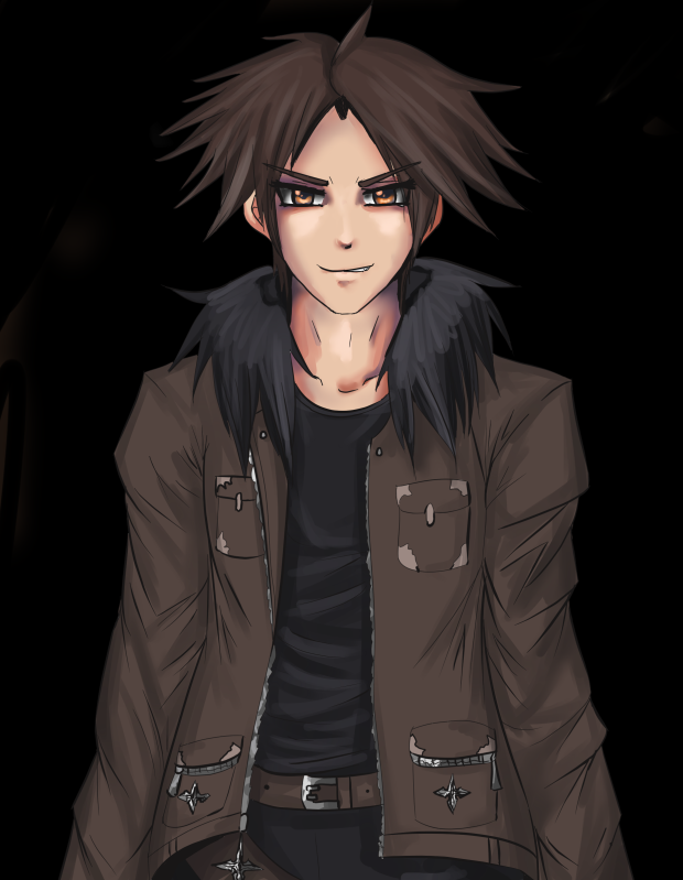
i love the tattered look. :]
@Creation- I love that kind of art, looks like random doodles and whatnot. great comic strip type stuff.
i love the tattered look. :]
@Creation- I love that kind of art, looks like random doodles and whatnot. great comic strip type stuff.
http://rpgmaker.net/users/Dudesoft/locker/198612_10150430004525434_746645433_17886070_4411248_a.jpg
Kangaroo Cloud concept art... I know Power Up! Isn't finished yet. But this won't take too long.
Kangaroo Cloud concept art... I know Power Up! Isn't finished yet. But this won't take too long.

http://i.imgur.com/gxmw3.jpg
That's actually a mashup of 2 A4 papers, and I've erased the ugliest stuff lol xD
That's what I do when I finish work. This sort of stuff is immune to art blocks! At most cases.
Anyways.
And kyrsty, that's very nice! I love the colors.
And that kangaroo reminds me of Zack Fair. >_<"
That's actually a mashup of 2 A4 papers, and I've erased the ugliest stuff lol xD
That's what I do when I finish work. This sort of stuff is immune to art blocks! At most cases.
Anyways.
And kyrsty, that's very nice! I love the colors.
And that kangaroo reminds me of Zack Fair. >_<"
Umm... What... What do you mean by...
...?
Did you try to link something, but couldn't?
Or what?
author=oh_no_im_melting
.
...?
Did you try to link something, but couldn't?
Or what?
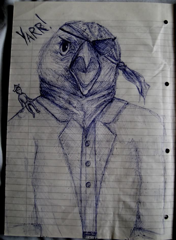
author=JosephSeraph
And that kangaroo reminds me of Zack Fair. >_<"
It's a guy tripping balls thinking he's Cloud Strife as a Kangaroo. ;P

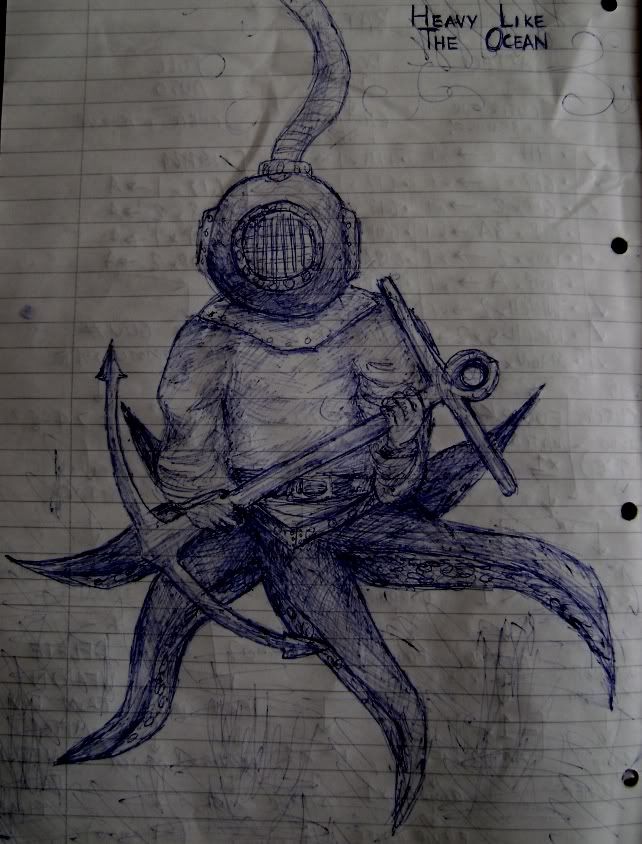
Reminds me of that damn sailor pin-up I started doing with posca pens and stopped because... Well, I couldn't get her quite.. Right. The thing is, she was also with an anchor. xD
http://i.imgur.com/wPWjl.png
For VGD. =_='
http://i.imgur.com/wPWjl.png
For VGD. =_='
Cute! Though it kind of looks like her hairline is receding D8.
Random art...I have a few sketches I guess :p.
 MUSCLES
 lol this sucks so bad. I hate drawing 3/4 digitally. The 'deformed' eye always ends up a different size or height and I have to do more fiddling than what the actual sketch took me. fff.
edit: which might have something to do with me having the same problem (one eye slightly higher than another). ssdlksjdlsakjl
Random art...I have a few sketches I guess :p.
edit: which might have something to do with me having the same problem (one eye slightly higher than another). ssdlksjdlsakjl

A demonstration of my lame art skills :P
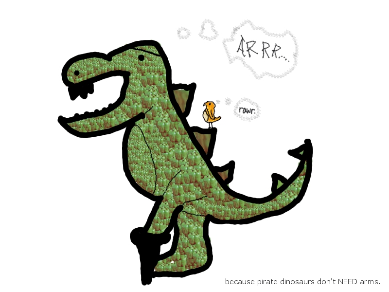
Yes he is textured with a pepper, Why? Because Pirate Dinos don't NEED arms.
I made this in GIMP (most awesome free image editor ever)
Yes he is textured with a pepper, Why? Because Pirate Dinos don't NEED arms.
I made this in GIMP (most awesome free image editor ever)

@Felix: Interesting.
Alright, I don't know where to put this but here goes.
I'd really, really appreciate some criticism for this tree for my game. I think it's ok but it could be better. I used a Zelda tree as reference.
Alright, I don't know where to put this but here goes.
I'd really, really appreciate some criticism for this tree for my game. I think it's ok but it could be better. I used a Zelda tree as reference.

@Creation:
Oooh I like the shading a lot, it seems kinda wierd that the outline doesn't have any Aa. And the roots look like they might be a little too blurry, but it's hard to tell without a context.
Oooh I like the shading a lot, it seems kinda wierd that the outline doesn't have any Aa. And the roots look like they might be a little too blurry, but it's hard to tell without a context.
It's too similar to the original tree, Creation...
Almost as if you painted directly over a zoomed tree, or something.
Try to add in more details, as well. And change the palette so the people won't instantly recall it's from Zelda. xD
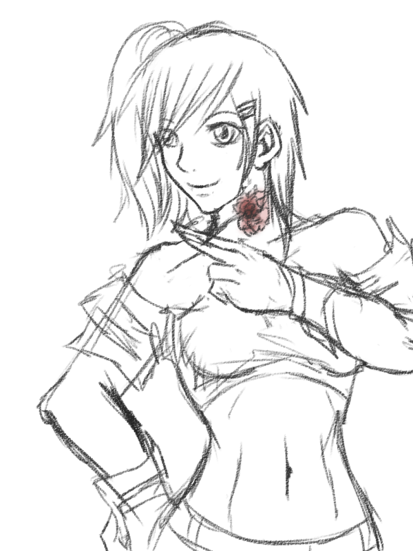
Kyrsty, I love the anathomy of the woman, the second picture. :D
It looks awesome. And she's very umm.... Flexible. I don't know how to describe it.
BUTT
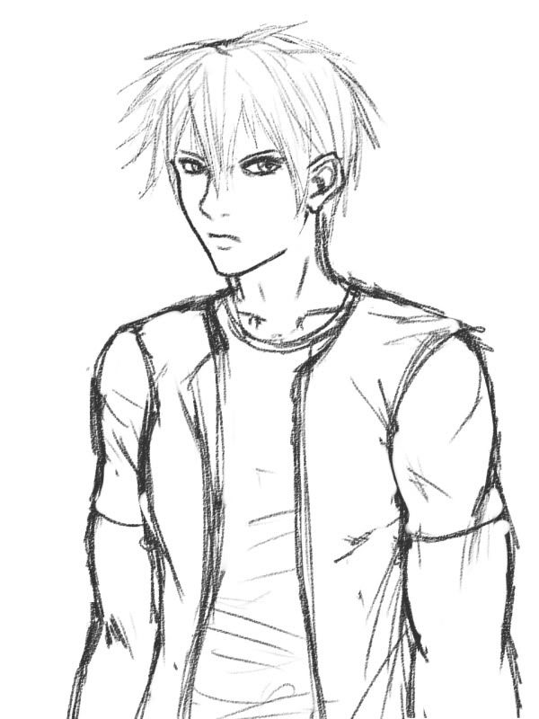
The first image... He seems to be a bit hardened. I don't know how to explain. Anyways, <3
Almost as if you painted directly over a zoomed tree, or something.
Try to add in more details, as well. And change the palette so the people won't instantly recall it's from Zelda. xD
Kyrsty, I love the anathomy of the woman, the second picture. :D
It looks awesome. And she's very umm.... Flexible. I don't know how to describe it.
BUTT
The first image... He seems to be a bit hardened. I don't know how to explain. Anyways, <3
Hmm... the palette isn't actually from Zelda but thanks for the comments. I'll try to modify it a bit more so that it doesn't look like the original.
the outline is very harsh compared to the rest of the picture.
you could neaten it up a little and add some more, less blurred, detail to the tree or you could get rid of the outline and use the colours of the tree as a replacement instead - for example extend the lighter colour on the trunk to the outline instead of the dark colour. there would be less of a contrast this way.
sorry if i haven't explained that very well...haha


