


THE SCREENSHOT TOPIC RETURNS
Posts


author=Arandomgamemaker
Gdoe Forest. The events are so the trees overlap. I also haven't added enemies yet.
The dark grass tiles randomly interspersed with light grass tiles makes the whole thing look kind of odd. I would place the dark tiles under the trees (shade) and use light tiles for the rest.
Also, a question: Are you meant to be able to walk behind trees? If not, it looks as though someone could just walk through the trees to the exit and skip half the map.

Just finished revamping the main lobby area (the tileset I'll have to edit later to add more...mansiony like things to it for the main mansion. As it is right now, there's not much in the ways of good tiles to place in the main mansion. Seems more fit for bedrooms and such. Don't mind the events, I'm going to have to rework ALLLLL of the goddamn events in this dungeon so that they're properly set. Ugh...this is what made me NOT want to do this, but it needs done...
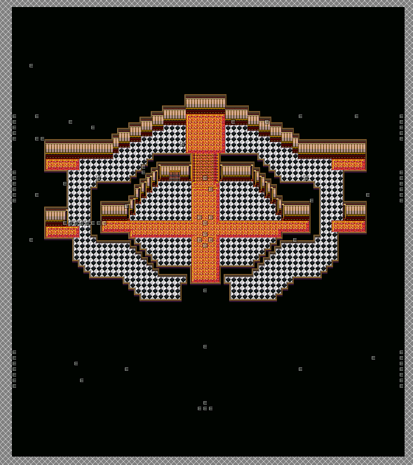
Zoomed out at 25%:
At 50%:
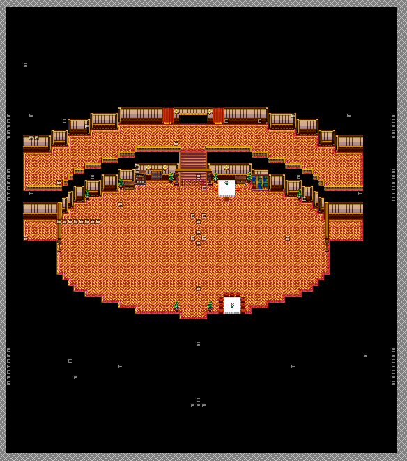
Do note, yes it may seem big to you guys, but it IS supposed to be big inside (that's what's stated in canon). So yes, it's kinda big. And it also doesn't accomodate doors that may be in corners. Probably won't go with the corners idea (the door in the lobby area goes to the library as usual, which is where the actual "dungeon" for this area is at). I really REALLY need to find something to spice the area up.
Oh, and the map size didn't change. The map proper IS smaller, but the map size is still the exact same dimensions as in the previous screenshot (being 70x80). I COULD resize it, but no real point in doing so at this point in time. Plus, don't want to accidentally lose events and all that (yes, a lot of those events are story events, as well as enemy events...).
C&C is welcome.
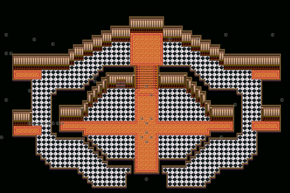
Zoomed out at 25%:
At 50%:
Do note, yes it may seem big to you guys, but it IS supposed to be big inside (that's what's stated in canon). So yes, it's kinda big. And it also doesn't accomodate doors that may be in corners. Probably won't go with the corners idea (the door in the lobby area goes to the library as usual, which is where the actual "dungeon" for this area is at). I really REALLY need to find something to spice the area up.
Oh, and the map size didn't change. The map proper IS smaller, but the map size is still the exact same dimensions as in the previous screenshot (being 70x80). I COULD resize it, but no real point in doing so at this point in time. Plus, don't want to accidentally lose events and all that (yes, a lot of those events are story events, as well as enemy events...).
C&C is welcome.

Sorry, Xenomic. Even if it supposed to be large, it doesn't have enough details for me to call it pretty. I would actually call it ugly. Sorry if that offends you, but I would rather you hear it from me, than suffer it from the players. I would recommend making it smaller even if it is supposed to be very large. You can convey largeness of a venue even in small maps. But the main problem with this is that there simply isn't enough detail to justify such a large map. However, you can include it in your game - but I would estimate that at least 50% of people would be unhappy with the mapping style. At least.
Again, as I've already stated (why do people constantly say things that I already know and stated?!), the tileset doesn't offer too much in the ways of "pretty" things, and so I'll need to edit it later, which I will. It needs to be large enough so that you can actually move around the enemies that'll be on the map itself during the actual events is the main issue. If it's TOO small, then you're going to run into enemies all the time (and that's a bad thing...and annoying). If it's TOO big (which this is by far smaller than what it was originally, although those second floor hallways are a tad too big...), then people are just going to complain and it'll be a pain to navigate around (it was already a pain to get through it before...10-30 minutes should not be how long it takes to explore the entire mansion when there's not even that many rooms! Of course, it might now when there's going to be a bunch of new rooms added in but who knows).
If you have any good suggestions as to what to add to the tileset for use in the main mansion (from other tilesets), that'd be great.
If you have any good suggestions as to what to add to the tileset for use in the main mansion (from other tilesets), that'd be great.

You must be kidding me? Mack tiles are very versatile and that one in particular has a lot for pretty.
It's far too busy on the eyes. Instead of carpet all over, use a stone tile for the floor and put carpets on the main walkways instead. That should break up some of the eyesore.
Secondly, cut that shit in half. In quarter, I'd highly recommend. Even if it's supposed to be big, it's far too big. You could fit a whole army in there. No, really, one event = one person. You could fit enough people in there to make RM2K lag out - and that's saying something! I've maps with over 100 events that don't have an ounce of lag, but that? That is overly huge for no reason.
Why is it oval? Is there a reason? Is the outside oval as well? It damn well better be.
Enemies? You can run past them in a two to three gap radius. You think people will run into them too much if it's smaller? Then make them move slower. You do not need that much room.
As it stands it looks terribad. Please change that.
Is this a Mack tile? I dunno...here, have it for reference:
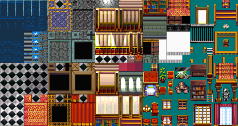
As I've stated, looking at this tileset, there's not that much I can USE for the main mansion. Most of it are for other rooms (for instance, I'd highly doubt they'd have a bunch of barrels just stacked in the lobby like that).
I will agree though, the mass amount of carpet is pretty ugh on the eyes. If I had a more...lavish tile for the floor, like...marble or something of that kind...I'd probably use that.
For reference, this is supposed to be the lobby that this is based off of:

Guess there's like NO carpet in the lobby, which strikes me as...odd? But I digress.
I...tried to make it circular, but I didn't do it right. Making a GOOD circle seems harder than it should be. As you can see from the reference image, it's supposed to be circular. Of course, the main entranceway isn't going to be part of the circular area, just being a straightway into the lobby itself.
I figured at least 4 tile-long hallways would be fine (again, I know the top hallways are TOO big...I kinda screwed up there a little). From what I see, the enemies move at 5 Speed (out of 8). I want them to move slightly quicker than normal so...hmmm....
As I've stated, looking at this tileset, there's not that much I can USE for the main mansion. Most of it are for other rooms (for instance, I'd highly doubt they'd have a bunch of barrels just stacked in the lobby like that).
I will agree though, the mass amount of carpet is pretty ugh on the eyes. If I had a more...lavish tile for the floor, like...marble or something of that kind...I'd probably use that.
For reference, this is supposed to be the lobby that this is based off of:
Guess there's like NO carpet in the lobby, which strikes me as...odd? But I digress.
I...tried to make it circular, but I didn't do it right. Making a GOOD circle seems harder than it should be. As you can see from the reference image, it's supposed to be circular. Of course, the main entranceway isn't going to be part of the circular area, just being a straightway into the lobby itself.
I figured at least 4 tile-long hallways would be fine (again, I know the top hallways are TOO big...I kinda screwed up there a little). From what I see, the enemies move at 5 Speed (out of 8). I want them to move slightly quicker than normal so...hmmm....

Saying Mack and Blue not versatile is ...crazy. It has like way too many things that made a lot of games memorable. Romancing Walker is pure Mack and Blue and that one had like very little edits to the tiles. If there were, I barely saw them.
A lot of the other stuff are in form of character sets as well.
A lot of the other stuff are in form of character sets as well.
Xenomic I'd definitely take Liberty's and ben's advice. That map is actually causing physical pain to my eyes. No exaggeration.
Are you using the Looseleaf charactersets to go with the map? if so, keep your corridors and hallways about 4 or 3 tiles wide. It should still convey a sense of open space without being overblown. Also, as Libby mentioned, add some tiled or stone floors so that everything isn't just a rug. Heck, just re-purpose the rug as a means to give the player a sense of direction. It would at least break up the monotony.
Your biggest issue right now is that you have a LOT of unused space, and right now I'd think more about the practicalities of your map instead of trying to "make sense" for the sake of it (that is, thinking carefully about how your player is going to interact with your map).
EDIT: Dude, in that reference image the room looks way smaller than what you've got.
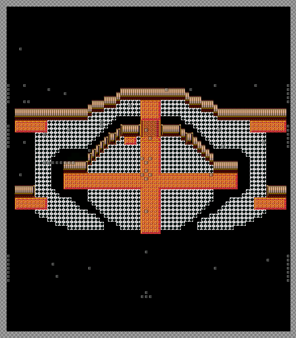
To make a circle in a block-based game, you draw an even-sided cross. You then fill in each side equally. In the case of below I made the longer parts 5, then dwindled down. It's not too hard, just start with floor tiles then fill in the walls after the circle is completed.
Look, that design you showed? It doesn't need adding too. It also doesn't need to be huge. How big are the characters compared to the size of that room? About 3/4 the height of the doors, and about 3/4 the width, too, if they're normal. That actually makes that room quite smaller than you'd imagined.

Here, simple and easy. No need for adornments and the like, just a plain, circular room with enough room to move around. It's a whole 30x30 map and doesn't even take up all that room. It's functional, and it doesn't need tables, chairs and the like. If you're really aiming for something like that room, this is as close as you can get without actually drawing the damn thing or editing chips to high-heaven and back.
Actually, if I were being more realistic, this is what it would look like:

Since the bottom walls would overlap the floor by two tiles. That said, with one-tile roof width top and bottom, it takes up a whole 22x22 map.
Yeah...
Look, that design you showed? It doesn't need adding too. It also doesn't need to be huge. How big are the characters compared to the size of that room? About 3/4 the height of the doors, and about 3/4 the width, too, if they're normal. That actually makes that room quite smaller than you'd imagined.
Here, simple and easy. No need for adornments and the like, just a plain, circular room with enough room to move around. It's a whole 30x30 map and doesn't even take up all that room. It's functional, and it doesn't need tables, chairs and the like. If you're really aiming for something like that room, this is as close as you can get without actually drawing the damn thing or editing chips to high-heaven and back.
Actually, if I were being more realistic, this is what it would look like:
Since the bottom walls would overlap the floor by two tiles. That said, with one-tile roof width top and bottom, it takes up a whole 22x22 map.
Yeah...
...Why do I not see the wooden planks anywhere on my tileset? I know this is the same tileset, but I don't see those at all...
Oh, a cross...dunno why I didn't think of using that. Hurr...
22x22 would be too tiny for my front foyer unfortunately.
This is what I managed to get going at least...incidentally, before I deleted the old map and restarted it, I did what you were doing with the tiles and carpet so...heh.
It needs to be this size for the second floor to be there. Granted, I can't seem to find those planks that you're using at all and need to think of a way to better handle the "balcony" thingie (you can kinda see what I'm aiming for there). I'm still using the room as a reference from the image, but giving it a bit of a twist so that it can lead to other places, savvy?
And no, I haven't added any decorations or whatnot yet, since I don't want to since I'M SURE SOMEBODY'S GOING TO SAY IT'S STILL TOO BIG! .=.
EDIT - Hurrrr....the brown tile + paintbucket made it work. Nevermind on that. >_>;;

Xenomic, I think your concerns about the space necessary to navigate around enemies are unfounded. As Liberty has clearly illustrated, even a small map can be functional. But if you're really that worried about it, have you considered switching to random encounters? ...Now, to be honest, I prefer touch encounters over random encounters any day. But if you're, even subconsciously, making your maps gigantic because of this, I'd actually wouldn't mind the random encounters in exchange for "cozier" maps.
Oh, I think the issue is you're seeing the map from far away.

and Xenomic, there's no reason for maps to be huge if you're going for touch encounters. It's perfectly reasonable to have 2 tile hallways, for example. Remember, encounters are supposed to be a bit hard to avoid, especially touch encounters. Making it bigger is just going to make things easier, don't you think?
and Xenomic, there's no reason for maps to be huge if you're going for touch encounters. It's perfectly reasonable to have 2 tile hallways, for example. Remember, encounters are supposed to be a bit hard to avoid, especially touch encounters. Making it bigger is just going to make things easier, don't you think?
Random encounters won't work due to the gimmick of the main mansion (any other time, there aren't any encounters outside of the library and basement, which are actual random encounters). During the encounter phase in the mansion (which happens during the first actual story event in the mansion), the enemies will be on the map with no random encounters. After that story event, you'll never run into enemies outside of the library or basement.
(Counting from entrance to stairs, it's only 24 steps. THAT'S NOT THAT FAR PEOPLE! Oi vey...lord knows it was like double or even triple that originally, if that tells you the original size (which you can see a couple pages back...this is MUCH smaller than the original so...dunno why people are STILL saying it's too big...it's literally half the height, which was 80, so it's TECHNICALLY about 40 height. That's not very big at all! Still 70 width but eh!).
Of note, ONLY the lobby is going to be this huge. Any other room isn't (since ya know, they're actually ROOMS and not a lobby). Hallways also aren't going to be any bigger than 4 tiles width. Library and basement will be different of course, because they're actual dungeons and whatnot.
@Xenomic: The difference between Liberty's map and you own, is that you could see most of her map in one single screen; while in yours, if you stand right in the middle of it, you would only see the same thing in all four directions- it would look empty! Even if 24 steps from point A to point B is not much for you, the map as a whole would lack in composition. If you can take a screen from any point of any of your maps and there's nothing of notice in that screen, that's a bad map. So, even if the source material asks you for gigantic halls and whatnot, I'd strongly suggest you to go against that in favor of more aesthetically pleasant areas.
@arandom: Have you considered making the outlines of the trees, ticker, so they look more cartoon-ish and so they stand out more from the ground? Changing the colors of the trees so they're brighter than the ground may work for the same purpose. I know you're trying to copy the RTP but, toying around with the colors a little may actually add some variety to your game... Also, if I could walk to the edges of a map and not be transported to a new area I would feel cheated, so, think about that. =P
@arandom: Have you considered making the outlines of the trees, ticker, so they look more cartoon-ish and so they stand out more from the ground? Changing the colors of the trees so they're brighter than the ground may work for the same purpose. I know you're trying to copy the RTP but, toying around with the colors a little may actually add some variety to your game... Also, if I could walk to the edges of a map and not be transported to a new area I would feel cheated, so, think about that. =P
The 'planks' are roof tiles. You find them below the carpet tiles. They look like a small square with a black inner in-engine but as autotiles, they 'expand', as you can see.
While that looks a bit better, it's still quite larger. As I said, you can always make enemy events slower moving. You could also do a less is more approach and have fewer that give more EXP so that you don't miss out on levelling even if you don't kill them all. There's so many ways you can work around it.
While that looks a bit better, it's still quite larger. As I said, you can always make enemy events slower moving. You could also do a less is more approach and have fewer that give more EXP so that you don't miss out on levelling even if you don't kill them all. There's so many ways you can work around it.
Yeah, I figured that out after someone mentioned that you probably used paint tool, and I was like "Naaah...there's no way that's it...", then I tried and lo and behold. *shrugs*
Well, here's the gimmick too with the dungeon when you have the touch encounters: As mentioned somewhere in the thread, you need 5 keys to open the library. I'm not sure if I'm going to have all of the keys where they are right now or move them, so there's that. One of the rooms, you actively HAVE to fight one of the touch enemies to get said key (the others are all found elsewhere not in fights). You won't miss out much on leveling up, but they're pretty easy access to Bs (Ethers) and Tents (which cost 2000 yen in my game). However...the flipside is they CAN hit like a truck (especially the Elite Maids, with their level 2 elemental spells. Get hit with an elemental weakness? Pretty much death for that character, and you have 3 characters to work with in this dungeon. Two of which are weak to Fire at that...).
In addition, the touch encounters are NORMAL encounters in the library and basement areas so...there's that too. All of the encounter groups that you can fight as touch encounters are like that. I did it that way so that I didn't have to PUT random encounters in here (because I didn't want to clone the dungeon again just for random encounters...) and to make it a bit more...threatening to say the least?? I dunno...
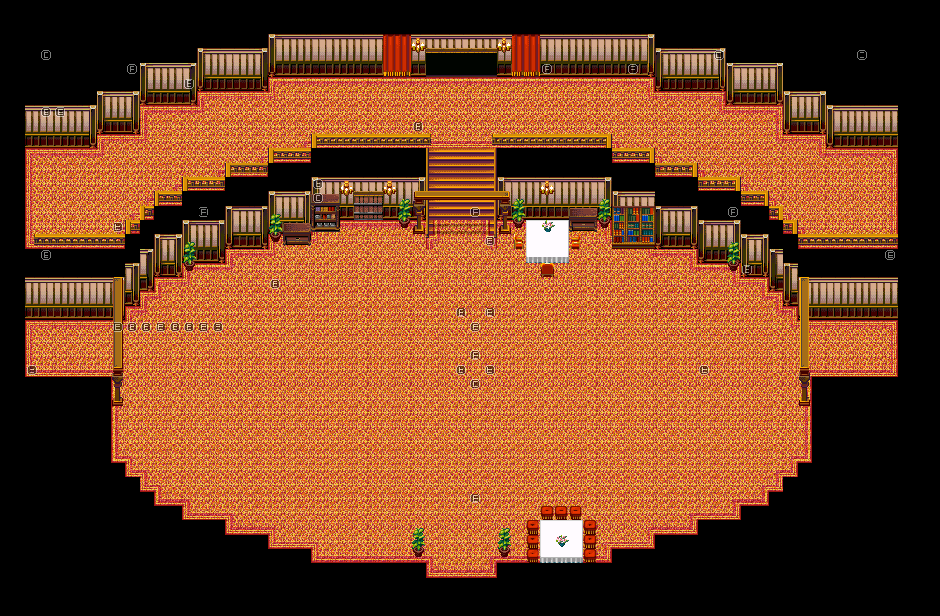
Anywho, revamp time:
25%:
50%:
100%:
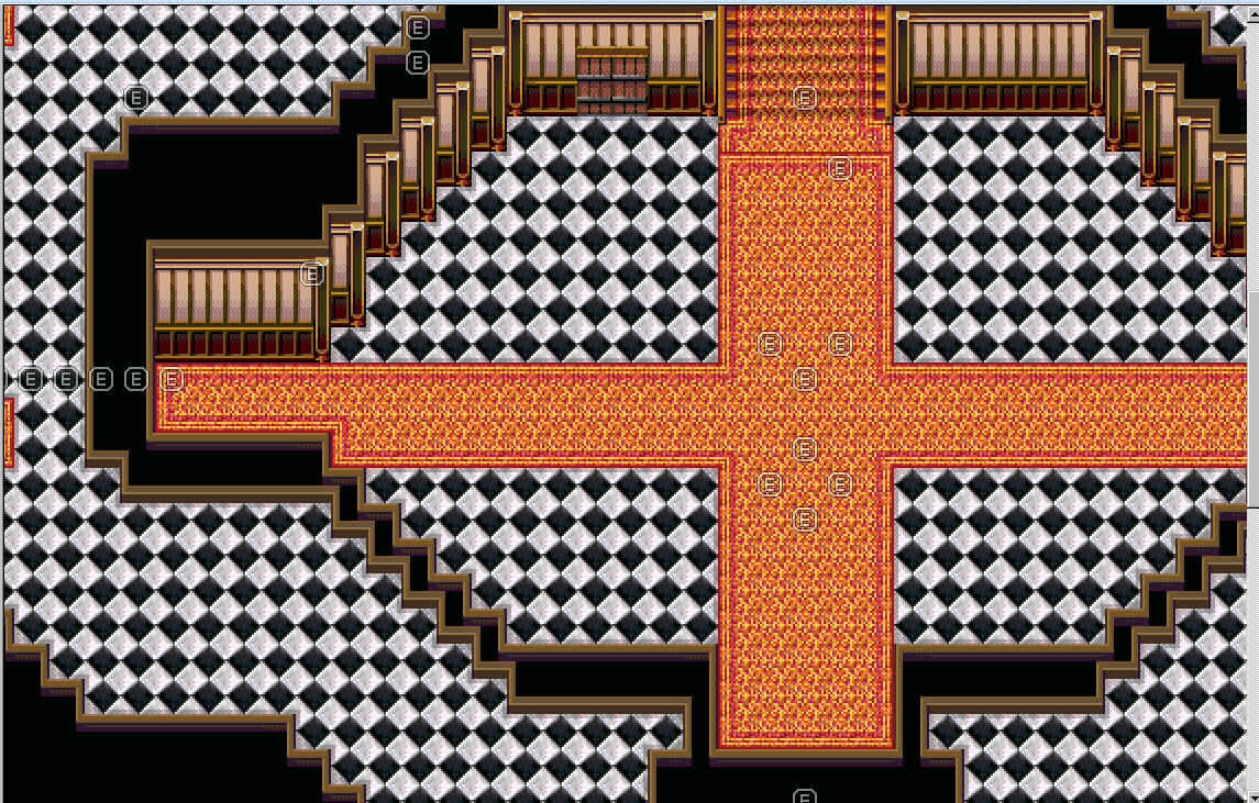
You can see where the entrance is and where the stairs are. When I made this version, I made the stairs first, then counted 14-15 steps south, and that's where I started...hopefully this is better. >_>
In case you're curious as to the event here, this is also part of the problem as well:
EDIT - Removing video to explain. Essentially, the character is supposed to be hidden off-screen, and then camera pans to her sitting on railing before hopping down. I want this to be still in, but I don't want the player to just SEE the character, savvy? Therefore lies the issue for me atm...I'm sure there are some other issues I'm not thinking of, but that's the biggest one. Sure, I could PROBABLY change it, but it's not something I want to really change and there's no other...GOOD way...to handle the scene for her to be there (I don't just want her to just walk on screen or anything).
Well, here's the gimmick too with the dungeon when you have the touch encounters: As mentioned somewhere in the thread, you need 5 keys to open the library. I'm not sure if I'm going to have all of the keys where they are right now or move them, so there's that. One of the rooms, you actively HAVE to fight one of the touch enemies to get said key (the others are all found elsewhere not in fights). You won't miss out much on leveling up, but they're pretty easy access to Bs (Ethers) and Tents (which cost 2000 yen in my game). However...the flipside is they CAN hit like a truck (especially the Elite Maids, with their level 2 elemental spells. Get hit with an elemental weakness? Pretty much death for that character, and you have 3 characters to work with in this dungeon. Two of which are weak to Fire at that...).
In addition, the touch encounters are NORMAL encounters in the library and basement areas so...there's that too. All of the encounter groups that you can fight as touch encounters are like that. I did it that way so that I didn't have to PUT random encounters in here (because I didn't want to clone the dungeon again just for random encounters...) and to make it a bit more...threatening to say the least?? I dunno...
Anywho, revamp time:
25%:
50%:
100%:
You can see where the entrance is and where the stairs are. When I made this version, I made the stairs first, then counted 14-15 steps south, and that's where I started...hopefully this is better. >_>
In case you're curious as to the event here, this is also part of the problem as well:
EDIT - Removing video to explain. Essentially, the character is supposed to be hidden off-screen, and then camera pans to her sitting on railing before hopping down. I want this to be still in, but I don't want the player to just SEE the character, savvy? Therefore lies the issue for me atm...I'm sure there are some other issues I'm not thinking of, but that's the biggest one. Sure, I could PROBABLY change it, but it's not something I want to really change and there's no other...GOOD way...to handle the scene for her to be there (I don't just want her to just walk on screen or anything).

Xenomic, I already gave you a lot of advice on creating maps. Y U no follow?
You want kinda a feeling of this map:
But you cant't tell if this is huge, because you don't have any reference. There is no person or anything that indicates how small or big this is.
Even if it is a big map you can tell by perspective the size and shape of it just by entering it. You immeditately see that is some kind of oval. Imagine your hero party entering: they know - "wow this is huge" (let's pretend it is). But they can already see the halls limits. They could estimate how long it would take to get from one side to the other.
If you enter this hall you only have a 20/15 piece of the map you can see at first. Your players party should be able to see the limits and shape immediately -> just like the player party would do.
This is why no open room or area in a game features more than 1 or 1/2 screens before you find a wall or something else that blocks your view and hampers looking beyond.
And if you want your game to be enjoyed by anybody at all you should follow the advice given by the community. They have been proven right for game design. Huge rooms in reality just don't equal to "huge" rooms in RPGs. The perspective is limited and you have to adapt your maps to that.

