


THE SCREENSHOT TOPIC RETURNS
Posts

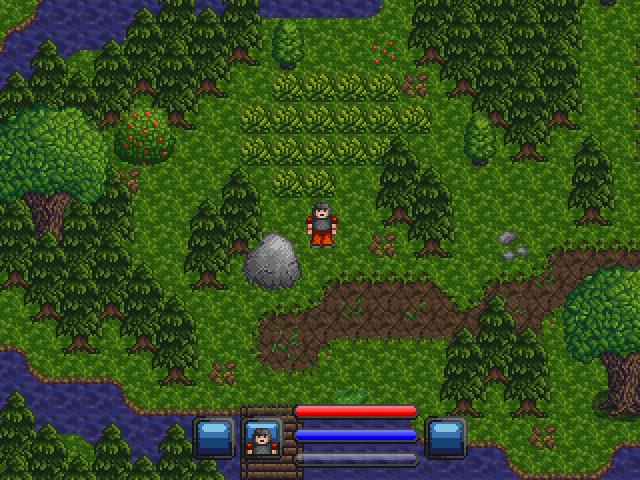
you might benefit from using the original colours, you've lost some colour information somewhere along the line. lockez's links are all forbidden because he's incompetent but they're all available here. you can find a nice area of dirt in mobliz.

author=Radnen
I think its a bit better now... Still don't quite like the tree itself, but the coloring is nice.
Not enough contrast. Try this:

Or something with a lower general saturation in your greens.
Typically, your scale from light to dark should cover a good range of brightness. Your first palette is fairly blah because you're not really using darker darks and brighter brights.
LockeZ

I'd really like to get rid of LockeZ. His play style is way too unpredictable. He's always like this too. If he ran a country, he'd just kill and imprison people at random until crime stopped.
5958
Augh that high of contrast hurts my eyes. It's impossible to look directly at it, my eyes just veer off the edge of the screen to avoid the severity. I think Radnen's lower contrast/saturation is far easier to look at.
The contrast change I suggest actually isn't that gaudy or drastic, imo. I might say the dominating amount of bright green is probably what's turning you off. Compare with a commercial palette.
I would make the grass more of a recessive colour or hue and style than that in the trees. I think the texture detracts from the detail of the features he would want to emphasize like trees, rocks, paths.

I would make the grass more of a recessive colour or hue and style than that in the trees. I think the texture detracts from the detail of the features he would want to emphasize like trees, rocks, paths.
LockeZ
I'd really like to get rid of LockeZ. His play style is way too unpredictable. He's always like this too. If he ran a country, he'd just kill and imprison people at random until crime stopped.
5958
BROWN IS MORE REALISTIC, DESATURATE EVERYTHIIIIIIING:
Alternately, as long as I'm cracking jokes about realism and saturation in games, I guess here are the most and least saturated photos on the first page of google results for forest photo:
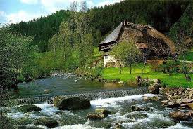
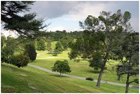
I'm pretty sure both of these have had their saturation and contrast digitally modified. So the moral of the story is that real life can have its chipset changed too, and I've never been outside of my basement to know which of these two is closer to an actual scene from nature.
Alternately, as long as I'm cracking jokes about realism and saturation in games, I guess here are the most and least saturated photos on the first page of google results for forest photo:
I'm pretty sure both of these have had their saturation and contrast digitally modified. So the moral of the story is that real life can have its chipset changed too, and I've never been outside of my basement to know which of these two is closer to an actual scene from nature.
Just got back in from the Big Wide Outside World and can safely say that nature is pretty goddamn bright green when it has a mind to be.
On that note, while the screenshot looks okay as-is, The saturation change really makes it POP. I know which of those screenshots my eye was immediately drawn to, and it wasn't the bigger one.
On that note, while the screenshot looks okay as-is, The saturation change really makes it POP. I know which of those screenshots my eye was immediately drawn to, and it wasn't the bigger one.

(It's so small...)
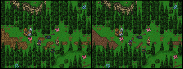
On the left is just a recolored of the previous dirt and on the right is the dirt from Mobliz. I'm taking a liking to the right.
Also, about the trees. Yeah, I also felt they were too cramped together but I was following how another chipset did their tress, however the graphics weren't FF3/6, and I looked at S. Figaro and Nikea and that was how I was doing the trees originally and somewhere along the way I meesed up and decided to keep the measurements 16x##. I'll try that again or just uncramp the trees.
EDIT: Oh sorry, lol!
@geodude: Thanks for the link! Now I have more of an idea have the graphics were used! (b^.^)b
@Kentona: Trying to keep the mapping as FF3/6-zy as I can, but I like those thicker trees!
If you could apply the left's dirt colors to the right's dirt pattern, it would look perfect. Although you're right about the trees. They're packed a little too tightly.
I agree with Dyhalto. The dirt on the left is coloured more organically while the dirt on the right has the better looking pixel work.

author=Dyhaltoditto
If you could apply the left's dirt colors to the right's dirt pattern, it would look perfect. Although you're right about the trees. They're packed a little too tightly.


author=Rowan
Faux Mode 7 in RM2k3.

You have no idea how happy it makes me that you are still working on Osheru Shori.
it will seriously be the game of the century

@LockeZ and Blitzen: Jeez, equal opinions. I dunno what to say. Blitzen, I know you mean well, and that screenshot/area has gone through many other opinions and I'm about had it with the coloring issues (in full screen it looks quite good). LockeZ: You are right too, I mean, later Pokemon games used a more desaturated color palette (Or I think they did...).
I'll try one last time on coloring, but I was aiming for a more desaturated feel to bring some seriousness to the world(s) you're in.
My monitor is also quite bright, and the high contrast even professional images look too glaring and hurt my eyes. I wonder if any of you guys are still using old CRT monitors? I do notice on those screens my graphics would look pretty dark.

@Radnen - I like the dark version a lot more, personally.
author=RadnenI do, and in my experience, CRT monitors aren't any more dark than LCD ones.
I wonder if any of you guys are still using old CRT monitors?
Okay I tried various different contrasts and I did not like any of them. I'm possibly going to desaturate more colors and go the other way with it.
LockeZ
I'd really like to get rid of LockeZ. His play style is way too unpredictable. He's always like this too. If he ran a country, he'd just kill and imprison people at random until crime stopped.
5958
I was grossly exaggerating my distaste for the saturated colors, in case I wasn't clear about that. I can easily live with any of the aforementioned styles, as long as it's consistent throughout the game.
Consistency is far more important than quality! Like my sixth grade teacher said, if you do something wrong, just make sure to keep doing it wrong the same way every time, so that everyone becomes convinced it's actually your style and not an error. (Disclaimer: Does not apply to most actual situations.)
Consistency is far more important than quality! Like my sixth grade teacher said, if you do something wrong, just make sure to keep doing it wrong the same way every time, so that everyone becomes convinced it's actually your style and not an error. (Disclaimer: Does not apply to most actual situations.)

Like my sixth grade teacher said, if you do something wrong, just make sure to keep doing it wrong the same way every time, so that everyone becomes convinced it's actually your style and not an error. (Disclaimer: Does not apply to most actual situations.)I feel fixing your mistakes and trying to improve is more important than giving excuses and not fixing your faults.

I tried an edit on the screen. I didn't change much in the trees. I think I probably made it a little bit brighter. Most of it is just in the grass, I made the grass itself have less contrast so it doesn't stick out as much.

rule 34. :p
Anyway, just a bit of side project like my others I'm working on when I'm not working on my three main projects.


