


THE SCREENSHOT TOPIC RETURNS
Posts

I think it looks beautiful. The bed could be a bit bigger, yes, but it's no big deal. Personally I see no other flaws.
EDIT: No screens, sorry :/
EDIT: No screens, sorry :/
Been reworking the menu, just finished it. It'll probably display health as well. Bottom left is a location display and upper right is a "see the hidden world" ability, though the eye (eight years old, needs to be replaced) is horrible.

You can customize the "system" set as well as the background image.
You can customize the "system" set as well as the background image.

Thanks for the comments as usual.
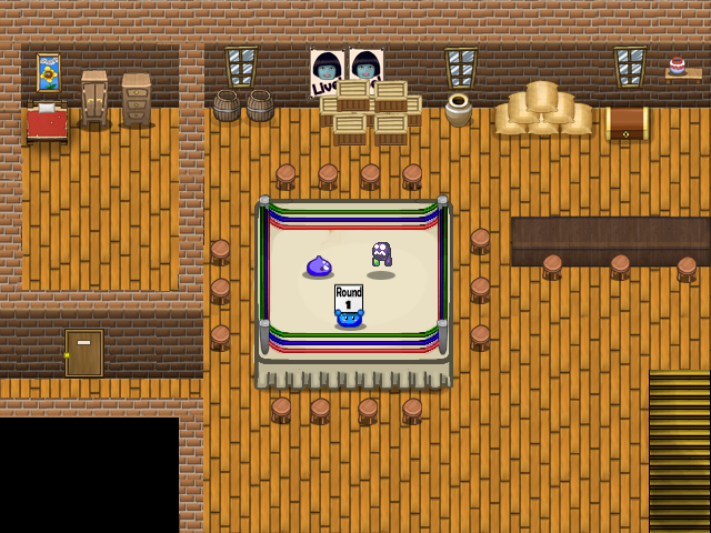
The ropes will be fixed, yes. I've been procrastinating about this because I'm doubtful as to how to improve it.
As for the stoots, good call. Problem is that is I reduce their size it'll become blurry and unwatchable which means I would need to sprite them in pixel art which I'm not good at.
The ropes will be fixed, yes. I've been procrastinating about this because I'm doubtful as to how to improve it.
As for the stoots, good call. Problem is that is I reduce their size it'll become blurry and unwatchable which means I would need to sprite them in pixel art which I'm not good at.

Looks pretty cool, Creation, if I was going to change anything though, I would change the bricks, I really don't think they match with everything else.
Maybe try drawing some like you did everything else.
Maybe try drawing some like you did everything else.
Demi, it's "Deity". Unless all of your characters are on diets.
Is that background the same for everywhere you go? It'd make more sense for it to reflect where you are somehow.
Is that background the same for everywhere you go? It'd make more sense for it to reflect where you are somehow.


Curse my spelling! Thanks, I fixed it. Apparently, every other instance in the game I spelled it corrently. Wouldn't you know it?
Anyway, the windowskin and the background are customizeable. I also thought about the background reflecting location. I don't know which would be better. As a player I think I'd rather be able to choose.
Anyway, the windowskin and the background are customizeable. I also thought about the background reflecting location. I don't know which would be better. As a player I think I'd rather be able to choose.
I think you need to download the font fix, Chana. As well, the rooms are too big... When it comes to making house interiors, make them as compact as possible. Rooms in an average real life home are never really more than 6 'tiles' or 'steps' across.
Oops, didn't mean to summon Satan. Oh noes, "mini" boss fight. But it's game, not suppose to be that realistic size, doesn't matter just like your c.....chickens, unless I'm fighting a midget.

@dethmetal : "Rooms in an average real life home are never really more than 6 'tiles' or 'steps' across", I see what you mean... that is true, I find a certain aethetic in a few objects well disposed in a spacious room... also, nothing is too realistic in rpgs : windows are always much too high for the characters, etc. ?
@chana, yes, the letter spacing is messed up because you don't have the appropriate font installed (not your fault, the game was distributed without it). This is a well-documented issue.
http://rpgmaker.net/users/kentona/locker/Fonts.rar
Download and install that font to correct it.
http://rpgmaker.net/users/kentona/locker/Fonts.rar
Download and install that font to correct it.

@ Demicrusaurus:
I like that interface a lot. The only thing that sucks is that you did not even edited your heroes' chars.
Oh and the eye in the upper right corner needs to be edited with Gimp or Photoshop. It looks too much MS Painty.
@ chana:
Don't mix RTP chips up with other stuff. Screens would look more eppic with lighting effects and less boring.
@ benos:
I am no fan of standard textboxes. And is the right guy a giant? The screen tone makes it more interesting though.
@S. F. Lavalle : thanks, doing that.
@Deacon Batista : Yes the light effect, I thought of that, it would be more interesting.
"Don't mix RTP chips up with other stuff" : you mean with characters that don't belong there or just "don't mix RTP chipsets" with other chipsets, in one single game?
Edit :
Is that it? The letter spacing is not that much better, but the font is nicer? I put your fonts in Windows, but it didn't change anything, not what I was supposed to do ? (This is ProFont.)

@Demicrusaurus
I think the setup looks great. I would however make the 'Beyond Eden' logo stand out more, perhaps by adding a border.
@chana
Your new Alex looks very 'rough and ready' compared to the old one, with a more down to earth vibe. I like it! I definitely think the tile set you used in the first pic looks better than the one from the second though.
@benos
The set up looks good, but I think the lighting looks a little dark. That's just me though.
Thanks, LucidStillness, for your comment : glad you like my new Alex ! Yes the upper chipset is really interesting.
@Khos:
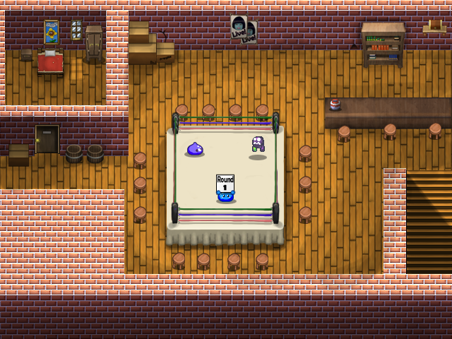
I'm getting complains about the bricks, yes.
Anywho, Here's another version, probably final unless I change the bricks. I've changed the ring with a brand new one and added some minor things which most of you probably won't notice :).
Just for fun, here's a before/after comparison:
Before:
After:
I'm getting complains about the bricks, yes.
Anywho, Here's another version, probably final unless I change the bricks. I've changed the ring with a brand new one and added some minor things which most of you probably won't notice :).
Just for fun, here's a before/after comparison:
Before:

After:

The overall effect is quite nice Creation. The graphics definitely stand out more in the newer version than in the original, and the lighting effects add a lot (I'm thinking about using some in my game now).
I've been working on town graphics of my own, and I'm eager to read what you guys think of them. I'm still building up these sprites and maps, so any suggestions are valid and welcome!


I've been working on town graphics of my own, and I'm eager to read what you guys think of them. I'm still building up these sprites and maps, so any suggestions are valid and welcome!
I'm still building up these sprites and maps, so any suggestions are valid and welcome!
Well, time to give some feedback of my own :). I hope the following comments help you out:
1. The grass doesn't tile well. I would also consider desaturating the color a bit, it's quite flashy at the moment. Ocean did a pretty good tutorial on his blog about grass tiles if my memory serves me well.
2. the trees are in the wrong perspective. They're seen from in front as opposed to being seen from up above.
3. The crates are ok although they look more like small furniture than actual crates.
4. The closet is fine as well.
5. the floor in the green room doesn't do it for me. It not seamless. You can clearly see the pattern.
6. I'd use some midtones on the walls, the transition right now is really rough and it's messing up the wall's perspective.
7. The perspective of the table seems wrong. It should be seen from above a bit more.
8. In the second screen, the tent top (the red and white thingy) really stands out. It's a lot more polished than the rest of the elements (it looks amazing). It has a painted look. The crates on the other hand are clearly pixel art. Mixing both doesn't look right to me. What's inside the crates also seem like it's been painted and it clashes with the pixel art.
9. It seems like you use that filter from photoshop for the walls (white walls). I think it looks odd. I'd paint them just like you did for the walls inside.
10. the transition with the road/grass looks wrong. It'd be great if you could see some grass strands on top of the road so to speak.
11. the really long building on the left side on the first screen looks weird and unpleasant I think.
12. The sprites are nice but the shoulders are too square. Also, the hair looks flat so I'd add some more pixel in there to make it look better.
Alright, that's my contribution, I hope it helps :). Looking forward to your next version.
Wow, thanks for the in-depth feedback!
1) I actually love the way the grass looks, so that won't be changing, lol. I do like the way it tiles as well. Still, I think I will experiment a bit with the saturation.
2) Actually, the perspective is correct. The game uses the typical RPG side-and-slightly-overhead view. I know this perspective for all the tiles is correct since I studied the RTP graphics very closely when sketching them all out. I'm not sure why you don't think it looks right though...I might play around with outlining the trees to make them stand out more.
3) Yeah, they are a bit 'dainty'. I'm working on some larger crates and barrels at the moment.
4) Thanks!
5) Good point. I'll have to fix that. It's actually the same floor I use for some of the castle rooms, but it's much brighter here so you can see the seams.
6) Yes, I wanted to make sure they tiled correctly, but they could use some blending.
7)Again, while I know the perspective is technically correct, it does seem to be 'floating' a bit. Maybe I'll add some shadows underneath.
8)Hmm. You're right about that being painted. I was hoping the pixel stuff and the painted stuff wouldn't clash too much, but is they are then I might have to do some extensive reworking. For obvious reasons I can't just exclude the pixel art entirely, so I'll have to homogenize the colour palette or something similar.
9)I used a lot of old textures for parts of the graphics, and looking at the bricks now they do stand out. I think I can change that up though.
10) That sounds like a neat detail to add. I think I will implement it!
11)Hmm, well that's just a design choice. I wanted the mayor's house to stand out a bit, but maybe I'll do something different now.
12)I made my own template for all the characters that I'm happy with, and it's too late to change that now, lol. I've been thinking about the hair, but since there are a limited number of colours for the character portraits I don't want to start adding new ones to the sprites. They're supposed to look as though they are cell shaded.
Thank you again for the feedback! I won't be implementing all of your changes, but it is great to get input. :)

