


THE SCREENSHOT TOPIC RETURNS
Posts

I've gotten pretty far for one night its been fun for most part but I still have my grips. I know your an FF13-2 advocate so I'll see how it goes when I get pasts the waterscape.

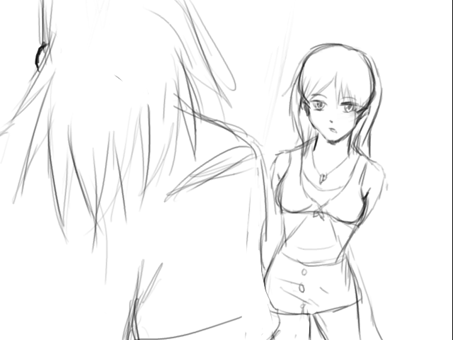
author=SorceressKyrstyMy only gripe is it has no color-and that woman's face is hilarious!<is not gripebecause im lazy and I find it hard to draw tweening frames with GIMP
also I hate trying to animate with vectors
and I'm not very good at it anyway
author=Link_2112
Whoa haha I was just trying to make small talk about your screen, I don't need anything explained xD Grumpy much?
Sorry about that, sometimes I'm just extra grumpy.
Here it is all in action, it is very hard to explain how it works otherwise.
LockeZ

I'd really like to get rid of LockeZ. His play style is way too unpredictable. He's always like this too. If he ran a country, he'd just kill and imprison people at random until crime stopped.
5958
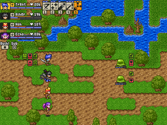
The melee part of your battle system is hilarious and really cute.
@TDS: The melee part reminds me a lot of Half-Minute Hero. This looks like a very fun battle system but it's kinda stupid that melee characters can't help each other when a few monsters are defeated.
The melee attacks text at the bottom is kinda useless because it scrolls way too fast and we look at the damage numbers on the sprites anyway.
I like the feeling of speed but at the same time the magic casting interrupts it so much, it's like... I dunno... it reminds me of Castlevania 2's "What a horrible night to have a curse"...
Everything is very well-made though. I especially appreciate that casters and targets clearly stand out during animations.
Menu's great too. Keep up the good work.

author=Avee
I like the feeling of speed but at the same time the magic casting interrupts it so much, it's like... I dunno... it reminds me of Castlevania 2's "What a horrible night to have a curse"...
For this one, I tested the battle system and it didn't felt that often specially once you start fighting strong enemies D:
LockeZ
I'd really like to get rid of LockeZ. His play style is way too unpredictable. He's always like this too. If he ran a country, he'd just kill and imprison people at random until crime stopped.
5958
Pausing the action to cast spells made me think of Tales of Phantasia, personally. Oh my god I hated magic in that. Spells took so long and my AI allies would cast them constantly (except in situations where it would actually be useful to, in which case they would stand around like idiots for 30 seconds first). Without fast forward that game would be unplayable.
In fact, I think playing ToP normally with Klarth and Arche's AI set to cast magic as needed was actually more time consuming than turning their AI off and grinding until I was high enough level to not need magic. On top of which the grinding option was more fun since I was at least doing something. When grinding the same enemy for half an hour is both the faster and the more fun option, your game is doing something wrong.
So yeah I agree that not pausing when magic is cast would perhaps be a good thing to at least consider. Your spells are about 1/20 the length of ToP's spells though, so maybe it's not super important.
The Intro to tales of phantasia was what inspired the casting process, originally it did not pause the battle system at all... And it was the most horrible thing put to code that I've ever done.
Without those small pauses characters and enemies could spam animations all over the screen, covering damage and basically removing all awareness of what is going on in the battle. The pauses are annoying but they are vital, they also allow you for a brief moment to turn your attention towards the characters information to see if anything is needed there.
As for the the text, this is a strange thing to say but you should not itemize the battle system, because it just wont work that way.
Everything on the screen is meant to kill you or confuse you, including that text at the bottom, of course no normal person could follow it but some will try and that split second you spend looking at the bottom of the screen could mean you're dead and since there is no way to bring back a dead party member that is a huge loss. That is also the case with the HUD at the top, most people watching the video don't notice it but when playing the game itself nearly everyone left the main character die because they basically forgot the bars were not at the bottom like the rest of the party. Each little detail is there to kill you, and force you to put your attention into split second decisions.
Also this battle system is very hard to convey through most mediums, as it is completely different when you play it and when you just see it.
LockeZ
I'd really like to get rid of LockeZ. His play style is way too unpredictable. He's always like this too. If he ran a country, he'd just kill and imprison people at random until crime stopped.
5958
Yeah, I understand what you mean about the short pauses being necessary to give you a chance to react to stuff. Otherwise I would probably be pausing the game every quarter of a second, like I do in fast-paced games like Dragon Age.
Confusing/distracting interface as a way of increasing the difficulty isn't something I really enjoy in RPGs, and my kneejerk reaction is "that's shitty design and not the kind of difficulty people enjoy," but Dance Dance Revolution actually does the same thing and people think it's brilliant. So uh. If you think you can make it work well, then go for it.
Confusing/distracting interface as a way of increasing the difficulty isn't something I really enjoy in RPGs, and my kneejerk reaction is "that's shitty design and not the kind of difficulty people enjoy," but Dance Dance Revolution actually does the same thing and people think it's brilliant. So uh. If you think you can make it work well, then go for it.


@Chana: It's not bad good job making this. I have a few suggestions for you:
1. Use the shift key to add water next to the bridges, that way the grass bit you see on the right won't appear.
2. The 2 blue roofed houses on the bottom are missing a tip at the top of the roof. This may be difficult at first as I'm guessing the chipset only has that tip attached to sides that continue to the left and right however you can easily create your own character set using the tip from the orange houses and re-coloring them light blueish-gray to match the rest of the blue roofed house.
3. The orange roof is cut off on the bottom screenshot with the base of the tree. Create an event and have it set to above hero using the image of that piece of the roof and you should be good to go.
Nice job again.

TDS, that's really cute; it feels like it'd play more like FFXIII where the focus is on overall tactics and not individual members?

This and the shot below are premade Ace maps. All character sprites were done in the in-engine character set generator.

The people here don't really believe in the Goddess; Daphne is quickly shut up by the man explaining that the desert river is man-made.

A dungeon I did myself - sliding puzzles, yay!
This and the shot below are premade Ace maps. All character sprites were done in the in-engine character set generator.
The people here don't really believe in the Goddess; Daphne is quickly shut up by the man explaining that the desert river is man-made.
A dungeon I did myself - sliding puzzles, yay!


Still a wip. Probably need to up contrast on the HUD for darker BGs. Also I need a new font/windowskin that fits the theme, but so far so good!
I find that really hard to read; what's that window with the action(?) and rage bar for? I suggest not making parts of it transparent.
Also, I honestly have no idea what those names are.
Also, I honestly have no idea what those names are.
The characters' names should be a tad less transparent.
@Lotus_Games : Thanks for the tips and the feedback.
@SorceressKyrsty : I really like those monsters hovering in that white-grayish landscape. It would be better if nothing in the hud was whited and you found some other way of indicating who's turn it is, imo. Otherwise it looks fine, except for the names, not too readable.
@SorceressKyrsty : I really like those monsters hovering in that white-grayish landscape. It would be better if nothing in the hud was whited and you found some other way of indicating who's turn it is, imo. Otherwise it looks fine, except for the names, not too readable.

That looks nice, too, but now I don't see any tents at all! I wanted to see one burnt to the ground. But the smoky filter on top looks good.
I have re-done the layout one more time to spread stuff out. Is it an improvement? Also, I'm considering changing the icons to just text more like a standard RPG now that the whole "Command Bar" thing I had going on is gone.
I have re-done the layout one more time to spread stuff out. Is it an improvement? Also, I'm considering changing the icons to just text more like a standard RPG now that the whole "Command Bar" thing I had going on is gone.
author=ashriot
That looks nice, too, but now I don't see any tents at all! I wanted to see one burnt to the ground. But the smoky filter on top looks good.
Still working on the tents and not having much luck, ha. That shot was more to show the dead characters, the darker screen and the fried palm tree. Thanks though!
author=ashriot
I have re-done the layout one more time to spread stuff out. Is it an improvement? Also, I'm considering changing the icons to just text more like a standard RPG now that the whole "Command Bar" thing I had going on is gone.
I think it looked better with the command bar underneath the character bars, but its not bad.

TP, your dead bodies could use some more work, imho. Look at the one with the green bandana, for instance; his arm is hovering. If his life was taken, his body is lax, the arm should be on the ground. The way it is now, I can tell that you just took a sprite facing left and rotated it.
When people die violently, as these people seem to have, usually they drop in awkward positions. I know that the VX style (Big head, small everything else) doesn't help with that, but, you may find a workaround.
When people die violently, as these people seem to have, usually they drop in awkward positions. I know that the VX style (Big head, small everything else) doesn't help with that, but, you may find a workaround.

