


THE SCREENSHOT TOPIC RETURNS
Posts
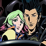
I'm not sure the two girls portraying fake smiles is an issue, we do it in the real world all the time...I guess it all depends on what emotion the artist was going for.
LockeZ

I'd really like to get rid of LockeZ. His play style is way too unpredictable. He's always like this too. If he ran a country, he'd just kill and imprison people at random until crime stopped.
5958
I wouldn't say their smiles look "fake." But the big open-mouth smiles combined with the relaxed eyes/eyebrows make them look kind of stoned.
@Sailerius: I think your art looks great and people at the Boston Festival will only have good things to say if you submit them just as they are. :)


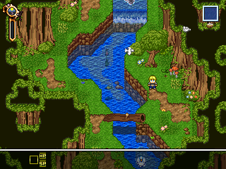
Ive never been a huge fan of overlays, but I feel they can be nice if used correctly, the first screen is what not to do with overlays. I just realized how bad that looked now. Anyways I'll probably make the canopy a bit more transparent as well as create an overlay that is a bit more fitting. Also please excuse my shitty trees they are temporary until after the demo. (Spriters will help you if you wish under a shooting star lol)

@Ash - Either one to be honest, the overlay does look nice but it doesn't add anything significant that it can't do without. I like the thing in the top left corner though.
Just the items store. I'm trying to give each store in the game a unique name through out. But not just that, some relating to the town or just it's name. Now that's me for awhile.
Just the items store. I'm trying to give each store in the game a unique name through out. But not just that, some relating to the town or just it's name. Now that's me for awhile.
@Tau: I like your mapping style, smaller maps with carefully arranged objects. Very similar to how I arrange things, nice work.
@Tau(Again): Yea, the overlay does nothing, I'll probably make an overlay of the canopy and some other stuff, maybe even expand the map. And the little bar is for Stamina, Energy, and Time of Day. When it fills up you have to leave a dungeon or lose 1/2 you stats (I know Im mean like that).
@Tau(Again): Yea, the overlay does nothing, I'll probably make an overlay of the canopy and some other stuff, maybe even expand the map. And the little bar is for Stamina, Energy, and Time of Day. When it fills up you have to leave a dungeon or lose 1/2 you stats (I know Im mean like that).
@Tau
Looking good, saw the video on the previous page. I would maybe make the fish transparent or something. I like the Theo tilesets, never liked how the water didn't animate though. Looks like you picked up your project again.

The girl on the far left is the protagonist, Talyssa. One of the themes in this game is that the world is changing in an abstract manner. Humans turning into monsters, animals becoming "weird". The screen above, the deer is mortally wounded and as it's drinking the water... The blood (more like ooze) sprouts life in the stream, the flowers.
Most of the characters in the game have their own lives / motives. However, the main plot is the investigation of these strange events. There is a parallel story that is that unfolds that help provide an explanation as well.
Talyssa travels with a little girl seen in the last screen I posted. People with the same motivations as you join your party, some of the party members that join you are more integral while others only join temporarily.
If you're interested in learning more about the project, I made a site / blog thingy. As of this post it's missing a sidebar with some important links, so I decided to just talk about it a little bit in this post.
http://www.rainfall-game.com
Looking good, saw the video on the previous page. I would maybe make the fish transparent or something. I like the Theo tilesets, never liked how the water didn't animate though. Looks like you picked up your project again.
The girl on the far left is the protagonist, Talyssa. One of the themes in this game is that the world is changing in an abstract manner. Humans turning into monsters, animals becoming "weird". The screen above, the deer is mortally wounded and as it's drinking the water... The blood (more like ooze) sprouts life in the stream, the flowers.
Most of the characters in the game have their own lives / motives. However, the main plot is the investigation of these strange events. There is a parallel story that is that unfolds that help provide an explanation as well.
Talyssa travels with a little girl seen in the last screen I posted. People with the same motivations as you join your party, some of the party members that join you are more integral while others only join temporarily.
If you're interested in learning more about the project, I made a site / blog thingy. As of this post it's missing a sidebar with some important links, so I decided to just talk about it a little bit in this post.
http://www.rainfall-game.com
@Ghost: I love the spites and the scene this game looks really nice. Keep posting I eager to see more.


1:

2:

Project is highly work in progress, so main character and title are classified at this point of time. And yes, enemies will be visible on map so you won't have to face them if you don't want to or are low on HP.
2:
Project is highly work in progress, so main character and title are classified at this point of time. And yes, enemies will be visible on map so you won't have to face them if you don't want to or are low on HP.

LockeZ
I'd really like to get rid of LockeZ. His play style is way too unpredictable. He's always like this too. If he ran a country, he'd just kill and imprison people at random until crime stopped.
5958
Unless the main character is also a small critter, I would quit the game as soon as the first dungeon started making fight mice for XP.
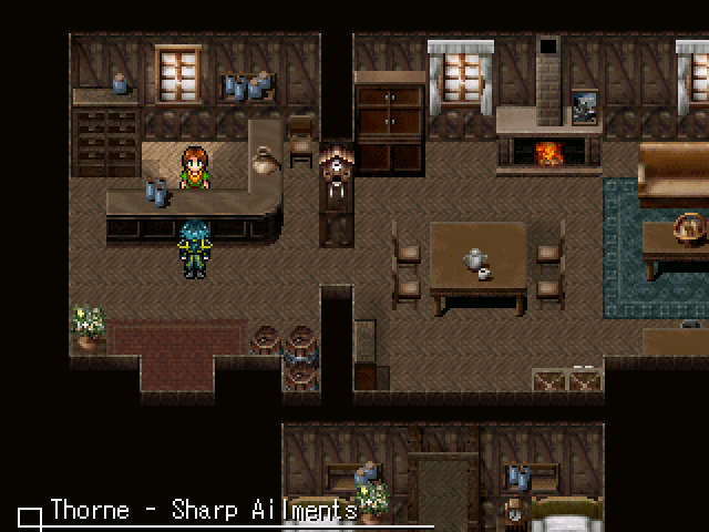
The map layout is highly questionable - the wall between the two visible rooms is like fifteen feet thick, and changes thickness as it goes due to the north room's border being ridiculous. No one builds walls like that.
The map layout is highly questionable - the wall between the two visible rooms is like fifteen feet thick, and changes thickness as it goes due to the north room's border being ridiculous. No one builds walls like that.
LockeZ, well, I've based dungeon's layout on generated one as I couldn't figure out it myself, so... Also, if I would make less thicker walls, I wouldn't have idea on how to fill space created by this. Believe me, it hurts me too, but not as much as empty space.
And it is blue, because it's dungeon under castle and it's kinda dark there. I've tried several different tones for this and this one works best.
And it is blue, because it's dungeon under castle and it's kinda dark there. I've tried several different tones for this and this one works best.
LockeZ
I'd really like to get rid of LockeZ. His play style is way too unpredictable. He's always like this too. If he ran a country, he'd just kill and imprison people at random until crime stopped.
5958
Well, don't make empty space, just condense it.


First: Wut?
And now I'll elaborate.
Maybe I don't make great maps myself, but there are many thing wrong with this map.
First of all, look at the ground. Namely cobblestone. It's very hard to see edges of road, because it blends with ground (supposedly) bellow. Even edges doesn't help. That's just look awful.
Solution: If possible use autotiles that look different (at least other kind of cobble) so it won't blend with each other and look bad.
Now... House with blue roof in top-left. Roof connects with roof of red-roofed house, which look bad. Not as bad as road thing, but still. Try to position a wall instead of roof tile where blue roof touches red one.
Same thing with house with blue roof between two orange/gold-roofed houses near right edge.
For rest I can't be really adviser, as there are little thing I'd do better here, but there's yet another thing: City walls. Try to make them less dull, because they look dull and empty for me. Add some doodads maybe.

