


THE SCREENSHOT TOPIC RETURNS
Posts

@pepsi there is a tool in ace that lets you do that, but im not sure about vx. The map looks great though.
LockeZ

I'd really like to get rid of LockeZ. His play style is way too unpredictable. He's always like this too. If he ran a country, he'd just kill and imprison people at random until crime stopped.
5958
author=Itaju

Man I can NEVER make decent swamp areas, and this is really good. The house on stilts is a great idea, and I really like the colors you're using here. I'd love to see more of this zone if possible, just to give me ideas and inspiration. But the non-centered character makes me think this isn't actually a whole dungeon, just a cut scene.

author=LockeZ
Man I can NEVER make decent swamp areas, and this is really good. The house on stilts is a great idea, and I really like the colors you're using here. I'd love to see more of this zone if possible, just to give me ideas and inspiration. But the non-centered character makes me think this isn't actually a whole dungeon, just a cut scene.
It's neither, it's just for tile set testing purposes and probably won't make it in the zone (but maybe in a slightly changed version).
I let you know when I have more of this (even playable stuff where you can see it moving with critters and stuff).
That looks fantastic Itaju. I really enjoy your screenshots. Was this made in engine or is this in an application like Photoshop? My only complaints are the light posts which seem a bit awkward in their shape, I'd suggest playing around with the pixels that comprise them some more. Also the bridge only has 1 railing on the top and not the bottom side, and the railing seems to be in a strange perspective...could be something else entirely though, I'm not sure. Maybe if you made the bottom horizontal pixels a darker value. Finally the large tree on the lower left has too many repeating segments that stand out and are easily noticeable. I'd suggest mixing the leaves around a bit to give it a more natural look. Great job overall though =]


For LockeZ:

@Lotus_games:
nah, it's made in engine, not in PS (don't use that, lol). Thank's for the compliments anyway. And I try to fix that bridge!
@Lotus_games:
nah, it's made in engine, not in PS (don't use that, lol). Thank's for the compliments anyway. And I try to fix that bridge!


Itaju: I'm sure you're heard it before but I love your puzzle HUD. Also been following the thread for a few days, don't let people give you a hard time about the dithering in your portraits. Looks great in my opinion, very reminiscent of some retro PC asthetics. It's jarringly different when you're used to seeing SNES-era Square spriting, but there's nothing wrong with that.
Alichains: Your blue carpet clashes with the red chains. I would try to some warmer tones for your carpet and walls honestly. Also you may want to try a rug under that table, eat up some of the empty space.
Testing out different lighting techniques. Pretty happy with the results.
Alichains: Your blue carpet clashes with the red chains. I would try to some warmer tones for your carpet and walls honestly. Also you may want to try a rug under that table, eat up some of the empty space.
Testing out different lighting techniques. Pretty happy with the results.

@Itaju: Oh my god, looking at this screen has the same effect of strolling in the streets... Only to be suddenly engaged by that smell of chocolate cake being baked, or perhaps chicken, or maybe... Anything feasty really. ;~;
That's cool *-*
I can't stop laughing at Craze's extremely LOL save menu.
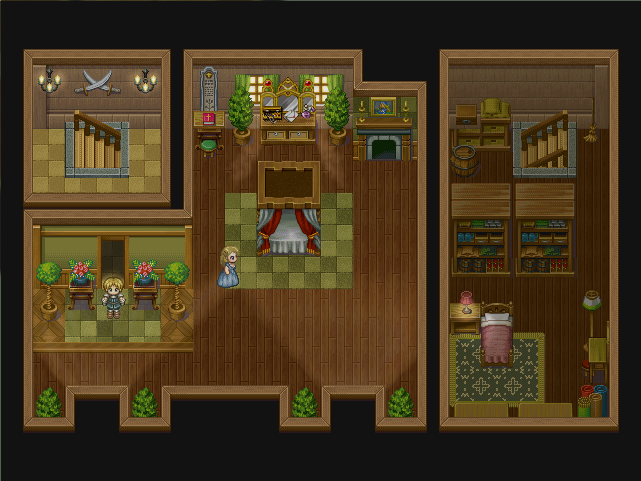
Oh, and @Daria:
You forgot a detail on the set of stairs to the left, and I do think that, since it's two different floors, they should be shown in two different maps (at least not aside eachother. Besides this the mapping is pretty good.
In regards to the lightning (wich is the purpose of your test)
You should add a little shading. Refer to the color wheel to see that opposite colors work differently, under sunlight everything tends to be a little more yellow-y, and shadows tend to be of a bluish tint, for example. This applies to every colored lightsource, but even when it's not a colored lightsource, the opposite of white is... Black.
As such, unlit parts should be respectively darker. This might not stand true for real life psychics, but works effectively on lightning design.
Also, contrast is too low... Lightning should primarily DARKEN dark areas, THEN you should come your concern on adding light (& more conntrasting) spots. Nonetheless, nice work. <3
Posting this 'ere since this is for ProjectROSE Gaiden, and not ProjectROSE, so... I don't want to fill my gamepage with lies ;AAAAA;

That's cool *-*
I can't stop laughing at Craze's extremely LOL save menu.
Oh, and @Daria:
You forgot a detail on the set of stairs to the left, and I do think that, since it's two different floors, they should be shown in two different maps (at least not aside eachother. Besides this the mapping is pretty good.
In regards to the lightning (wich is the purpose of your test)
You should add a little shading. Refer to the color wheel to see that opposite colors work differently, under sunlight everything tends to be a little more yellow-y, and shadows tend to be of a bluish tint, for example. This applies to every colored lightsource, but even when it's not a colored lightsource, the opposite of white is... Black.
As such, unlit parts should be respectively darker. This might not stand true for real life psychics, but works effectively on lightning design.
Also, contrast is too low... Lightning should primarily DARKEN dark areas, THEN you should come your concern on adding light (& more conntrasting) spots. Nonetheless, nice work. <3
Posting this 'ere since this is for ProjectROSE Gaiden, and not ProjectROSE, so... I don't want to fill my gamepage with lies ;AAAAA;
Joseph Seraph:
The rooms are on the same floor. Accessible by two seperate staircases. It's an architectural quirk of this particular home. I see no reason that the player shouldn't see both parts.
Also the lighting is a fog overlay, as such I'd pretty much working in monochrome gradients. So yeah. Next time I'm spriting though I'll keep your advice in mind. (:
Yeah, even though you're using monochrome gradients it doesn't stop you from a slight increase in contrast & focus. <3
But... Well, unless you're going old school or those are magical stairs of some sort, it does seem a bit odd... For both rooms, wich are atop one another, be represented at the same height level... It's just me, though, pay no mind. >A> *disappears*
But... Well, unless you're going old school or those are magical stairs of some sort, it does seem a bit odd... For both rooms, wich are atop one another, be represented at the same height level... It's just me, though, pay no mind. >A> *disappears*
But still it is visible... Like in Final Fantasy 1, for example, you wasn't able to see the higher floor, but you WERE able to see other rooms on the same floor much for the same effect you attained there, independently from connecting doors and I think we've got a language barrier problem here, sorry.
It might be my awful english stopping me from making much sense. ._.
Ugh, I give up. T_T
It might be my awful english stopping me from making much sense. ._.
Ugh, I give up. T_T

Seraph, that's what Daria is saying. They are both on the same floor, with a wall between them. Like so:
____|____ <- Second Floor
__\___/__ <- First Floor | is a wall, / and \ are the stairs
____|____ <- Second Floor
__\___/__ <- First Floor | is a wall, / and \ are the stairs
I SEE NOW
So it's not that I can's SPEAK, more like I can't understand. ._.
I'm sorry, really sorry. <3
*ashamed*
Ohh, it's a matter of luck, I guess... Eventually my english and understanding will be sharpened enough. Sigh
So it's not that I can's SPEAK, more like I can't understand. ._.
I'm sorry, really sorry. <3
*ashamed*
Ohh, it's a matter of luck, I guess... Eventually my english and understanding will be sharpened enough. Sigh
Heh. It's alright. You already speak more languages than I do. :P
Love your screenie BTW. The color palette looks like something from a GBA game.
Love your screenie BTW. The color palette looks like something from a GBA game.

joseph's eye for color continues to amaze and surprise
I want more
I want more
Pokemaniac
@Craze ahahahaha. is the phrase random or does it depend on the save slot/play time?
As long as the file has >30m, it's random based on a variable rolled when you save. (It just says "LIKE X MINUTES" until the half-hour mark.)
...god you have no idea how hard that was to type without it being in ALL CAPS
EDIT:


