


THE SCREENSHOT TOPIC RETURNS
Posts

@LouisCyphre
Indeed they are. Thanks for the opinion. :)
@LockeZ
I put a lot of work in these maps, I like messing in Photoshop until i deem my map perfect!
Indeed they are. Thanks for the opinion. :)
@LockeZ
I put a lot of work in these maps, I like messing in Photoshop until i deem my map perfect!

Allastorn, you ought edit your maps into your post on this page, since you accidentally sniped yourself.


allastorm you're using a number of different graphical styles in your tiles and they don't all work well together. that stuff at the armor stand looks awful. stuff like the XP RTP fountain also doesn't fit.
the road tile is repetitive as FUCK and looks awful because you spraypainted grass over the edges. stone roads don't work that way, m'dear
you're just throwing a shitton of different trees together and it looks bad. trees are different sizes, yeah, but they overlap oddly and just don't look that good.
the waterfalls and the reflections in the water are nice, against the cliff anyway. the waterfall in the middle of the really long shot looks stupid because the elevation of the ground doesn't change but the water's elevation dramatically shifts? not how it works buddy ;V
keep practicing, this isn't worth putting in a game but it's a start
LockeZ

I'd really like to get rid of LockeZ. His play style is way too unpredictable. He's always like this too. If he ran a country, he'd just kill and imprison people at random until crime stopped.
5958
The equipment looks awkward, yeah. Maybe it's on purpose - if it is outlined as a way to indicate that it's the only interactive object on the map, and all other interactive objects in the game are also indicated with outlines, then that's fine. I've seen that before. If it's just that way because those were the equipment spries you had on hand, it needs to be fixed.
I don't think the road cobblestones look bad like that - I mean, people who use tiles have the same problem - but if you wanted to make them better the way to do it would be to not have grass cut off stones in the middle, have it always go up to the edge of a stone.
I don't think the road cobblestones look bad like that - I mean, people who use tiles have the same problem - but if you wanted to make them better the way to do it would be to not have grass cut off stones in the middle, have it always go up to the edge of a stone.
I think the equipment would look less awkward if the equipment had shadows to give more of an effect that they are leaning there.
Though the overall Map looks great, easily.
Though the overall Map looks great, easily.

LouisCyphre: The interface looks tidy and the mini-icons are nice, but I can't comment any further since I have no idea what your project is about!
Anyway, two screenies from me.
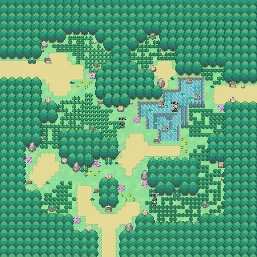
1. This is the editor shot of a hidden area from my project's Overworld. It's a simple riverside path with a cave and a hill (the north of the river can't be seen in-game so ignore that).
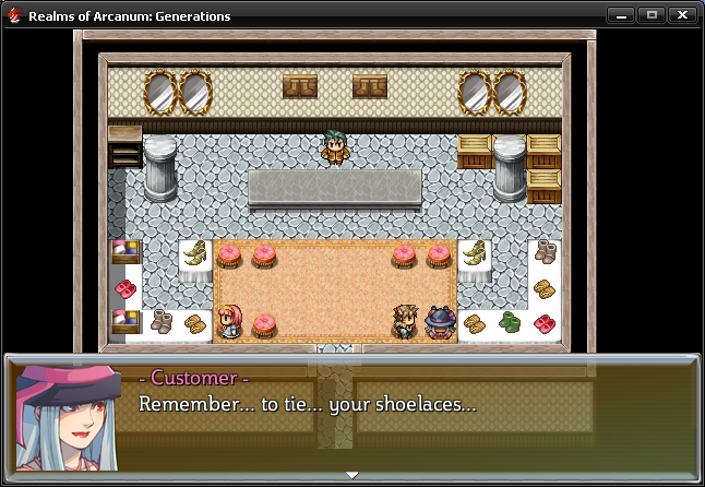
2. So I had to make a footwear store, but there were no shoes or boots tiles on the tilesets I have (and I doubt there are any available that do have them), so I did some quick work and added some icons into the tileset. The lack of shadows and the notorious difference is striking, but I don't think it looks THAT bad... I can't into spriteart, but I might try if it does seem too weird. :(

Anyway, two screenies from me.
1. This is the editor shot of a hidden area from my project's Overworld. It's a simple riverside path with a cave and a hill (the north of the river can't be seen in-game so ignore that).
2. So I had to make a footwear store, but there were no shoes or boots tiles on the tilesets I have (and I doubt there are any available that do have them), so I did some quick work and added some icons into the tileset. The lack of shadows and the notorious difference is striking, but I don't think it looks THAT bad... I can't into spriteart, but I might try if it does seem too weird. :(

I like the top map, although you could add some rocks or junk to the visible part of the river to spice it up a bit.
Is that customer about to die? She sounds like she's about to die :P
"Remember... to tie... your shoelaces...*gasp* *dies*
Is that customer about to die? She sounds like she's about to die :P
"Remember... to tie... your shoelaces...*gasp* *dies*

I'm with Craze about the trees. I can never understand why people hump together six completely different species of trees in the same twenty feet and expect it to look natural. Never seen a forest in my puff where that happens.
As boring as it may seem to just use the same tree over and over in your forest, at least it looks right and natural; adding in other ones for flavour just makes it look like a weird acip trip.
Differentiate trees with size and slight hue changes, not a different species.
Saying that; the giant tree-houses were cool, I thought. I always like human nature-society mixes. S'a shame you don't see it very often with Tolkien-style elves immediately tagged on, but w/e
//tangent.
Tnx for all the comments on the maps.
I will consider all the negative comments & try to change my maps to what you professionals think is better. :)
I'll see what i can do with that road though.
@hesufo
I like the top map ^^
I will consider all the negative comments & try to change my maps to what you professionals think is better. :)
I'll see what i can do with that road though.
@hesufo
I like the top map ^^
Good way to look at it Allastorn. Despite any issues it may have, it still look great; the art on it is pretty damn...pretty!
Can imagine taking forever to make a whole game like that though but hey; if you have the dedication to do it, go ahead!
Personally, I like going with the simpler look myself, albeit that may partially be down to just me being a lazy bum!
Although this tileset is designed to match up with the comic style of the game so that a transition from the interactive map to the comic looks natural~


@Brady: I would suggest editing your character sprite, as it really doesn't fit in with that style at all. Also, the edges of the trees are mighty square in comparison to the tops and bottoms.
Other than that it looks good though.
Other than that it looks good though.
Not sure what to do about the sprite tbh; I was trying to keep the colour palette to two to suit the comic/tilesets. I was skipping heavy outlines mainly because it was just removing too much of the detail. Then again, I am kinda wanting the sprite to oomph a bit from the tilesets.
Either way, none of this is finalised yet, so am still just editing and adding things as we see fit! ^^
ALTHOUGH, s'a good point about the sides/edges of the trees! Never really noticed that until you said it. Am going over them now and trying to make them smoother and a bit less clone-y~
Either way, none of this is finalised yet, so am still just editing and adding things as we see fit! ^^
ALTHOUGH, s'a good point about the sides/edges of the trees! Never really noticed that until you said it. Am going over them now and trying to make them smoother and a bit less clone-y~

@Brady
The current palette choices for your tileset and charset aren't pretty to the eye and are dragging the whole thing down, not to mention that they clash with each other, avoid ramping the value of your color to shade. I would recommend referencing pokemon maps for the "simpler look" style done right, as well as reading up a bit about color theory:
I also think your map looks too bare at the moment, but not really gonna comment on that since you mentioned its all WIP for now.


I just started making this map, and there seems to be something really wrong with the stairs. Did I miss something? :)
They look wrong because they're taller than the building, yet the horizontal distance from the foot of them to the wall is about five feet.
In other words; they're basically vertical, they're that steep.
Fixed by pushing the wall back several tiles.
The building has a similar issue, with the foot of the steps at the edge of the pavement where the vending machines are, while the top of the stairs is apparently directly above them leading to the door. If there is any distance between the buildings walls and the vending machine (which there should be), it's not been made apparent.

author=Brady
I'm with Craze about the trees. I can never understand why people hump together six completely different species of trees in the same twenty feet and expect it to look natural. Never seen a forest in my puff where that happens.
As boring as it may seem to just use the same tree over and over in your forest, at least it looks right and natural; adding in other ones for flavour just makes it look like a weird acip trip.
Differentiate trees with size and slight hue changes, not a different species.
Well, It can happen. Now, I'm no tree expert so I don't know about species and all that. But it's not unreasonable to think this is what people is trying to imitate when they paste a bunch of different trees together. I mean, if they are not savvy enough graphic-wise to make their own trees in different colors, sizes, and shapes or even to edit some, they gotta work with what they have at hand.
I agree that subtlety is key, though. Every possible effort to normalize the difference in art styles should be made. Composition is also important considering the limited space of a screen... But still, I'd try not to discourage the idea completely.
author=Brady
They look wrong because they're taller than the building, yet the horizontal distance from the foot of them to the wall is about five feet.
In other words; they're basically vertical, they're that steep.
Fixed by pushing the wall back several tiles.
The building has a similar issue, with the foot of the steps at the edge of the pavement where the vending machines are, while the top of the stairs is apparently directly above them leading to the door. If there is any distance between the buildings walls and the vending machine (which there should be), it's not been made apparent.
I am not sure if I get what you are saying about the building, though... :O

Are the stairs still too high? Should I have reduced the bottom part?
LockeZ
I'd really like to get rid of LockeZ. His play style is way too unpredictable. He's always like this too. If he ran a country, he'd just kill and imprison people at random until crime stopped.
5958
author=Mr_DetectiveI just started making this map, and there seems to be something really wrong with the stairs. Did I miss something? :)
Here's what this map would look like from a three-quarters perspective

perhaps this clarifies the problem
Hopefully LockeZ's image helped?
Moving the stairs back like that didn't actually do anything to help the problem. What you'd need to do is move the wall itself back (as in, create more grass).
@alterego:
Aye, anything CAN happen I suppose, but even when things like that happen in real life it looks weird. I'm not saying every tree in a fictional forest needs to be the same, but having half a dozen different kinds of trees within the same fifty square feet just looks plum weird.

