THE SCREENSHOT TOPIC RETURNS
Posts
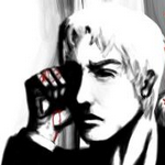
Tis all about the sound and atmosphere, bebeh~
(the flashing and CG are WIP)
I don't know if I convey the events here well enough...I wanna be kinda subtle with this scene rather than violent or gory, and the scene afterwards does kind of capture what happens here, but hm...
@NOACCEPTANCE772
An example of sprites not fitting together would be the bikers in white clothing.
They have clear black outline and not much in the way of detail.
The bikes, however, is really detailed and has no outline.
The blood flowing from them in buckets also is extremely grainy and looks like you just put various big squares of slightly different shades of red together randomly.
Obviously I am aware you're not showing the whole game here. I'm sure there are lots of rape and murder, but rape and murder doesn't automatically equal a serious story and good dialogue.
I could give you heaps of examples but I'm going to give one I feel is very similar to your game: 90% of action B-movies made from 1980-90.
Which just makes me say this again. Your game would be alot better as a side-scrolling shooter game, at least that is the feeling I get from the parts shown here.
author=SnowOwl
@NOACCEPTANCE772
An example of sprites not fitting together would be the bikers in white clothing.
They have clear black outline and not much in the way of detail.
The bikes, however, is really detailed and has no outline.
The blood flowing from them in buckets also is extremely grainy and looks like you just put various big squares of slightly different shades of red together randomly.
Obviously I am aware you're not showing the whole game here. I'm sure there are lots of rape and murder, but rape and murder doesn't automatically equal a deep story and good dialogue.
I could give you heaps of examples but I'm going to give one I feel is very similar to your game: 90% of action flicks made from 1980-90.
Which just makes me say this again. Your game would be alot better as a side-scrolling shooter game, at least that is the feeling I get from the parts shown here.
Yeah, you're like, 98% right here.
I gotta change those damn motorbike cop sprites.They are so damn hideous.LOL xD
The blood too.I am planning on redoing it all.Completely.
The rape and murder scenes are not the only scenes and I am not saying they make the story deep.:P
The story is different and once you go through the game for the first time, your head would be pumping.LOL
Yeah, I know.All the action scenes....well I am not sure of them.
I like making it like the old stuff, like old animes and so on. :\
I would love to make this a side scrolling shooter but RM2K3 is the only program I can use when it comes to game making :(
I was originally aiming to make a 3D game when I got into game making but it is just so complicated :\
it took me like, 4-5 years to fully understand RM2K3 :|
Among all other things, there are other things in my life, like my shitty exams and college and stupid, pointless, worthless shitty drama with ignorant numb nuts :\
So yeah, this is all affecting my game making abilities and makes me want to quit completely after whore of babylon :\
Finally, some good and elaborated criticism.Thanks, SnowOwl and AlterEgo. ;)
~♥
I'd say go for the bottom one, but I think the windows are really out of place there. People would get distracted and look outside instead of at the screen. xD
So neither ones are good enough? XD
The reason the north corridor looks so weird is because the ceiling and floor tiles appear to be on the same level, amplified by the lack of a wall image at the back and from being four tiles away from the other nearest wall; it creates a small section where you can't tell that there's any walls at all.
I think the players should be able to tell. They would be too familiar with these tiles and mapping style from the other maps by the time they get here. But I am still open for more feedback. :D
I actually think it's because the wall tile is one solid colour; you don't get a levels issue if you use a tile with a black interior. Try switching it up and see how that looks.
Bad. :(
@Kyrsty: I like that, but I think you should keep the flashing barely noticeable. Also for extra dramatism, how about zooming-in on Fionn a little? It would be a good idea to make the background to slowly get dimmer too, to empathize more on him... As for the sound. What is it supposed to be? It sounds like a baby 'something'. A baby werewolf, maybe? =P
@Mr_Detective: Well, the bottom one but w/out the windows. Not sure what you should put there, though. Screens look cluttered also.
@Mr_Detective: Well, the bottom one but w/out the windows. Not sure what you should put there, though. Screens look cluttered also.
author=alterego
@Mr_Detective: Well, the bottom one but w/out the windows. Not sure what you should put there, though. Screens look cluttered also.
Uh, I could cut down the sizes of the tables, I suppose. But if I remove the windows, it isn't going to be much different than the first one. XD
author=NOACCEPTANCE772
The rape and murder scenes are not the only scenes and I am not saying they make the story deep.:P
the what
author=mawkauthor=NOACCEPTANCE772the what
The rape and murder scenes are not the only scenes and I am not saying they make the story deep.:P
Aww, don't worry :)
Those are not the only horrible things you'll witness in the game! :D
you're underestimating me if you think I'm gonna bother with some guy's rape fantasy
oh sorry my line was "wow noacceptance you are very edgy and I could just smooch you" wasn't it
e: vvv I love to fight
oh sorry my line was "wow noacceptance you are very edgy and I could just smooch you" wasn't it
e: vvv I love to fight
author=mawkExcuse me?
you're underestimating me if you think I'm gonna bother with some guy's rape fantasy
oh sorry my line was "wow noacceptance you are very edgy and I could just smooch you" wasn't it
I am not telling you to admire it.
I don't implement it to look edgy either.Do you like to pick fights with everybody here or something?
EDIT: Woops, took you for somebody else.
But anyhow, haters hate.What am I supposed to do? ;)
author=NOACCEPTANCE772author=mawkAww, don't worry :)author=NOACCEPTANCE772the what
The rape and murder scenes are not the only scenes and I am not saying they make the story deep.:P
Those are not the only horrible things you'll witness in the game! :D
Furries?
author=alterego
@Kyrsty: I like that, but I think you should keep the flashing barely noticeable. Also for extra dramatism, how about zooming-in on Fionn a little? It would be a good idea to make the background to slowly get dimmer too, to empathize more on him... As for the sound. What is it supposed to be? It sounds like a baby 'something'. A baby werewolf, maybe? =P
The flashing is definitely going to be more subtle, since I'm going to tie it into the actual drawing rather than a picture tint.
The sound is children's laughter...I'll probably actually add a couple of children running out into the street as it plays so it's not so ambiguous.
author=benosauthor=NOACCEPTANCE772Furries?author=mawkAww, don't worry :)author=NOACCEPTANCE772the what
The rape and murder scenes are not the only scenes and I am not saying they make the story deep.:P
Those are not the only horrible things you'll witness in the game! :D
LOL, I was thinking of it before and a friend of mine, who is a huge fan of furries suggested it but.. nah, fuck it. :P LOL!
looks pretty nice so far. it's a little weird that the top-right and bottom-left workstations are identical, though, and the top-left and bottom-right too -- change 'em up a bit!
You could probably push some of the chairs in, turn off a few computer monitors in empty stations, add bins instead of pot plants and perhaps get rid of books on some of the desks. Little things can make it look very different from each other.
Also, have a mini-story for the characters that work at the desk if you're having trouble. Maybe one is a neat-freak so everything is clean and stacked nicely, another could be a family man with a picture of them on his desk, yet another could be an otaku who collects cute dolls or someone very messy with a full or overflowing bin. Perhaps one of the monitors is broken or there's a desk that's empty because the occupant quit recently? Many different little things to add character.
Here's some recolours. I dunno, I just like messing around with the RTP. Also, you can change what gender, class, appearance and name your character has.

This be a female Rogue.

And here be female Fighter.
Also, have a mini-story for the characters that work at the desk if you're having trouble. Maybe one is a neat-freak so everything is clean and stacked nicely, another could be a family man with a picture of them on his desk, yet another could be an otaku who collects cute dolls or someone very messy with a full or overflowing bin. Perhaps one of the monitors is broken or there's a desk that's empty because the occupant quit recently? Many different little things to add character.
Here's some recolours. I dunno, I just like messing around with the RTP. Also, you can change what gender, class, appearance and name your character has.

This be a female Rogue.

And here be female Fighter.


