


WINNIPEG JETS REVEAL NEW "LOGO"
Posts
Pages:
1

So, yeah, anybody who has been following hockey for awhile must have heard the news just a few months ago about the city of Winnipeg getting back their hockey team after a long hiatus. They decided to keep the name "Jets" back at last month's "Entry Draft," and thus the long wait began to see what, exactly, they were going to come up with for their new logo.
Well, it's here, and it looks...RATHER GAY!!! WTF is this shit!? It looks a giant curling / bulleyes target with a jet / leaf in the middle! This almost looks like what the old Canadian flag was suppost to look like before they switched to the one we have now!!! Lol. Is this the best they could come up with?
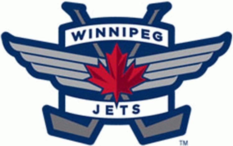
Personally, I like this logo MUCH better:
Discuss!

They are both bad, really...
-The old one would have been much better with just the name of the team left alone, and without that curvy-ness or whatever you may call it. The stick is a nice touch, but the silhouetted jet and all other awkwardly drawn lines around it are just garbage.
-As for the new one. The circle is the epitome of equilibrium in Graphic Design, so most logos strive for it. But this one doesn't tell you "Hockey" unless you're a fan of the team. In addition, its fancy 3D look makes me question its real worth as a logo.
Uh...

I thought it looked good. Also, there is a 99% chance they will have a "retro" jersey (teams are allowed 3 jersey styles, right?).
...and if it isn't selling well, they can change it down the road. I mean, look at the Canucks now. Or the LA Kings (does anyone remember their hideous purple and yellow jerseys?)
...and if it isn't selling well, they can change it down the road. I mean, look at the Canucks now. Or the LA Kings (does anyone remember their hideous purple and yellow jerseys?)
author=kentona
(does anyone remember their hideous purple and yellow jerseys?)

*gag*
But you know what, after looking at the logo a second time, it's really not half that bad. And since most Winnipeg fans at the peg are buying this stuff like two rapid bunnies getting it on, I like it!
As soon as tickets go on sale for the Canucks game, I am -- so -- getting a seat when we play Winnipeg at our home arena for the first time! I was never into a hockey when they were around, so I'll make up for lost time. :D

author=Brent
like two rapid bunnies getting it on, I like it!
author=Brent
bunnies getting it on
author=Brentlololololololol. :3
getting it on

Old logo sucked, new logo is win.
Minus the Jet, it's the same logo that is on all of the Royal Canadian Air Force's Jets. It's very traditional, and works wonderfully. At very first glance, I had a bit of "Holy shit this looks like Captain America's shield but with a leaf and jet on it."-moment, but after realizing where it's roots are, I am all for it.
Minus the Jet, it's the same logo that is on all of the Royal Canadian Air Force's Jets. It's very traditional, and works wonderfully. At very first glance, I had a bit of "Holy shit this looks like Captain America's shield but with a leaf and jet on it."-moment, but after realizing where it's roots are, I am all for it.
author=prexus
"Holy shit this looks like Captain America's shield but with a leaf and jet on it."
Funny enough, this logo came out just a few days before the release of the movie! Hmmmmm...


This logo isn't half bad, and is the one I expect will end up on most of the merch and on the jerseys.

When I was 10 one of my friends redesigned every sport's teams logos. The Jets logo he made looks just like the one in the video.
author=ShortStar
When I was 10 one of my friends redesigned every sport's teams logos. The Jets logo he made looks just like the one in the video.
What did the "Canucks" one look like?
It makes me sometimes wonder, "Why a stick?" Can't we have something cool like what almost every other team has for their logo? Oh, well...
Pages:
1

