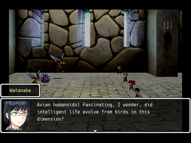
One or two (or six) people pointed out to me that Agency FB is not easy to read so I switched fonts/typefaces for The Staircase to 'Hack'.
Better? Worse? What do you think? If the consensus is that this is a good font, I'll go through and finish rejiggering the rest of the show text commands and item descriptions in the game to make sure the text fits, since Hack is obviously much less compact than Agency FB.

 Add Review
 Subscribe
 Nominate
 Submit Media
 RSS
RSS StormCrow