


 Add Review
 Subscribe
 Nominate
 Submit Media
 RSS
RSS
Heartland: New Textbox Format and More!
 Faye
Faye- 11/02/2019 12:53 PM
- 246 views
Ahh. Should've posted this yesterday, but my connection sucked. Regardless of that, here's the weekly report on Heartland's progress :)
This weekly report is short on content unlike the last one, sadly. But this time at least I got GIFs to show!
What I wanted to talk about today is textboxes. To me, text, from the way it's displayed, to the font and the colours, is highly important in a game. Specially in RPGs where everything is managed through it (GUI, dialogues, story narrative and whatnot). Therefore I needed to change the way text was displayed in my game due to the graphical upgrade I made. The first stop was the text aesthetics--it needed to stand out more over the new windowskin. So then, I decided to use gradients(thanks Neonblack) just like rm2kX did, as well as a contour. It looked neat.
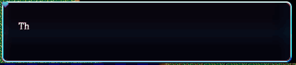
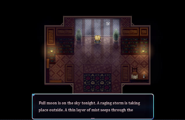
However, the next problem I saw was how text was shown outside of any GUI. Heartland is a game that features a narrator telling the player everything you do, what you have to do and what you did. The way the game showed the narrator's lines before featured no textbox per se. It was rather a black bar with the width of the screen and two lines worth of (possible) content. This had problems: the screen being 640px wide made the text line too "big" to read comfortably. Like it wasn't so much of a big issue, but it was not optimal. Also, having only two lines made for a lot of text display commands, thus getting easily lost if you didn't pay attention enough. Putting a lot of text in two wide lines also wasn't optimal. So here's the solution:
I decided to go back to using a textbox. A very simple one yet handy which could hold any of the contents I'd put into it, in a coherent way of course. Apart from that, the thing also has a sound when it opens and when it closes (soft and nice, of course) for better immersion. This decision optimized the aesthetics of the text display method as well as optimizing the problems it had when reading.
One of the harshest critique I received was how damn slow the text was. And I completely agree. Hence why I changed the speed to the quickest, reduced wait command for punctuation in half, and made able for the player to skip text by pressing the action button (Z).
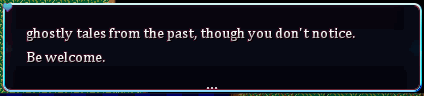
Remember what I said about the two lines not holding enough content? Well, this textbox is smaller but can hold four lines. Even then, some paragraphs can have more than four lines. What'd happen then? Another text display and continue the same problematic? Of course not. The paragraphs can now be reviewed! This is done by pressing the up and down arrows of the keyboard.
Smooth-fashioned! Thanks to modern algebra for their ATS scripts. Wonderful doing.
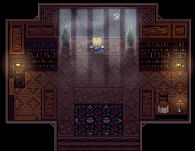
If you're wondering how it'd look in a map, take a look! This is the same scenario than the gif at the top.
A few last notes to be said: I yet have to re-visit the menu design. And I did, but then I realized that it had to have the new gameplay elements not yet defined, and thus I couldn't design something unknowingly of its contents themselves. For such, I decided to firstly re-structurate the game flow, story and narrative firstly and after everything's done, the CMS will be made. It's just more logical that way.
Last note is that Heartland: Awakening will be a game of its own. What will remain from the old Heartland are only core elements (such as characters and -some- of the barebones of the script). A lot to be changed. However, and for exposure purposes, I'll keep blogging in this game's page :)
Well, that's all for this day! Time to drink (more) coffee.

