


0 reviews
 Add Review
 Subscribe
 Nominate
 Submit Media
 RSS
RSS
✦ Content Warning
✦ Characters

✦ Gameplay
A forgotten memory lost within the tides of time.
Bonds forged. A promise made.
Aimlessly they wander through the starless sea.
With the pale moon's guidance, they walk towards their fate.
Bonds forged. A promise made.
Aimlessly they wander through the starless sea.
With the pale moon's guidance, they walk towards their fate.
✦✦✦
✦ Content Warning
This game contains depictions of beauty of death, murder, implied sexual assault, depression, anxiety, and suicide, and may not be suitable for all audiences. It also contains bright flashing imagery that may cause discomfort and/or seizures for those with photosensitive epilepsy. Viewer discretion is advised.
✦✦✦
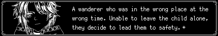
✦ Characters
✦✦✦
✦ Gameplay
 | Explore the world through a node based system. Trigger events, encounters or treasure! |
 | Manage your resources properly. Each field action, skill and powering up costs gems. Gems are only replenished by defeating monsters or through your HP! |
 | Meet various characters on your journey! Are they friend or foe? |
✦✦✦
Latest Blog
Primer Trailer Update
 Archeia_Nessiah
 0 post(s)
- 06/06/2022 06:54 PM
- 312 views


- Production
- 1 of 3 episodes complete
- Archeia_Nessiah
 RPG Maker MZ
- Simulation RPG Visual Novel
- 04/11/2022 07:08 AM
- 09/28/2023 02:29 AM
- N/A
- 10471
- 16
- 0
Tags
Posts 

Pages:
1


Pages:
1

