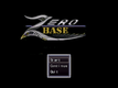
Mmh- I like the "Z" it looks like a crazy graffiti or something, the "ero" seems to be part of the same picture but I'm not sure. However what really bothers me is the word "base" that is just kind of pasted on top and with a font (times?) that is exactly the opposite of what this logo needs... You really need to change that.
your keen eye isn't wrong, I just had some trouble finding a font which would replicate the old one better. For those who don't recognize it, it's a slight edit of the Zero Wing title screen.
If I get time, I'd like to do something about it, but since I want this done for the valedictory event, other stuff takes priority.
Perhaps you can word that Start to Press Start, and Continue to Continue from last Save, or just Continue(?) bc RPG Maker 2003. :) It looks a little blurry to me. I tried sharpening but that made it look weird. The Z almost looks like a metallic bird and there's a gold beak there lol it does look cool, I added CC for creative commons (?) can't really copyright that -_- The word BASE seemed out of place to me, didn't fit fully. When great minds think alike, and great things can be achieved.

 Add Review
 Subscribe
 Nominate
 Submit Media
 RSS
RSS


