


 Add Review
 Subscribe
 Nominate
 Submit Media
 RSS
RSS
- Summary
- Blog
- Images
- Reviews
- Media
- Hints and Puzzle Solutions
- Hunts and Powerful Weapons
- Downloads
- Play Lists
Preview of comic-style scene.
 polarcactus
- 03/08/2012 01:58 PM
- 2490 views
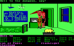
So, I've only finished the first two images of the very first scene in the game. I was actually listening to Phantasy Star 4's sountrack while doing this. I haven't played that game since 2008, but I still have memories of it ( being my first RPG and all...)


Ignore the windowskin, the original one from the game still appears there. This is a mockup, after all. I decided to use smaller versions of the character bust-shots ( the larger ones being used for less important scenes ) since the portrait faces ( as used for a message window ) don't fit all that well into a 96x96 portrait grid ( as seen in my avatar ). I prefer to see their neck and shoulders as well.
Do you think I should dim out the portraits whenever a new character speaks? Even though their name appears in the name box ( due to the ATS ), I think it will make a better visual indicator.
Thoughts? :)
Posts 

Pages:
1
I don't know if I like seeing the portrait next to the comic book scenes because from my standpoint right now, I don't see a point for them. I actually like how the smaller ones look to be honest (less clutter on the screen, but that's just my personal preference with portraits). Though I think I'd need to see it in action to see how the portraits work with the rest of the scene in question before I can really say if you should keep portraits during those scenes or just stick with name box and all that.
Though you're going to hate me in a second: is everyone wearing goggles? I know what you're going for, but I always thought it was a lame cheap trick anime used so they didn't have to draw eyes. The point of these scenes is to show you aren't being lazy! (Though, this is personally my view of the goggle-eyes old shows used to do, but I really do think you can do better) I think you should either have their heads more looking down (to warrant the shadow over the eyes), or perhaps just draw in the eyes.
Though you're going to hate me in a second: is everyone wearing goggles? I know what you're going for, but I always thought it was a lame cheap trick anime used so they didn't have to draw eyes. The point of these scenes is to show you aren't being lazy! (Though, this is personally my view of the goggle-eyes old shows used to do, but I really do think you can do better) I think you should either have their heads more looking down (to warrant the shadow over the eyes), or perhaps just draw in the eyes.

Is this better, Ron?

The hooded man's eyes is never shown in any scene, so I just pulled down his hood a bit. I also ditched the larger portrait, and tried working with the 96x96 portrait instead. Given that there won't be more than 3 images used in these scenes, I could maybe still get away with using the smaller bust shots, but for some it may be too distracting. So, still deciding there.
The hooded man's eyes is never shown in any scene, so I just pulled down his hood a bit. I also ditched the larger portrait, and tried working with the 96x96 portrait instead. Given that there won't be more than 3 images used in these scenes, I could maybe still get away with using the smaller bust shots, but for some it may be too distracting. So, still deciding there.
Looks pretty good! The "goggles" over the eyes are really noticeable, though. Perhaps lessen the outline so it can blend in with their normal skintone better.
I also agree that the smaller portraits are probably better. The bust shots are quite big and distracting. The small portraits do look quite clipped, though...I'm sure you'll work something out.
I also agree that the smaller portraits are probably better. The bust shots are quite big and distracting. The small portraits do look quite clipped, though...I'm sure you'll work something out.
I think on the shadow guy, the "goggles" is fine because of the way his hood is. I can't say the same for Pat and Laine however!
I do like the face in the windowskin better than the portrait off to the side. I think that helps to focus on the image above. I would say take out the face in the window too because you don't want to draw the eye away from the scene happening, do you know what I mean? Our focus should be the main image, not the portrait down on the bottom. Though if you must have a face for your own design reasons, I can respect that. Just remember to always have the player focused on the main scene.
I do like the face in the windowskin better than the portrait off to the side. I think that helps to focus on the image above. I would say take out the face in the window too because you don't want to draw the eye away from the scene happening, do you know what I mean? Our focus should be the main image, not the portrait down on the bottom. Though if you must have a face for your own design reasons, I can respect that. Just remember to always have the player focused on the main scene.
I admit it was a little hard getting their eyes and mouth in, but here it is.

The faces in the windowskin can also express emotion for an image that I'm not normally able to draw in ( due to the 3 image limit for these scenes, also, the screen would probably be too cluttered with more than that ). For example, in this scene, when Laine draws her sword and points it at this hooded man, Patrick's reaction is one of fear. Now, because i don't have an image for that, his faceset should convey that in place of the missing image, since it's there for all of 2 seconds.
Hopefully, that makes some sense. :)
Looking good in terms of the faces in the main page! I'm not up on what you've based this comic-book style on, but in terms of emotions, would it be really hard to subtly change it in the main picture? Though if what you're going for is like the game you're emulating and they don't do it that way, I think the faceset in the windowskin would be cool. :D Can't wait to see it in action!
Hm...by the way, a comment on the second picture: Laine looks awfully relaxed. I believe it's supposed to be showing her anger, but the picture doesn't really show that to me. She looks too relaxed, and the weird perspective makes it look like she's holding the sword to the side, making it look like a formal duel. Perhaps if she looked more tense (and she was pointing the sword straight at the cloaked man), it would get across her anger better.
Pages:
1

