
1 reviews
 Add Review
 Subscribe
 Nominate
 Submit Media
 RSS
RSS
- Summary
- Blog
- Images
- Reviews
- Media
- RSW Bug Reports
- Unlockable Guests
- RMN Soundtrack Voting
- Credits
- Downloads
- Play Lists
 WCouillard
- Added: 08/18/2013 05:25 PM
- Last updated: 04/19/2024 02:40 AM
- 24662 views
Posts 


I see!
I hadn't thought of just drawing another Rect behind the gauge. I was thinking I would have to code a 1 pixel line around each side. Currently I have image files for each part of the HUD. Such as the base layout, each bar, etc.
Which is how I have multiple colors in the HP/MP gauge, and the FF4PSP ATB gauge.
The border colors are part of the image I added, not part of the script, although each different gauge shown here has its own method, instead of just using draw_gauge.
Adding a colored border, though, is as easy as creating a new Rect behind the gauge, and filling it with whatever color you want, and making it 2 pixels wider and 2 pixels taller than the gauge itself. Then you just position it correctly to show it as a 1 pixel border around the entire gauge.
As for getting the gauge itself to be a single color, that's a default function. You can set the colors of the gauges in the script, I think in Window_Base. Look for something like color1 and color2 in the draw_gauge method. Just make them the same color and your gauges will be one solid color.
Oh, thanks!
That sounds a lot more of use than MOGs entire script just to change a few things, but I suppose I wouldn't be able to get the detail that I have if I just moved the basics of everything around myself. (Such as gauges being a solid color)
I'm using sFonts as well, and MOGs doesn't pick it up for whatever reason.
It also scrolls through states instead of showing them all at once.
How hard is it to add the colored borders around each separate gauge?
I'm not a script-er of any sort so this has been a challenge, ha ha!
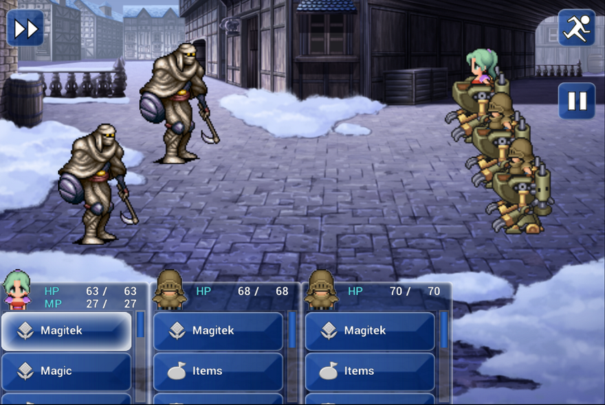
I'm not using Moghunter's script for it, I wrote that one up myself for FFD. Just basically cloned a bunch of the methods in the default scripts and changed a bunch of values to get the positioning right and added a background image to each actor's row.
Nice job on the image! Looks good!
Nice job on the image! Looks good!
Curious towards which script you're using for the HUD.
I'm currently using one of MOGs HUD systems.
Using your design (Which I really liked) as a base, I tweaked it to my liking.
This is how it looks now: http://imgur.com/7wuJQad
If you're using MOGs too I would -really- appreciate some help with a few things!
I'm currently using one of MOGs HUD systems.
Using your design (Which I really liked) as a base, I tweaked it to my liking.
This is how it looks now: http://imgur.com/7wuJQad
If you're using MOGs too I would -really- appreciate some help with a few things!

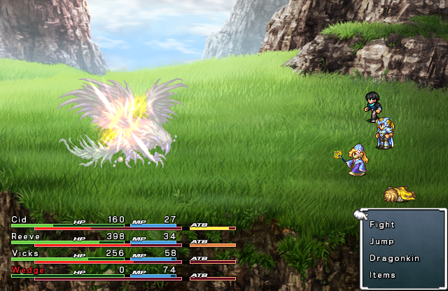
author=Noel_Kreissauthor=ThiamorI think you missed the memo, but there'll be custom animated sprites for party in the game; FFIV:TCC sprites are just placeholders from what I know.
Only suggestion I have is to tweak the character battle sprites to be as detailed, or close to as detailed as the background and monsters. This way it won't look as colorful mainly because it stands out so much compared to the sprites.
Doesn't change my point. Hopefully they will be as detailed as the rest of the battle HUD.
author=ThiamorI think you missed the memo, but there'll be custom animated sprites for party in the game; FFIV:TCC sprites are just placeholders from what I know.
Only suggestion I have is to tweak the character battle sprites to be as detailed, or close to as detailed as the background and monsters. This way it won't look as colorful mainly because it stands out so much compared to the sprites.
Only suggestion I have is to tweak the character battle sprites to be as detailed, or close to as detailed as the background and monsters. This way it won't look as colorful mainly because it stands out so much compared to the sprites.
i actually like this better then the old one, i don't mind the colors and the whole thing looks more "professional"
author=Noel_Kreiss
I'm in-between: I like how each of the game has its own colour, but then again it appears to be somewhat distracting. Maybe you should go with less vivid colours...
Also, can a character "Defend"? If so, s it some kind of left/right arrow or is an equipment skill or something like that?
Pressing left will give the option for the Defend and Summon commands (if a Nethicite is equipped). Still working on the implementation there, though.

I'm in-between: I like how each of the game has its own colour, but then again it appears to be somewhat distracting. Maybe you should go with less vivid colours...
Also, can a character "Defend"? If so, s it some kind of left/right arrow or is an equipment skill or something like that?
Also, can a character "Defend"? If so, s it some kind of left/right arrow or is an equipment skill or something like that?
Hmm... I think it almost seems too colorful now. I think I preferred the one right before (a la 13) without the 14 influence. I'm interested in what others think though.
I might do that, actually. Right now, the gauges serve to show the player how full their HP/MP is, but I might still add the color thing in, too. I updated the screen again, after I gave the gauges their own specific color backgrounds. Inspired by FFXIV, that was. :D
That's an awesome look!
Does the staff-and-blue-light icon stand for a "Magic Up" type status enhancement? I assume that the icons are temporary?
If I could suggest a little thing: FFIV:TCC has this pretty way of colouring numbers for current HP and MP green when they are fully healed (in other words: either HP and/or MP is full). That's be nice.
Updated on 11-18-2014.
We decided on a more modern look, inspired by later FF entries like FFXIII. We may still adjust things here, but it's basically a finished look.
We decided on a more modern look, inspired by later FF entries like FFXIII. We may still adjust things here, but it's basically a finished look.