If you need help I can make this a heck of a lot better. It's a bit too rushed, it's not the background itself but the text could use a bit of a push, kinda a not great font, I feel like something maybe with serifs could improve it. That bottom text isn't really lined up well - breathing space (the knowledge of art school fills me with this sort of wisdom). That and I can get your name or a logo in the 'splash screen' with a quick editor - just to make it yours.


 Add Review
 Subscribe
 Nominate
 Submit Media
 RSS
RSS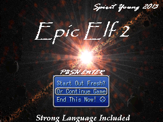
 spirit_young


