Don't hesitate to share your thought.
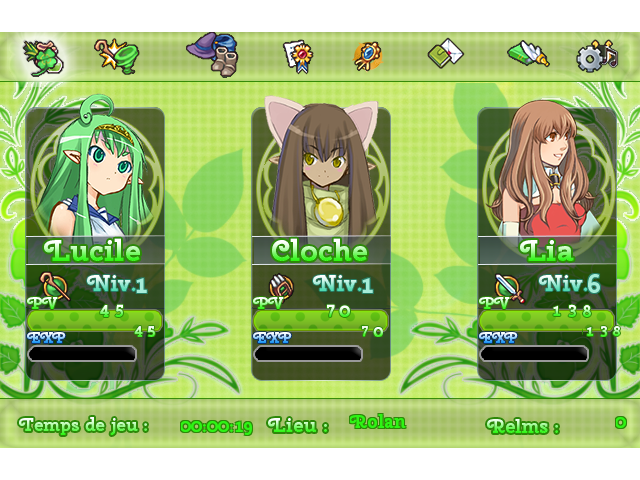
The "all in green" (but not the same green) was completly made on purpose.
The text color of the down menu will change.
The style clash between the character faces is about the only issue, bar the readability of some of the text (the HP numbers are very hard to read - try using straight white or something so they stand out better).
author=Liberty The style clash between the character faces is about the only issue, bar the readability of some of the text (the HP numbers are very hard to read - try using straight white or something so they stand out better).


 Add Review
 Subscribe
 Nominate
 Submit Media
 RSS
RSS