 Add Review
 Subscribe
 Nominate
 Submit Media
 RSS
RSS
The Old and the New (Facesets Continued)
 Feldschlacht IV
- 01/22/2017 03:55 AM
- 6687 views
The transformation of Chronology continues with the transformation and addition of new custom facesets, courtesy of JosephSeraph!

In an interesting twist, JosephSeraph did such a good job with the last guy that he'd fit perfectly on another character (that wouldn't have a face at all otherwise) and I'm making an extra/other faceset for the last guy.
This is also one of the last instances where some of the facesets resemble the original; with the first few faces, there were some, like the two soldiers, that I liked so much that I wanted an original take on it (with the color scheme I edited in), but something to notice.
And now for some progress gifs.


This will be the last update with just the facesets; the next big update I hope to be able to show off the facesets with brand new bodies.

In an interesting twist, JosephSeraph did such a good job with the last guy that he'd fit perfectly on another character (that wouldn't have a face at all otherwise) and I'm making an extra/other faceset for the last guy.
This is also one of the last instances where some of the facesets resemble the original; with the first few faces, there were some, like the two soldiers, that I liked so much that I wanted an original take on it (with the color scheme I edited in), but something to notice.
And now for some progress gifs.


This will be the last update with just the facesets; the next big update I hope to be able to show off the facesets with brand new bodies.
Posts 

Pages:
1
Dang, I'm loving this hair accessories. I'm pretty sure the last faceset is someone cosplaying as the Empress from Neverending Story. I am OK with that.
I'm sensing a total overhaul in visual design based on all these neato details.
now give us dem bods
I'm sensing a total overhaul in visual design based on all these neato details.
now give us dem bods
S-Sorry, but again, I prefer the old ones, colour-wise at least. The actual designs are great but something about the skin colour makes them look... sickly is the best description I can come up with. I think it might be the highlights. They appear too white/grey instead of being closer to the skin tone. Maybe try varying the colours a tad away from the washed-out ones.
I took a closer look and you use a lot of grey colours for shadows and highlights. It really washes out the colours that are there (which are nice ones!) and makes them drabber than they should be.
I took a closer look and you use a lot of grey colours for shadows and highlights. It really washes out the colours that are there (which are nice ones!) and makes them drabber than they should be.
I'm with Libby. My big caveat is that Joseph's colorfulness completely undermines the gritty dark fantasy you've been going for all along. His artwork is outstanding, but it's just the wrong stuff for the wrong project.
so everything that's remotely dark isn't allowed colors? dyhalto please. he was using ff6 & rudras tiles and you think that made it dark & gritty?
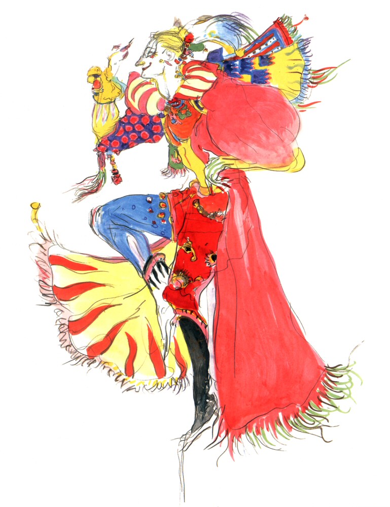
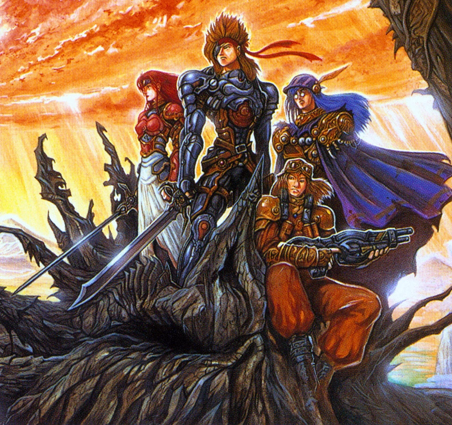
rudras was literally about stopping the apocalypse as a result of human pollution. no idea what you're on.
i kinda agree with libby's "grey skin" thing but also don't really mind it. i'm also a big fan of joser in general so *shrug*


rudras was literally about stopping the apocalypse as a result of human pollution. no idea what you're on.
i kinda agree with libby's "grey skin" thing but also don't really mind it. i'm also a big fan of joser in general so *shrug*
Red_Nova

Sir Redd of Novus: He who made Prayer of the Faithless that one time, and that was pretty dang rad! :D
9192
I agree that the difference in design and colors is pretty huge, even more so when viewed on top of the old tilesets, but I think it's best to wait and see all these assets in action before dismissing them as unfit for the game. When you're going for an original look after sticking with one style for so long, there's going to be some growing pains. Sure, they may be colorful, but these colors are all pretty low saturated, so it can still fits the gritty fantasy style as long as the rest of the new assets match.
That said, the one aspect that sticks out to me is, like Liberty said, the skin highlights. I think there is too much white on the skin for Dais, Metis, and the fourth person (whose name I can't remember. Sorry!). To me, all that white makes them look glistening, like they all just jumped out of the pool. I looked back through the other redesigns, and I don't see this amount of white on any of their skins, so that inconsistency may be why it's so jarring to me.
The blonde woman's portait (again, don't know the same) has the right amount of highlights, but that block of dark underneath her right eye (from her perspective, not the viewers) is oddly flat compared to the rest of her shading.
But that's just what sticks out to me. Hope I explained it well.
Thanks for all the feedback guys! As you can see, the second batch is quite different from the first one. I'm experimenting still, and later I'll come back to the portraits and rendering them with the style that Felds will prefer, and that I feel are also better technically. With that in mind, all the feedback is incredibly helpful!
I haven't done pixel art portraits in a while, but I"ve done lots and lots of tiles -- so I'm bringing the limited palette mentality far too intensely into the faces I feel. While with some of them I feel pretty happy (Metis' headgear texture is by far what I'm the happiest about) overall I'm far from happy with the palette, Dais in particular might be a bit too colorful.
Next batch of portraits I'll try to come with a more complex palette and see if it works! This way I can work on smoother shading on the skin without relying on whites (which are actually grays) for instance.
I'm also considering doing drawn portraits and rendering them colour-limited through irfanview to give them a PS1 rendered look, but that'd require approval (it would look fitting though, since I touch it up at hand it'd have a distinct pixel art look while having the palette control of a regular painting of mine)
Anyway all that detailed feedback is extremely precious!
And as @Craze mentioned by citing 2 marvelous examples i'm not going to do that by dulling colours out, but instead by working on a more solid palette : )
Am I the only person who likes the greyish skin? Like, dudes running around with pink and purple hair and nobody bats an eye, but grey skin? Oh that's a big no-no guys make those people orange again!
I love the limited palette and I like that the characters don't have the same bog-standard pink faces every other artist goes with. The only real issue I can see with the shading is those few errant off-white pixels around the Empress' nose, there.
Also what is this hullabaloo about "no colours in dark fantasy"? Dark fantasy is made infinitely better by having rich colours to contrast the grim parts of the tale. Like, look at how bad Fallout 3 looks because it wanted to be dreary because it was post-apocalyptic. I am so incensed by the thought of dark fantasy=lack of colours that I refuse to come up with any more examples.
COLOURS ARE GOOD COLOURS ARE GOOD COLOURS ARE GOOD
Anyway keep playing around with it until you find something you and Mog are both happy with :D
Thanks for the feedback and discussion; keep it coming, because it's very helpful to us both in moving forward.
Also keep in mind that skin color wise, not all of these people are supposed to be 'white'! Yes, some of them are, but Callox in particular I made somewhat racially ambiguous, and Dmitri is straight up dark skinned. While we're still working out the kinks of the palette, I wanted to make that aware for everyone.
Also keep in mind that skin color wise, not all of these people are supposed to be 'white'! Yes, some of them are, but Callox in particular I made somewhat racially ambiguous, and Dmitri is straight up dark skinned. While we're still working out the kinks of the palette, I wanted to make that aware for everyone.
it is fun to look at the progress gifs ^^
Metis looks great
I think the monocle gets lost in the noisy shading, maybe if its kept more simple/clean it'll be easier to see
Metis looks great
I think the monocle gets lost in the noisy shading, maybe if its kept more simple/clean it'll be easier to see
Testing a completely different approach; doing HD art and shrinking / color reducing it, then touching it up as pixel art.


we're torn since the new technique looks more PS1-ish than SNES-y even though it only has 20 colors (technically possible on the SNES)
I'll try "raw" pixel art again, but maybe with a broader, browner palette.
Perhaps i should take a few days to fetch SNES era portraits, deconstruct them, study their palettes etc. then resume work on this!
Thanks for the feedback, guys.
author=Feldschlacht IV
Thanks for the feedback and discussion; keep it coming, because it's very helpful to us both in moving forward.
Also keep in mind that skin color wise, not all of these people are supposed to be 'white'! Yes, some of them are, but Callox in particular I made somewhat racially ambiguous, and Dmitri is straight up dark skinned. While we're still working out the kinks of the palette, I wanted to make that aware for everyone.
They all look like the same 'color' due to palette though. If you asked me to identify those of a different race based on their skin colour, that one guy in the previous group would be the only one I could point out as any different in that aspect. Sorry, I know it's not what you'd like to hear. >.<;
The warmer palette is a lot nicer, yes.
Funny, I prefered the greyish tones of the other personally. I have no problems with that.
My only issue is that they all look like if they were smirking or happy about something, but your new one has a better, more determined attitude I think.
Regardless I prefer the new ones to the rips.
My only issue is that they all look like if they were smirking or happy about something, but your new one has a better, more determined attitude I think.
Regardless I prefer the new ones to the rips.
author=Liberty
They all look like the same 'color' due to palette though. If you asked me to identify those of a different race based on their skin colour, that one guy in the previous group would be the only one I could point out as any different in that aspect. Sorry, I know it's not what you'd like to hear. >.<;
The warmer palette is a lot nicer, yes.
No, that's exactly what I like to hear; feedback! On that note, Callox (the main character) has darker skin as well.
I'm surprised though, you can't tell the different skin color tones between the characters? I'd think if nothing else, the soldier guys from the first set are noticeably whiter than the rest.
author=Craze
dyhalto please. he was using ff6 & rudras tiles and you think that made it dark & gritty?
No. I was thinking it was dark & gritty on account of the game's summary and all the elaborate details put into characters, the bestiary, the newspaper clipping events, et al. It's the stuff of a game more likely to follow a politically driven logical storyline and less likely to be a series of fetch quests in order to defeat the dark god. Usually those kinds of games avoid the bubbly smiled pink and purple hair folk.
Anyway, the whole thing will be a package deal in the end anyway. We have no idea what the new sprites and tilesets will look like yet, so what the heck am I on? Feld and Joe, forget I said anything. My comment was too in-the-moment.
author=Feldschlacht IVauthor=LibertyNo, that's exactly what I like to hear; feedback! On that note, Callox (the main character) has darker skin as well.
They all look like the same 'color' due to palette though. If you asked me to identify those of a different race based on their skin colour, that one guy in the previous group would be the only one I could point out as any different in that aspect. Sorry, I know it's not what you'd like to hear. >.<;
The warmer palette is a lot nicer, yes.
I'm surprised though, you can't tell the different skin color tones between the characters? I'd think if nothing else, the soldier guys from the first set are noticeably whiter than the rest.
Oh, I forgot about those ones. They are noticeably whiter, definitely. Out of this lot, though, you can't tell any difference in races.
author=Liberty
Oh, I forgot about those ones. They are noticeably whiter, definitely. Out of this lot, though, you can't tell any difference in races.
You're right; these ones all pretty much the same ethnic group, but I was thinking of all of the characters released so far.
author=Dyhalto
No. I was thinking it was dark & gritty on account of the game's summary and all the elaborate details put into characters, the bestiary, the newspaper clipping events, et al. It's the stuff of a game more likely to follow a politically driven logical storyline and less likely to be a series of fetch quests in order to defeat the dark god. Usually those kinds of games avoid the bubbly smiled pink and purple hair folk.
I understand what you mean, but I don't think you're giving Craze's view a fair shake.
List of games off the top of my head that are dark, logical, or politically driven games with featuring people/etc with odd/vivid colors;
-Xenogears (this game, is particularly egregious for being dark as hell with some pretty silly characters and moments)
-Xenosaga
-Tactics Ogre: Let Us Cling Together
-Saga Frontier 2
-Final Fantasy IX
-Final Fantasy VI
-Suikoden series
I can even think of some WRPGs that can fit this bill, particularly some elements of Dragon Age and Mass Effect. The Witcher 3 even has some moments.
While the final product may have some slightly different color palettes with a bit more serious tone (keep in mind that this batch represents just 4 of the total people who will have facesets), I'd like to echo Craze's sentiments; while my game is more serious and not at all anime comic relief-y or lighthearted, it's not straight GRIMDARK or even Vagrant Story-ish in tone, either.
At the end of the day, I'd like the 'tone' of my game to be a mix reminiscent of FFVI, FFXII, and Xenogears. A dash of Tactics Ogre as well.
Metis' pink hair is staying though!
By all means though, feedback is important, so keep it coming!
never forget basch's rainbow chest pieces or balthier's gay pride rings
and yeah. xenogears isn't my favorite game but it definitely did "hey did you notice the color PURPLE" pretty well because if any rpg has come close to having a central color... yeah
and yeah. xenogears isn't my favorite game but it definitely did "hey did you notice the color PURPLE" pretty well because if any rpg has come close to having a central color... yeah
I'd also like to toss Chrono Cross into that mix; possibly the most colorful, vivid RPG I've ever played.
The game has a ton of lighthearted moments and ridiculous characters, but when you get into the meat of its themes and lowest moments, it's actually...dark as shit.
Not a direct inspiration to Chronology, but definitely something I wanted to mention. By all means though, I'm open to dissent; all feedback is valuable.
author=Liberty
Oh, I forgot about those ones. They are noticeably whiter, definitely. Out of this lot, though, you can't tell any difference in races.
Actually, they might've got the same skintone but i've envisioned Dais as having japanese traits, metis as middle eastern, amelia as british and dahaka as a brazilian.
i didn't really make an effort to make it evident but i think if you look its not hard to see their different features! : P
By the way as people know akihiko yoshida has been the biggest influecne in my works through the last 2 or so years! ´v`)/
anyhow, all the input has been really helpful, thanks!
Pages:
1


