


 Add Review
 Subscribe
 Nominate
 Submit Media
 RSS
RSS
- Summary
- Blog
- Images
- Reviews
- Media
- Survival Tips
- Characters
- Videos
- You might also like...
- Downloads
- Play Lists

 NicoB
NicoB- Added: 08/03/2010 06:24 AM
- Last updated: 04/16/2024 04:18 AM
- 7819 views
Posts 

Pages:
1


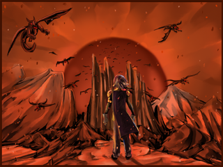
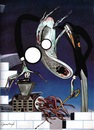
it's hard to see because this is the really small version, but he does have some red glowing off him from the front and sides...i guess i wanted to make him stand out more haha
Yeah can see those, but it's almost like adding a photo filter to everything when there's a certain colored light. Which is exactly what I did to try to point out what I mean:
But it's really really nice otherwise, though. Pretty ace job.
But it's really really nice otherwise, though. Pretty ace job.
comment=38416
Really nice. Though why is everything else made red by the light, except the character? ;o
comment=38417
it's hard to see because this is the really small version, but he does have some red glowing off him from the front and sides...i guess i wanted to make him stand out more haha
I'd say that since the name of the screen shot is "Standing on the Threshold" it makes sense that he should be a different colour... it shows that he is not a part of the chaos... yet... or maybe he's the 'hero' come to bring a sense of calming blue to a red world... :-)
comment=38422
...I usually think I'm the one who comes off too aggressive, haha.
Me too. I can never judge the tone of my comments for some reason..! %-)
ps. If you want to create pictures where the character stands out in a dynamic way, it could be done so that there is foreground colors like that blue character, and then further in the horizon a set of red colors. In such case you'd have to change most of the foreground colors (aka colors of the objects that are close to the viewpoint (the hero in this case) to be neutral. (ie. make the rock he's standing on not really that much red at all) and that gargoyle less red as well.
So in the background where the light is strong, most of stuff would be dominated by red and then as it comes closer to the viewpoint, you could have it casually transit to more neutral colors. (including any shapes to the the tonepatterns in this process can make some really cool effects) Then have the foreground create sort of frames of neutral colors with hints of the color of the background light on the edges of the foreground objects (ie. what you tried with the character)
So in conclusion, I'm not saying you should revise whole thing. (not at all, it looks great as it is now, except the character stands out like a sore thumb in the original version.) But just in case you want to create something more dynamic, or want to make a character stand out like you pointed above, but still have it to not clash with the picture, it might be good idea to try out to organize the colors in "foreground" and "background" in they way I pointed. (pps. the transition point where the colors mix up can create a middleground)
Yes, but because of that the blue can't be so strong, because there is no natural light which gives the blue color ... its color. The only light in the atmosphere is red hence it effects in the tone which the blue appears in.
But if there were other lights which would allow the blue appear as strong as in the original picture, it should affect other objects around the hero as well, as I pointed out above. In such case the ground and gargoyle shouldn't all be as red.
But if there were other lights which would allow the blue appear as strong as in the original picture, it should affect other objects around the hero as well, as I pointed out above. In such case the ground and gargoyle shouldn't all be as red.
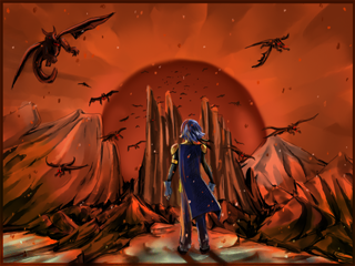
And here's an example of the second way the picture can be done. Notice that the character is now still all blue but shouldn't clash with the rest of the picture. I didn't see so much effort to make the ground look right, but the point should come across. The sense of depth and how the light source determines the colors. In this picture it's more apparent there is other light source beside that red. I just gave some of the mountains a green tone, the ground a brown tone and darkened the Gargoyle. (I fucked up and accidentally made some unnecessary shadows to the ground, but ignore that.) (and yes the hero's shadow should be made less heavy in the version because the light isn't as illuminating.)
I'm not particularly fond of editing existing artwork, because I know it's not a nice thing to do, so I apologize for that, and yes Booble's art in general is better than anything for 90% of the RM games, but that is also the reason why I want to give my feedback and point the existing problems, so she could get even better, because there is lot of potential.
ps. the idea can be applied a lot better than I did in the example, but it was supposed to just guide in general.
i see exactly what you're saying, and i do indeed appreciate the feedback :)
i might edit it up once i've finished doing the other scenes
might
might not
i'm mysterious like that(probably will seeing as you've gone through all this effort to point it out to me! haha)
i might edit it up once i've finished doing the other scenes
might
might not
i'm mysterious like that(probably will seeing as you've gone through all this effort to point it out to me! haha)
Well it can be pain in the ass to redo things that have felt complete already, so I'd say do as you feel like, just as along as you take a note of things you can improve in the future pieces!
Pages:
1

