


 Add Review
 Subscribe
 Nominate
 Submit Media
 RSS
RSS
The Italians are out to get me!
 Happy
Happy- 03/19/2010 06:37 PM
- 3389 views
A look into Italian Rpg Making with Rei- ... or an interview with Rei- for the Italians?
Today I met two Italian guys who caught me by gripping me from the elbows and then dragged me into a room where there was no one else except the three of us. First I was worried and afraid, but when I raised my head and looked deep in their warm, brown eyes under their seducing, curly dark hair, they smiled at me and said: "Your game has arrived to Italy."
AAAAAAAAAAAAAAAAWW YEEEEEEAAAAAAAAAAAAAAAAAAAAAAAHHH! \o/
So yeah these two guys; Freank and Marco from RpgMker.net asked me for an interview which they could post to their Italian Rpg Maker community, and here it is!
It's all pretty basic stuff, and there isn't happening much of "sharing the secrets of a true mastermind to make your lives or Rpg Maker projects better."ought to be because there wasn't a mastermind, aahhah!
Anyway, here's my first interview I've ever given to anyone. There's some cool screens of Italian Rpg Maker games on the second half, which I was asked to comment on. Take a look at them, there's a few interesting looking games there!
And thanks for the interview to these guys, I appreciate this as somekind of acknowledgment for the work I have done so far. So the conquering process for my ultimate world domination begins from Italy! I follow the footsteps of the oncenot so great men...!
Okay, that was inappropriate. Let's get to the interview. Thanks to Solitayre for cleaning it up:
The Interview:
Where did your passion for RPG Maker come from?
Well I've always been fan of the RPG genre when I was a kid, and I also liked to use my imagination to create and build my own things, so that eventually led into me wanting to create my own RPGs too.
I consider RPG maker just a silly hobby, even though I spend a lot of time on it. But when I'm working with it, I try not to be too serious.
I do have intentions of aiming my studies around game design or at least visually creative aspects of communications in the future, though.
What are the limits of RPG maker to you?
Let's see. The first limits I can think of are the graphical limitations. Use of 256 colors, and the biggest problem, the small resolution it uses for some of the graphics.
Though that's mostly just for RPG Maker 2003, which I've been using for my main project. But because of that I've started to like VX more and more.
I think the real limitation depends on what you're going for yourself, though. Making a game is a lot of work, and if you have ambitious plans, the real limit is the time.
For this reason I've started to consider working in a team in a positive light, because it makes the chances of getting the job done more realistic.
Especially if you're aiming to create "an epic" RPG that's solid on all of its aspects.
What are the most common drawbacks in games made with RPG maker?
Haha, I'm not the best person to ask this question, because I make a lot of mistakes too, but I guess everybody does. I'm still learning more about general game design formulas if you may call them that.
I mean, if you're aiming to create a professional, solid game, then you should probably try something else than RPG Maker. Of course it's not forbidden to aim to do that with Rpg Maker either,
but then it's about practice and about remembering the essentials of a game. I think maybe the biggest mistakes with RPG Maker games is that the creators aren't always focusing to the relevant:
they want to make their game look good to the others and match different standards - I say make the game one you would personally enjoy. It doesn't fix all the problems that might come along the way, but at least you're focusing onto making the game fun before you're focusing onto polishing it. If your game is all about polish, pretty systems and graphics, but there is no ambition, inspiration or idea behind it, it's not going to be very fun or memorable.
About teams: do you think its better working alone or in teams?
Working in a team can be beneficial in many ways, but if you're going to do so, you have to be prepared to be more organized than working alone. Planning in advance and task management both have an important role in team work.
I haven't worked much in teams myself while creating games before, but I'm looking forward to get more experience on that. Usually each of us is specialized in a certain task in game making,
like graphics, mechanics or writing, for example. If your team consists of several individuals who're each specialized to a certain factor, you'll get better results in the end, because everyone is able to focus onto their main choice of interest. What's important though, is to make certain that the person who is given a task, is confident he can match the standards, or requirements set for him.
In other words, that he has enough experience. If he's really uncertain, it can end in sloppy results for the game, or lack of his motivation to finish this task. Motivation is important when working in a team.
To ensure it, make sure everyone gets to do what they like, and that they're given a creative freedom and that they're able to match your standards. After all, none of us get paid for working with these programs, so getting someone else to do their job won't be that easy.
Do you talk about the Italian RPG making in America?
There's always some discussions about foreign RPG Maker games and the like, but not enough. I'm Finnish myself, so I'm from Europe, too. Usually the main image of European RPG Maker games is that we
focus a lot to the visuals. I can't deny that, as it seems to me that the communities in Germany and France for example, set very high standards for graphics in the RPG Maker games and spend a lot of time to polish that aspect, while in USA they usually keep talking about how important the game mechanics and gameplay is.
I think there could be more communication between these communities, as we would probably would have a lot to give each other.
Can we show you a few screens or videos of italian games and have you comment on each of them?
Sure, let's see:
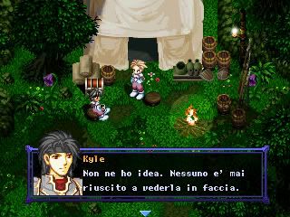
Raldon by theoras
Seems like an RPG Maker XP game. Well, the first thing catching my eyes is the difference of style in the interface and level design. The level is very colourful, saturated and busy, while the interface:
the status bars and the like, are very simple in color terms, small and don't really stand out enough. With a bit more colors, some outlines and design that matches the "cartoonish" RTP graphics,
the interface would fit better. I also spot an icon from World of Warcraft. I recommend withdrawing from using resources that are commonly known. Though I do use some rips on some of my projects myself,
too, I try to avoid using them in a way where they make you instantly think the source game, like Shadow Word Pain (the icon) does: it takes you instantly back to World of Warcraft in your mind.
I would also like to add that the map looks very busy. It could use some simplicity and peace, like some open areas. When it's very colourful and there is so much to focus onto, it's kind of pushing you away.
Poket Quest by Testament
Okay, this one works much better. There is some simplicity and hence, there aren’t too many points in the design that all fight together for catching your attention - it's easier for eyes.
The clear text with distinct outlines makes the interface work a lot better, and you don't have as hard a time trying to follow the important stats going on the screen.
The graphical style also seems pretty coherent, which is important.
Pokemon Garmet by Mercury
Not much I can say. Great use of colors and the design is simple - nothing stands out too much. It's pretty harmonic, though this is a screen of a map that is straight horizontal line, so it has a little advantage to it!
If the creator of this one can make all his maps as pretty as this while making them work mechanics-wise so that they remain interesting and fun to the player, then it's going to be visually very enjoyable game.
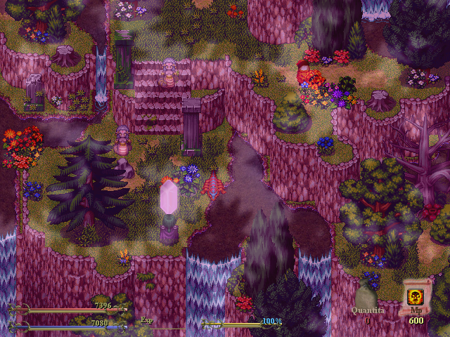
Tales Of Caledon by Sabaoth Team
The game itself seems visually great. If I would have to pick a few things that brought it down a little, they would be the sprites and the menus.
The sprites go along well enough with the surroundings, but to make them work perfectly, their colours would need to be adjusted accordingly. As for the menus, again, they look like something out of World of
Warcraft because of the button color and shape design - I'd personally change that, but it's no biggie. The animation seemed great though, really really smooth. The game seems interesting, but the trailer doesn't do it much justice.
The trailer uses a way overused track: Requiem for a dream. Everyone's heard it way too many times and this is why it seems pretentious whenever someone is still using it. It's like they wanted to match that
some certain "ooh cool trailer" group, while they just could be original and come up with something that everyone hasn't already heard before - as in, actually entertain the audience with something fresh.
Also, the video should show the highlights of the game and something to look forward to, but it focused a lot of moving a cursor in menu, which isn't too exciting. And in the later parts it was cut too much while the
player was moving around on the environments. It made it look like the video or the game was lagging, or something - it just didn't work that well. In conclusion: the game looks pretty interesting, but the trailer doesn't do it justice.
Element of Chaos by Val
It looks alright, but there really is too many graphical styles clashing here. The lighting style varies too much in the different objects and the sprites and the portrait from Fire Emblem make it clash even more.
They need to be edited a lot further to go well together. It's a lot of work to make a lot of different styles work together - a lot of editing and trial and error. In this screen there is good effort, but it still needs
more work. Alternative choice is to pick one style and go with it - it might be less troublesome.
The stone of Punishment by Seto
I really like it. There still is something little wrong with it that is not very easy to tell first, though. I think it's the color scheme of the dialogue window - it's very rich, while the rest of the graphics are much more
composed colors, and not as much shaded (the sprites for example. Compare their hair to the dialogue window, for example.) But generally I like it a lot. Changing the saturation of the dialogue window
could just work some wonders.
Remothered by Chris
Okay, this is beyond amazing. The video was very, very impressive. A great use of the visuals, sound effects and all. I'm simply running out of words. The atmosphere was very creepy. I'd really love to play that
game and I'm sure many other people would love too. If they've got the guts, that is.
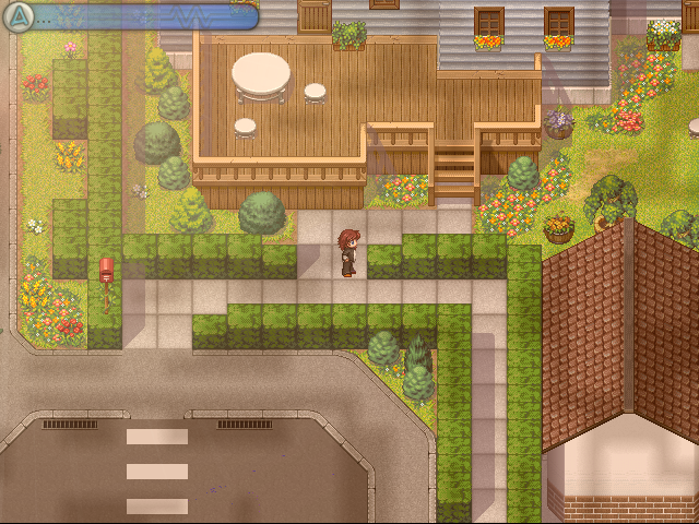
Fifth Era by Lollo
The graphics used for the map look good, but the objects stand out too much. they need different shading and colors to go well along with the map. The interface bit on bottom right corner of the screen clashes
too. It looks generally good. If those little bits were taken care of, then I'd say it would look graphically pretty solid game
Tenshi by Fenrix
Blocky! I'd definitely take out the square outlines from the bushes at least, considering the ground tiles are supposed to be flagstones. As it is now it looks too much like some grid or something.
Other than that it looks generally nice. A bit empty perhaps, but maybe that's because it's a town but the player sprite seems to be the only living thing in there. The interface bit doesn't go very well with the map,
but that's a quick fix - just some exposure changes.
.
Last but not least : Valiant Dreamers by Ally
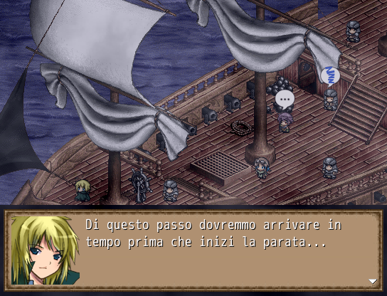
This particular screen looks pretty cool because of the awesome ship. The little sprites look so cute in it... But I can't say for the rest of the game. Does it use the same graphics all the way?
Anyway, the ship is great and the sprites go very well together with it. The dialogue window could be a little more fancier, though. Maybe give it a background pattern, or try some different frames.
I'm just saying the awesome map totally outshines the dialogue window. To give the screen some balance, make everything equally awesome.
Thanks for your time, we are very happy for this interview! We hope we gave you a good impression of Italian game making!
Yeah, there are several interesting looking projects! Thank you for the review. If you're interested to check out my current project, check out Ill Will on Rpgmaker.net
It's a side project I begun with two other people in December and it's going to be finished in the two following months. Once it's complete I will return back to working my main project.
Thank you~
Sorry for another blog post with no real relevance to progress updates on Ascendence! You'll see those around summer. Thanks for your time. Feel free to comment, point out and discuss any of the contents of this post. =))
Today I met two Italian guys who caught me by gripping me from the elbows and then dragged me into a room where there was no one else except the three of us. First I was worried and afraid, but when I raised my head and looked deep in their warm, brown eyes under their seducing, curly dark hair, they smiled at me and said: "Your game has arrived to Italy."
AAAAAAAAAAAAAAAAWW YEEEEEEAAAAAAAAAAAAAAAAAAAAAAAHHH! \o/
So yeah these two guys; Freank and Marco from RpgMker.net asked me for an interview which they could post to their Italian Rpg Maker community, and here it is!
It's all pretty basic stuff, and there isn't happening much of "sharing the secrets of a true mastermind to make your lives or Rpg Maker projects better."
Anyway, here's my first interview I've ever given to anyone. There's some cool screens of Italian Rpg Maker games on the second half, which I was asked to comment on. Take a look at them, there's a few interesting looking games there!
And thanks for the interview to these guys, I appreciate this as somekind of acknowledgment for the work I have done so far. So the conquering process for my ultimate world domination begins from Italy! I follow the footsteps of the once
Okay, that was inappropriate. Let's get to the interview. Thanks to Solitayre for cleaning it up:
The Interview:
Where did your passion for RPG Maker come from?
Well I've always been fan of the RPG genre when I was a kid, and I also liked to use my imagination to create and build my own things, so that eventually led into me wanting to create my own RPGs too.
I consider RPG maker just a silly hobby, even though I spend a lot of time on it. But when I'm working with it, I try not to be too serious.
I do have intentions of aiming my studies around game design or at least visually creative aspects of communications in the future, though.
What are the limits of RPG maker to you?
Let's see. The first limits I can think of are the graphical limitations. Use of 256 colors, and the biggest problem, the small resolution it uses for some of the graphics.
Though that's mostly just for RPG Maker 2003, which I've been using for my main project. But because of that I've started to like VX more and more.
I think the real limitation depends on what you're going for yourself, though. Making a game is a lot of work, and if you have ambitious plans, the real limit is the time.
For this reason I've started to consider working in a team in a positive light, because it makes the chances of getting the job done more realistic.
Especially if you're aiming to create "an epic" RPG that's solid on all of its aspects.
What are the most common drawbacks in games made with RPG maker?
Haha, I'm not the best person to ask this question, because I make a lot of mistakes too, but I guess everybody does. I'm still learning more about general game design formulas if you may call them that.
I mean, if you're aiming to create a professional, solid game, then you should probably try something else than RPG Maker. Of course it's not forbidden to aim to do that with Rpg Maker either,
but then it's about practice and about remembering the essentials of a game. I think maybe the biggest mistakes with RPG Maker games is that the creators aren't always focusing to the relevant:
they want to make their game look good to the others and match different standards - I say make the game one you would personally enjoy. It doesn't fix all the problems that might come along the way, but at least you're focusing onto making the game fun before you're focusing onto polishing it. If your game is all about polish, pretty systems and graphics, but there is no ambition, inspiration or idea behind it, it's not going to be very fun or memorable.
About teams: do you think its better working alone or in teams?
Working in a team can be beneficial in many ways, but if you're going to do so, you have to be prepared to be more organized than working alone. Planning in advance and task management both have an important role in team work.
I haven't worked much in teams myself while creating games before, but I'm looking forward to get more experience on that. Usually each of us is specialized in a certain task in game making,
like graphics, mechanics or writing, for example. If your team consists of several individuals who're each specialized to a certain factor, you'll get better results in the end, because everyone is able to focus onto their main choice of interest. What's important though, is to make certain that the person who is given a task, is confident he can match the standards, or requirements set for him.
In other words, that he has enough experience. If he's really uncertain, it can end in sloppy results for the game, or lack of his motivation to finish this task. Motivation is important when working in a team.
To ensure it, make sure everyone gets to do what they like, and that they're given a creative freedom and that they're able to match your standards. After all, none of us get paid for working with these programs, so getting someone else to do their job won't be that easy.
Do you talk about the Italian RPG making in America?
There's always some discussions about foreign RPG Maker games and the like, but not enough. I'm Finnish myself, so I'm from Europe, too. Usually the main image of European RPG Maker games is that we
focus a lot to the visuals. I can't deny that, as it seems to me that the communities in Germany and France for example, set very high standards for graphics in the RPG Maker games and spend a lot of time to polish that aspect, while in USA they usually keep talking about how important the game mechanics and gameplay is.
I think there could be more communication between these communities, as we would probably would have a lot to give each other.
Can we show you a few screens or videos of italian games and have you comment on each of them?
Sure, let's see:
Raldon by theoras
Seems like an RPG Maker XP game. Well, the first thing catching my eyes is the difference of style in the interface and level design. The level is very colourful, saturated and busy, while the interface:
the status bars and the like, are very simple in color terms, small and don't really stand out enough. With a bit more colors, some outlines and design that matches the "cartoonish" RTP graphics,
the interface would fit better. I also spot an icon from World of Warcraft. I recommend withdrawing from using resources that are commonly known. Though I do use some rips on some of my projects myself,
too, I try to avoid using them in a way where they make you instantly think the source game, like Shadow Word Pain (the icon) does: it takes you instantly back to World of Warcraft in your mind.
I would also like to add that the map looks very busy. It could use some simplicity and peace, like some open areas. When it's very colourful and there is so much to focus onto, it's kind of pushing you away.
Poket Quest by Testament
Okay, this one works much better. There is some simplicity and hence, there aren’t too many points in the design that all fight together for catching your attention - it's easier for eyes.
The clear text with distinct outlines makes the interface work a lot better, and you don't have as hard a time trying to follow the important stats going on the screen.
The graphical style also seems pretty coherent, which is important.
Pokemon Garmet by Mercury
Not much I can say. Great use of colors and the design is simple - nothing stands out too much. It's pretty harmonic, though this is a screen of a map that is straight horizontal line, so it has a little advantage to it!
If the creator of this one can make all his maps as pretty as this while making them work mechanics-wise so that they remain interesting and fun to the player, then it's going to be visually very enjoyable game.
Tales Of Caledon by Sabaoth Team
The game itself seems visually great. If I would have to pick a few things that brought it down a little, they would be the sprites and the menus.
The sprites go along well enough with the surroundings, but to make them work perfectly, their colours would need to be adjusted accordingly. As for the menus, again, they look like something out of World of
Warcraft because of the button color and shape design - I'd personally change that, but it's no biggie. The animation seemed great though, really really smooth. The game seems interesting, but the trailer doesn't do it much justice.
The trailer uses a way overused track: Requiem for a dream. Everyone's heard it way too many times and this is why it seems pretentious whenever someone is still using it. It's like they wanted to match that
some certain "ooh cool trailer" group, while they just could be original and come up with something that everyone hasn't already heard before - as in, actually entertain the audience with something fresh.
Also, the video should show the highlights of the game and something to look forward to, but it focused a lot of moving a cursor in menu, which isn't too exciting. And in the later parts it was cut too much while the
player was moving around on the environments. It made it look like the video or the game was lagging, or something - it just didn't work that well. In conclusion: the game looks pretty interesting, but the trailer doesn't do it justice.
Element of Chaos by Val
It looks alright, but there really is too many graphical styles clashing here. The lighting style varies too much in the different objects and the sprites and the portrait from Fire Emblem make it clash even more.
They need to be edited a lot further to go well together. It's a lot of work to make a lot of different styles work together - a lot of editing and trial and error. In this screen there is good effort, but it still needs
more work. Alternative choice is to pick one style and go with it - it might be less troublesome.
The stone of Punishment by Seto
I really like it. There still is something little wrong with it that is not very easy to tell first, though. I think it's the color scheme of the dialogue window - it's very rich, while the rest of the graphics are much more
composed colors, and not as much shaded (the sprites for example. Compare their hair to the dialogue window, for example.) But generally I like it a lot. Changing the saturation of the dialogue window
could just work some wonders.
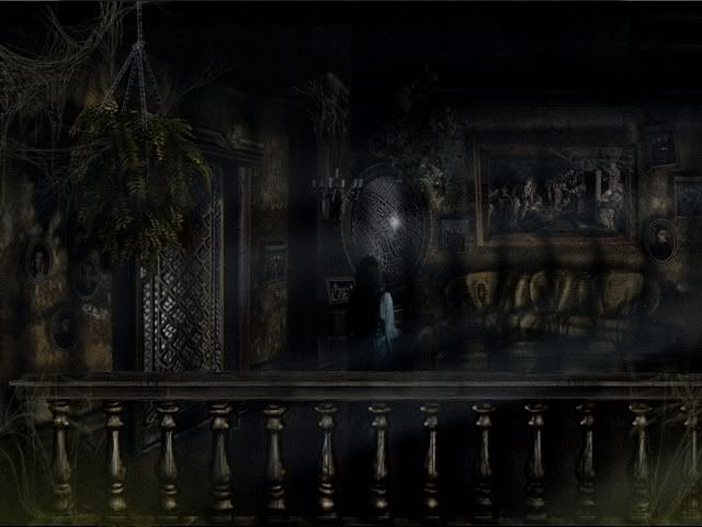
Remothered by Chris
Okay, this is beyond amazing. The video was very, very impressive. A great use of the visuals, sound effects and all. I'm simply running out of words. The atmosphere was very creepy. I'd really love to play that
game and I'm sure many other people would love too. If they've got the guts, that is.
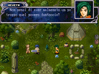
Fifth Era by Lollo
The graphics used for the map look good, but the objects stand out too much. they need different shading and colors to go well along with the map. The interface bit on bottom right corner of the screen clashes
too. It looks generally good. If those little bits were taken care of, then I'd say it would look graphically pretty solid game
Tenshi by Fenrix
Blocky! I'd definitely take out the square outlines from the bushes at least, considering the ground tiles are supposed to be flagstones. As it is now it looks too much like some grid or something.
Other than that it looks generally nice. A bit empty perhaps, but maybe that's because it's a town but the player sprite seems to be the only living thing in there. The interface bit doesn't go very well with the map,
but that's a quick fix - just some exposure changes.
.
Last but not least : Valiant Dreamers by Ally
This particular screen looks pretty cool because of the awesome ship. The little sprites look so cute in it... But I can't say for the rest of the game. Does it use the same graphics all the way?
Anyway, the ship is great and the sprites go very well together with it. The dialogue window could be a little more fancier, though. Maybe give it a background pattern, or try some different frames.
I'm just saying the awesome map totally outshines the dialogue window. To give the screen some balance, make everything equally awesome.
Thanks for your time, we are very happy for this interview! We hope we gave you a good impression of Italian game making!
Yeah, there are several interesting looking projects! Thank you for the review. If you're interested to check out my current project, check out Ill Will on Rpgmaker.net
It's a side project I begun with two other people in December and it's going to be finished in the two following months. Once it's complete I will return back to working my main project.
Thank you~
Sorry for another blog post with no real relevance to progress updates on Ascendence! You'll see those around summer. Thanks for your time. Feel free to comment, point out and discuss any of the contents of this post. =))
Posts 

Pages:
1


calunio: They're just showing the best of their community. Would you pick ugly games from the English-speaking community if you were playing ambassador?
Yeah, this is really cool!
Hm, I quite liked the look of an Italian RM2K3 game called Fifth Era... I wonder how well regarded that is.
Hm, I quite liked the look of an Italian RM2K3 game called Fifth Era... I wonder how well regarded that is.

Pages:
1

