


 Add Review
 Subscribe
 Nominate
 Submit Media
 RSS
RSS
New Logo
 Housekeeping
- 02/17/2016 04:36 PM
- 3765 views
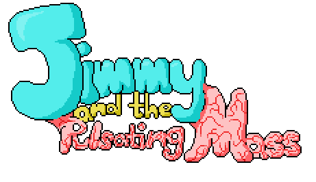
I’ve updated the logo so that it matches the current style of the game. This is what it used to look like:
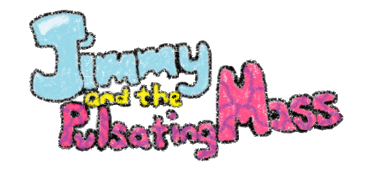
This was actually the final remnant of an old version of Jimmy and the Pulsating Mass where everything was drawn (poorly) with crayons (okay, the crayon tool in MS Paint…). Originally, Jimmy was going to be a much shorter game that had some story similarities to the current version but played way differently. One of these days I’ll take some screenshots of that version so you can see how far the game has come, but for now, I’ll just focus on the logo. I finally got around to fixing the title screen, which was the last thing I had left in this style. Here’s the new logo:
The old logo has an animated version, too, but I can’t find it–-and it’s not as good, anyway. Pretty snazzy, eh?
Posts 

Pages:
1
Red_Nova

Sir Redd of Novus: He who made Prayer of the Faithless that one time, and that was pretty dang rad! :D
9192
Ooh, this looks pretty cool! I like how the new title screen is more in line with the game's art style than the old one, and it really makes me curious to see the art style of the original.
Is there supposed to be some hidden meaning with Pulsating Mass being fused to Jimmy? Cause that's what I want to believe.
Is there supposed to be some hidden meaning with Pulsating Mass being fused to Jimmy? Cause that's what I want to believe.


author=SgtMettool
Hooo-o-o-ooo it makes me so uncomfortable in the best way. Really awesome stuff.
This. I squirm a little bit just looking at it XD;; It's incredible and perfect for this game!

It looks really surreal and vibrant. I like it. The yellow "a" looks a bit off to me though. It kind of looks like the male gender symbol.

Glad you all like it!
@luiishu: I don't see it! I'm crap at drawing text, though, so I'm not the best judge. I'll probably leave it as is unless a lot of people think it looks wonky--every time I change a letter, it means I have to change it for every frame and then remake the .gif, which is a pain in the ass.
@Red_Nova: I could answer that and I wouldn't spoil anything, but I think it's best to go ahead and invoke a hush order on me divulging plot details. So, I'll let your question remain rhetorical, haha.
Corfaisus

"It's frustrating because - as much as Corf is otherwise an irredeemable person - his 2k/3 mapping is on point." ~ psy_wombats
7874
author=unityauthor=SgtMettoolThis. I squirm a little bit just looking at it XD;; It's incredible and perfect for this game!
Hooo-o-o-ooo it makes me so uncomfortable in the best way. Really awesome stuff.
Let me echo this sentiment. When it bulges, it makes my brain dry heave a little every time.
Pages:
1

