


 Add Review
 Subscribe
 Nominate
 Submit Media
 RSS
RSS
Amalie Redesign
 Red_Nova
- 03/26/2016 02:36 PM
- 4586 views

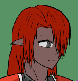
Amalie's design has always been one of the most interesting to me. As if her being a Manna wasn't enough to ostracize her from the rest of the Knights, her red equipment color further differentiates her from their standard blue armor. Was Commandant Vanessa playing a joke when she issued Amalie this armor set? Or was she silently telling Amalie that she is in a unique position to lead a new movement of acceptance for the Manna? Not even Amalie, who understands and respects Vanessa more than anyone else in the Asalan Knights, is sure of her intent.
Original version:

Posts 

Pages:
1

Red_Nova

Sir Redd of Novus: He who made Prayer of the Faithless that one time, and that was pretty dang rad! :D
9192
Yep. I was afraid to make the scarring so visible, but I suppose it adds a bit to the mystery of what happened to her.
Wait. So is the final version, including shadowing and stuff? 'Cause the old one seems brighter/less dull, and more consistent in the lighting.
And her dull eye in the new one is creeping me out... as it's more like she's just staring at her hand constantly in the new one, as the old one has her iris be more in the center of her eye...
And her dull eye in the new one is creeping me out... as it's more like she's just staring at her hand constantly in the new one, as the old one has her iris be more in the center of her eye...
Red_Nova
Sir Redd of Novus: He who made Prayer of the Faithless that one time, and that was pretty dang rad! :D
9192
None of these are final pieces, just their concepts. I've been posting these in the hope of getting some feedback, then I'll redraw them all with cleaner lines, shading, as well as their respective dialogue portraits if there's no serious issues with their style or design.
I added some reflection on her armor to help differentiate between plate armor and cloth in the hope of preventing confusion, but now I see that it's had the opposite effect, haha! As for her less saturated color palette, a few lessons I picked up when studying color theory was that super saturated colors can strain the eyes as well as look a little unnatural. So I dulled everyone a little bit in the hopes of making them easier to look at. Plus, it makes more sense now that the custom tilesets have adopted a more muted palette.
As for her dull eye, that is very much intentional this time. Amalie never had any light reflection even in her final art/bust in the main game, after all.
author=Marrend
I remember thinking, for the longest time, that she only had the one eye. However... yeah.
I had the same reaction! I thought it was just me!
Maybe if there's a way to shorten the bang on the right side? Or accentuate the angle of the face with the nose?
Red_Nova
Sir Redd of Novus: He who made Prayer of the Faithless that one time, and that was pretty dang rad! :D
9192
Her bangs are like that to hide a key plot point. However, I can definitely make her nose more pronounced to give the head some more shape.
Thanks for the suggestion!
Thanks for the suggestion!

Hmm, yeah, good suggestions. I hadn't really thought of that problem before. Showing more of the overall face so that the viewer gets a better idea of where the hidden eye should be might help, too. Maybe like this?

Red_Nova
Sir Redd of Novus: He who made Prayer of the Faithless that one time, and that was pretty dang rad! :D
9192
I shortened her bangs slightly and moved her nose to a more pronounced position. How's this?
Red_Nova
Sir Redd of Novus: He who made Prayer of the Faithless that one time, and that was pretty dang rad! :D
9192
Success! Thanks for the feedback!
EDIT: Aaaaand image updated.
EDIT: Aaaaand image updated.
Pages:
1

